Apex PageBlockSection component
Apex PageBlockSection component is used to create sections within a page block to categorize different fields into different sections. It’s similar to adding a section by using a edit page layout assignment. Apex PageBlockSection component consists of two cells, one for “Label” and another for “value“.
Each component found in the body of an <apex: pageblock section> is placed into the next cell in a row until the no. of columns is reached. Apex pageBlockSection must be a child component to <apex:pageBlock> component. <apex:inputField> and <apex:outputField> are the two components used to add fields from a Salesforce object.
Apex PageBlockSection component attributes.
| Title | This attribute will display the title of Apex PageBlockSection component |
| Collapsible | Collapsible is a boolean type. It Specifies whether the page block section can be expanded and collapsed by a user, by default its “TRUE” |
| Columns | Columns is an Integer type. It specifies t specifies the no. of columns that can be included in a single row of a pageblock section |
| Dir | It specifies the text direction RTL or LTR |
Visualforce page
<apex:page >
    <apex:form>
        <apex:pageBlock title="Tutorialkart" mode="Account">
            <apex:pageBlockSection title="Page Block Section - 1" columns="2" collapsible="true" >
                <apex:outputLabel> Prasanth Kumar </apex:outputLabel>
                <apex:outputLabel>Prasanth Kumar </apex:outputLabel>
                <apex:outputLabel> Prasanth Kumar</apex:outputLabel>
            </apex:pageBlockSection>
            <apex:pageBlockSection title="page block section - 2" columns="3">
                <apex:outputLabel> Prasanth Kumar</apex:outputLabel>
                <apex:outputLabel> Prasanth Kumar</apex:outputLabel>
                <apex:outputLabel> Prasanth Kumar</apex:outputLabel>
            </apex:pageBlockSection>
        </apex:pageBlock>
    </apex:form>
</apex:page>
We can add any number of Apex Page Block Section component in <apex:pageblock> component. To specify Apex PageBlockSection as expanded and Collapsed use Collapsible attribute as shown above.
- To specify the number of columns use columns attribute and enter the integer value in page block section.
Output
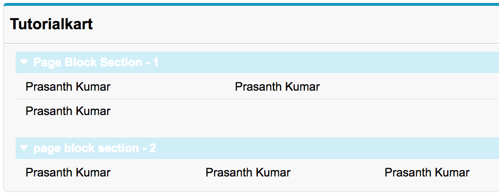
In the first page block section, we entered 2 columns for the row and in Second block section we enter 3 columns for the row. Now we understood the working and usage of Apex pageblockSection component.
Conclusion
In this Salesforce tutorial, we clearly understood about Apex Page block section component. In our upcoming Salesforce tutorial, we will learn about Apex pageblocksectionItem component and it’s attributes.