CSS Flexbox Layout
This CSS Flexbox cheatsheet covers essential properties for building flexible layouts. Each property and value has a code example, along with a demonstration image for visual reference.
display
The display property enables Flexbox on an element.
display: flex;flex-direction
Defines the main axis direction of the flex container.
row – Items align horizontally, from left to right (default).
flex-direction: row;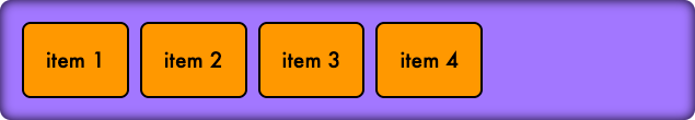
row-reverse – Items align horizontally, from right to left.
flex-direction: row-reverse;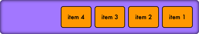
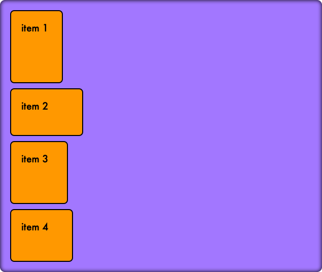
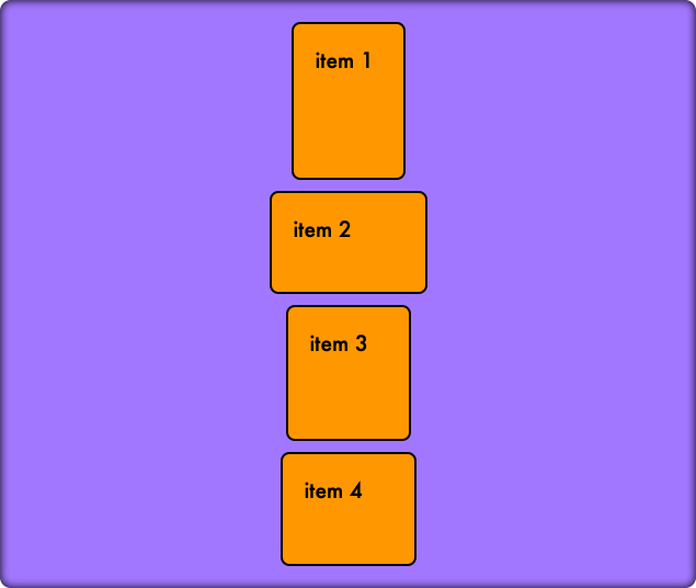
column – Items align vertically, from top to bottom.
flex-direction: column;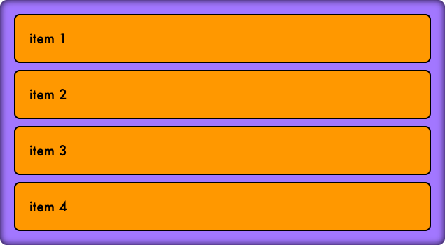
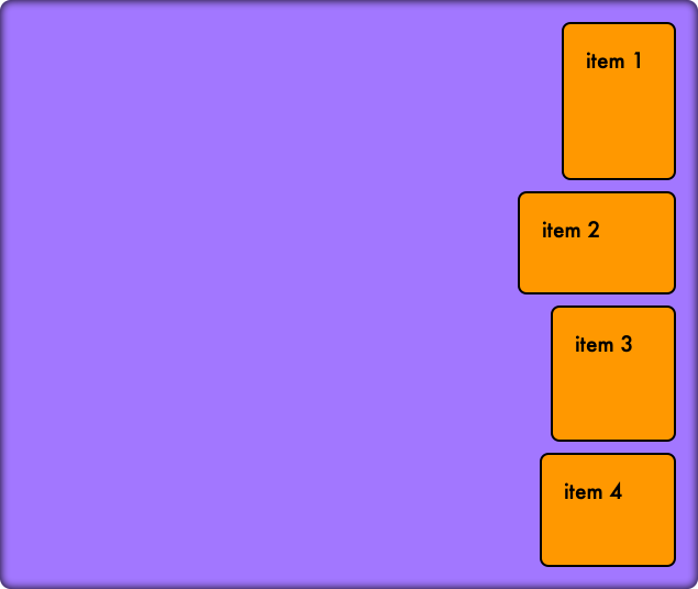
column-reverse – Items align vertically, from bottom to top.
flex-direction: column-reverse;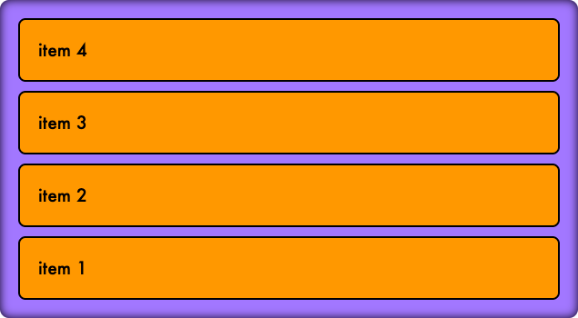
justify-content
Aligns flex items along the main axis.
flex-start – Items align to the start of the main axis.
justify-content: flex-start;flex-end – Items align to the end of the main axis.
justify-content: flex-end;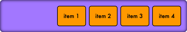
center – Items are centered along the main axis.
justify-content: center;
space-between – Space is distributed evenly between items.
justify-content: space-between;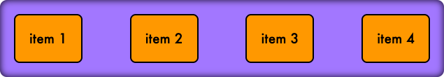
space-around – Space is distributed evenly around items.
justify-content: space-around;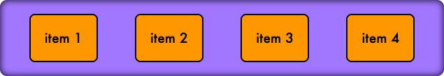
align-items
Aligns items along the cross axis.
stretch – Items stretch to fill the container (default).
align-items: stretch;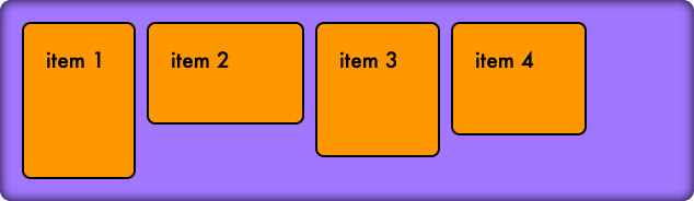
flex-start – Items align to the start of the cross axis.
align-items: flex-start;flex-end – Items align to the end of the cross axis.
align-items: flex-end;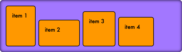
center – Items are centered along the cross axis.
align-items: center;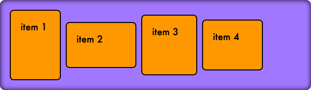
flex-wrap
Specifies if flex items should wrap onto multiple lines.
nowrap – Items stay on a single line (default).
flex-wrap: nowrap;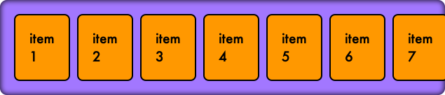
wrap – Items wrap onto multiple lines.
flex-wrap: wrap;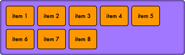
wrap-reverse – Items wrap onto multiple lines in reverse order.
flex-wrap: wrap-reverse;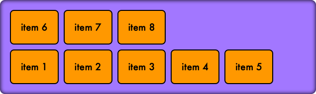
align-content
Aligns flex lines along the cross axis when there is extra space in the container.
Note: align-items should be set to either wrap or wrap-reverse.
flex-start – Lines align to the start of the cross axis.
align-content: flex-start;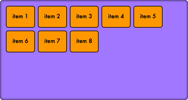
flex-end – Lines align to the end of the cross axis.
align-content: flex-end;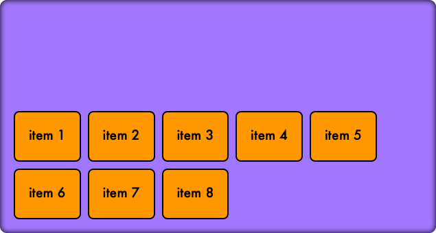
center – Lines are centered along the cross axis.
align-content: center;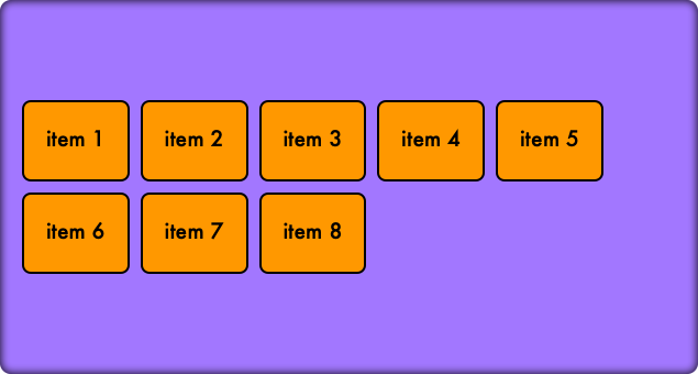
space-between – Space is distributed evenly between lines.
align-content: space-between;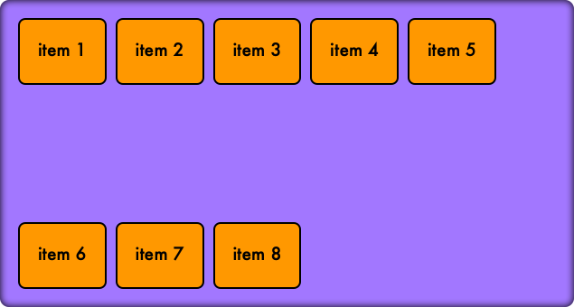
space-around – Space is distributed evenly around lines.
align-content: space-around;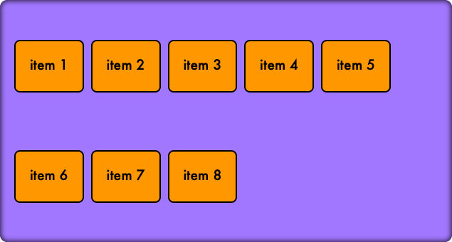
flex-grow
Specifies the growth factor of a flex item relative to others.
flex-grow: 2;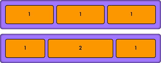
flex-shrink
Specifies how a flex item will shrink relative to others if space is limited.
flex-shrink: 0;flex-basis
Defines the initial size of a flex item before space distribution.
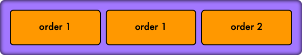
flex-basis: 200px;order
Controls the order of flex items within a container.
order: 1; <div class="flex-container">
<div class="flex-item flex-item-1" style="order:1">order 1</div>
<div class="flex-item flex-item-1" style="order:2">order 2</div>
<div class="flex-item flex-item-1" style="order:1">order 1</div>
</div>