3D Button Effect to a Link Using CSS
Applying a 3D button effect to a link using CSS makes it look more interactive and visually appealing. This effect is commonly used for call-to-action buttons, navigation links, and interactive elements.
You can achieve this effect using the box-shadow and transform properties. Below is a basic example where a link is styled as a 3D button:
/* 3D button effect */
a.button-3d {
  display: inline-block;
  text-decoration: none;
  color: white;
  background-color: #007BFF;
  padding: 15px 20px;
  font-size: 18px;
  font-weight: bold;
  border-radius: 5px;
  box-shadow: 0 5px #0056b3;
  transition: all 0.2s ease-in-out;
  position: relative;
}

a.button-3d:active {
  box-shadow: 0 2px #0056b3;
  transform: translateY(3px);
}
Examples
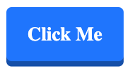
Example 1. Simple 3D Button Effect
In this example, the link appears raised, and when clicked, it gives a press-down effect.
index.html
<!DOCTYPE html>
<html lang="en">
<head>
  <meta charset="utf-8">
  <style>
    a.button-3d {
      display: inline-block;
      text-decoration: none;
      color: white;
      background-color: #007BFF;
      padding: 15px 20px;
      font-size: 18px;
      font-weight: bold;
      border-radius: 5px;
      box-shadow: 0 5px #0056b3;
      transition: all 0.2s ease-in-out;
      position: relative;
    }

    a.button-3d:active {
      box-shadow: 0 2px #0056b3;
      transform: translateY(3px);
    }
  </style>
</head>
<body>
  <p><a href="https://www.example.com" class="button-3d">Click Me</a></p>
</body>
</html>
Output:
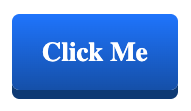
Example 2. 3D Gradient Button Effect
In this example, we add a gradient background and a deeper shadow for a more pronounced 3D effect.
index.html
<!DOCTYPE html>
<html lang="en">
<head>
  <meta charset="utf-8">
  <style>
    a.button-3d-gradient {
      display: inline-block;
      text-decoration: none;
      color: white;
      padding: 15px 20px;
      font-size: 18px;
      font-weight: bold;
      border-radius: 5px;
      background: linear-gradient(to bottom, #007BFF, #0056b3);
      box-shadow: 0 6px #004080;
      transition: all 0.2s ease-in-out;
      position: relative;
    }

    a.button-3d-gradient:active {
      box-shadow: 0 3px #004080;
      transform: translateY(3px);
    }
  </style>
</head>
<body>
  <p><a href="https://www.example.com" class="button-3d-gradient">Click Me</a></p>
</body>
</html>
Output:
Conclusion
Using the box-shadow and transform properties, you can create a 3D button effect for links that enhances user interaction. You can also experiment with gradients and deeper shadows to create more visually appealing buttons. Try different styles to match your website’s design!