Displaying a Link as a Button Using CSS
By default, links (<a> tags) appear as underlined text, but you can style them as buttons using CSS. This technique is commonly used for call-to-action (CTA) links, navigation menus, and interactive web elements to enhance user experience and improve clickability.
You can achieve this by applying CSS properties like display: inline-block;, padding, background-color, and border-radius to the link element. Below is a basic CSS example to style a link as a button:
/* Style a link as a button */
a.button {
  display: inline-block;
  padding: 10px 20px;
  background-color: blue;
  color: white;
  text-decoration: none;
  border-radius: 5px;
  font-size: 16px;
  font-weight: bold;
  text-align: center;
}

a.button:hover {
  background-color: darkblue;
}
Examples
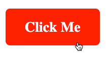
Example 1. Basic Link Styled as a Button
In this example, we transform a regular link into a button by applying padding, background color, and rounded corners.
index.html
<!DOCTYPE html>
<html lang="en">
<head>
  <meta charset="utf-8">
  <style>
    a.button {
      display: inline-block;
      padding: 10px 20px;
      background-color: blue;
      color: white;
      text-decoration: none;
      border-radius: 5px;
      font-size: 16px;
      font-weight: bold;
      text-align: center;
    }

    a.button:hover {
      background-color: darkblue;
    }
  </style>
</head>
<body>
  <p><a href="https://www.example.com" class="button">Click Me</a></p>
</body>
</html>
Output:


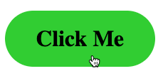
Example 2. Rounded Button with Hover Effect
In this example, we add a larger border radius to create a fully rounded button and modify the hover effect to change the text color.
index.html
<!DOCTYPE html>
<html lang="en">
<head>
  <meta charset="utf-8">
  <style>
    a.button {
      display: inline-block;
      padding: 12px 25px;
      background-color: green;
      color: white;
      text-decoration: none;
      border-radius: 25px;
      font-size: 18px;
      font-weight: bold;
      text-align: center;
      transition: background-color 0.3s ease, color 0.3s ease;
    }

    a.button:hover {
      background-color: limegreen;
      color: black;
    }
  </style>
</head>
<body>
  <p><a href="https://www.example.com" class="button">Click Me</a></p>
</body>
</html>
Output:

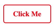
Example 3. Outline Button Style
In this example, we create a transparent button with an outline and change the background color on hover.
index.html
<!DOCTYPE html>
<html lang="en">
<head>
  <meta charset="utf-8">
  <style>
    a.button {
      display: inline-block;
      padding: 10px 20px;
      border: 2px solid red;
      color: red;
      text-decoration: none;
      border-radius: 5px;
      font-size: 16px;
      font-weight: bold;
      text-align: center;
      transition: background-color 0.3s ease, color 0.3s ease;
    }

    a.button:hover {
      background-color: red;
      color: white;
    }
  </style>
</head>
<body>
  <p><a href="https://www.example.com" class="button">Click Me</a></p>
</body>
</html>
Output:
Conclusion
Using CSS, you can easily transform a regular hyperlink into a button, improving user engagement and enhancing website design. You can customize button styles with different shapes, colors, and hover effects to match your website’s theme. Try out these examples to make your links more interactive!