Scaling a Link on Hover Using CSS
Scaling a link on hover using CSS enhances interactivity and draws attention to important links.
To scale a link on hover using CSS, you can use the transform: scale() property for the link element.
The following basic CSS code scales the link smoothly when the user hovers over it:
/* Scale link on hover */
a.scale {
  display: inline-block;
  text-decoration: none;
  color: blue;
  font-size: 18px;
  transition: transform 0.3s ease-in-out;
}

a.scale:hover {
  transform: scale(1.2);
}
Examples
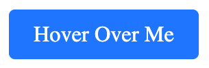
Example 1. Basic Scaling Effect on Hover
In this example, the link scales up by 1.2 times its original size when hovered.
index.html
<!DOCTYPE html>
<html lang="en">
<head>
  <meta charset="utf-8">
  <style>
    a.scale {
      display: inline-block;
      text-decoration: none;
      color: blue;
      font-size: 18px;
      transition: transform 0.3s ease-in-out;
    }

    a.scale:hover {
      transform: scale(1.2);
    }
  </style>
</head>
<body>
  <p><a href="https://www.example.com" class="scale">Hover Over Me</a></p>
</body>
</html>
Output:
Example 2. Scaling a Button-Like Link on Hover
In this example, we apply the scale effect to a button-styled link with padding and a background color.
index.html
<!DOCTYPE html>
<html lang="en">
<head>
  <meta charset="utf-8">
  <style>
    a.scale-button {
      display: inline-block;
      text-decoration: none;
      color: white;
      background-color: #007BFF;
      padding: 10px 20px;
      font-size: 18px;
      border-radius: 5px;
      transition: transform 0.3s ease-in-out;
    }

    a.scale-button:hover {
      transform: scale(1.2);
    }
  </style>
</head>
<body>
  <p><a href="https://www.example.com" class="scale-button">Hover Over Me</a></p>
</body>
</html>
Output:
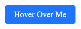
Upon hovering,
Example 3. Continuous Scaling Animation on Hover
In this example, we create a pulsing animation where the link smoothly scales up and down while hovered.
index.html
<!DOCTYPE html>
<html lang="en">
<head>
  <meta charset="utf-8">
  <style>
    @keyframes pulse {
      0% { transform: scale(1); }
      50% { transform: scale(1.2); }
      100% { transform: scale(1); }
    }

    a.scale-pulse {
      display: inline-block;
      text-decoration: none;
      color: red;
      font-size: 18px;
      transition: transform 0.3s ease-in-out;
    }

    a.scale-pulse:hover {
      animation: pulse 0.6s infinite alternate;
    }
  </style>
</head>
<body>
  <p><a href="https://www.example.com" class="scale-pulse">Hover Over Me</a></p>
</body>
</html>
Conclusion
Using the transform: scale() property, you can create engaging scale effects for links on hover. Whether you want a simple scaling effect, a button-style scale, or a pulsing animation, CSS provides flexible options. Experiment with different scale values and animations to enhance user experience!