HTML <button> Tag
The HTML <button> tag is used to create clickable buttons on a web page. It can be used for submitting forms, triggering JavaScript functions, or providing user interaction. Buttons are highly customizable with text, icons, and styles.
Basic Example of HTML <button> Tag
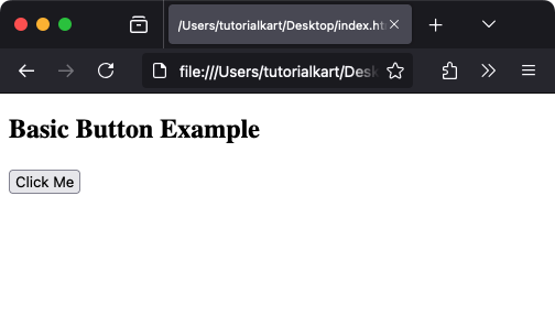
Here is a basic example of a button:
index.html
<!DOCTYPE html>
<html>
    <body>
        <h2>Basic Button Example</h2>
        <button>Click Me</button>
    </body>
</html>
This button doesn’t perform any action by default but can be customized to execute specific tasks.
Attributes of HTML <button> Tag
- type: Specifies the button type. Possible values are:
button: A simple button with no default behavior.submit: Submits the form it is contained within.reset: Resets all form fields to their initial values.
- disabled: Disables the button, making it unclickable.
- name: Specifies the name of the button, used when submitting form data.
- value: Specifies the value associated with the button, submitted with form data.
Example with Form Submission
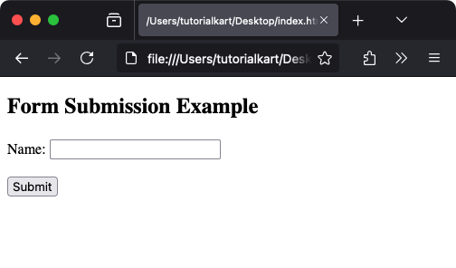
The type="submit" attribute allows the button to submit a form:
index.html
<!DOCTYPE html>
<html>
    <body>
        <h2>Form Submission Example</h2>
        <form action="/submit" method="post">
            <label for="name">Name:</label>
            <input type="text" id="name" name="name"><br><br>
            <button type="submit">Submit</button>
        </form>
    </body>
</html>
Using JavaScript with HTML <button> Tag
The onclick attribute allows you to trigger JavaScript functions when the button is clicked:
index.html
<!DOCTYPE html>
<html>
    <head>
        <script>
            function showAlert() {
                alert('Button clicked!');
            }
        </script>
    </head>
    <body>
        <h2>Button with JavaScript</h2>
        <button onclick="showAlert()">Click Me</button>
    </body>
</html>
Styling the <button> Tag with CSS
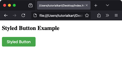
The <button> tag can be styled using CSS to customize its appearance:
index.html
<!DOCTYPE html>
<html>
    <head>
        <style>
            button {
                background-color: #4CAF50;
                color: white;
                padding: 10px 20px;
                border: none;
                border-radius: 5px;
                cursor: pointer;
                font-size: 16px;
            }

            button:hover {
                background-color: #45a049;
            }
        </style>
    </head>
    <body>
        <h2>Styled Button Example</h2>
        <button>Styled Button</button>
    </body>
</html>
Special Cases for HTML <button> Tag
Disabled Button
A disabled button cannot be clicked or interacted with:
index.html
<!DOCTYPE html>
<html>
    <body>
        <h2>Disabled Button</h2>
        <button disabled>Disabled</button>
    </body>
</html>
Button with Icon
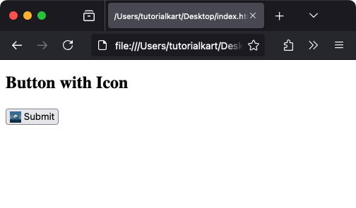
Buttons can include icons for enhanced design and functionality:
index.html
<!DOCTYPE html>
<html>
    <body>
        <h2>Button with Icon</h2>
        <button>
            <img src="icon.png" alt="Icon" style="width:16px; height:16px; vertical-align:middle;"> Submit
        </button>
    </body>
</html>
