HTML Images
Images are an integral part of web design, enhancing the user experience by providing visual context, breaking up text, and making content more engaging.
HTML gives a simple and flexible way to embed images in a webpage using the <img> tag.
In this tutorial, we cover all aspects of HTML images, including their attributes, properties, formatting options, responsive techniques, and best practices for web optimization.
Introduction to the <img> Tag
The <img> tag is a self-closing tag used to embed images into HTML documents. Unlike other elements, it does not require a closing tag. At a minimum, the <img> tag requires two attributes:
src: Specifies the path to the image file.alt: Provides alternative text describing the image for accessibility and situations where the image fails to load.
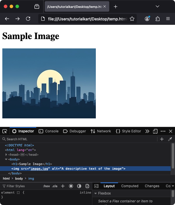
Here’s an example of the basic syntax:
<img src="image.jpg" alt="A descriptive text of the image">Screenshot

Attributes of the <img> Tag
To provide additional control and functionality, the <img> tag supports several attributes:
| Attribute | Description |
|---|---|
src | Specifies the URL or path to the image file. |
alt | Provides alternative text describing the image for accessibility. |
width | Sets the width of the image in pixels or percentages. |
height | Sets the height of the image in pixels or percentages. |
title | Displays a tooltip when the user hovers over the image. |
loading | Specifies the loading behavior of the image (lazy or eager). |
Specifying Image Paths
The src attribute can use either an absolute or relative path to specify the location of the image:
- Absolute Path: A full URL that points to the image on an external server.
- Relative Path: A path relative to the location of the HTML file, ideal for locally hosted images.
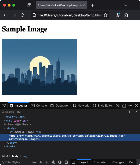
Example of an absolute path:
<img src="http://www.tutorialkart.com/wp-content/uploads/2024/12/image.jpg" alt="Example Image">
Example of a relative path:
<img src="/wp-content/uploads/2024/12/image.jpg" alt="Example Image">Common Image Formats
The most commonly used image formats on the web include:
- JPEG: Ideal for photographs due to its ability to compress images without significant loss of quality.
- PNG: Supports transparency and is best suited for logos, icons, and detailed graphics.
- GIF: Useful for simple animations but limited to 256 colors.
- SVG: Scalable Vector Graphics are resolution-independent, making them perfect for icons and graphics.
- WebP: A modern image format that offers superior compression and quality.
Responsive Images
Responsive images adapt to different screen sizes and resolutions, ensuring a seamless experience across devices.
Using CSS for Responsiveness
Apply CSS rules to make images scale with the screen:
img {
  max-width: 100%;
  height: auto;
}
This ensures the image scales down appropriately on smaller screens while maintaining its aspect ratio.
Using the srcset Attribute
The srcset attribute allows the browser to choose the appropriate image based on the device’s screen size and resolution:
<img src="image-800.jpg"
     srcset="image-400.jpg 400w,
             image-800.jpg 800w,
             image-1200.jpg 1200w"
     sizes="(max-width: 600px) 400px,
            (max-width: 1200px) 800px,
            1200px"
     alt="Responsive Image">
This method improves performance by delivering the optimal image size for each device.
Lazy Loading Images
Lazy loading defers the loading of images until they are visible on the screen, reducing initial page load time. This can be done using the loading attribute:
<img src="image.jpg" alt="Lazy Loaded Image" loading="lazy">This attribute instructs the browser to load the image only when it is about to enter the viewport.
Image Accessibility
Ensure your images are accessible by providing meaningful alternative text using the alt attribute. This helps screen readers convey the purpose of the image to visually impaired users.
Examples of good and bad alt text:
| Good | Bad |
|---|---|
| “A smiling person holding a dog.” | “Image1.jpg” |
| “The Eiffel Tower at sunset.” | “Tower photo” |
Best Practices for HTML Images
- Optimize Images: Compress image files to reduce load times without compromising quality.
- Use Descriptive Alt Text: Ensure alternative text describes the image’s purpose clearly.
- Leverage Modern Formats: Prefer formats like WebP for better compression and quality.
- Test Responsiveness: Verify that images look good across all devices.
Conclusion
HTML images are a fundamental element of web development, providing visual enhancements and better engagement for users. By understanding and applying the properties and best practices outlined in this tutorial, you can create images that are visually appealing, accessible, and optimized for performance.
