HTML Input Button
The HTML <input> element with type="button" is used to create a clickable button that can perform custom actions defined through JavaScript.
Unlike other input types such as submit or reset, which have predefined behaviors, <input type="button"> is highly versatile and depends entirely on JavaScript for its functionality.
In this guide, we will cover everything you need to know about <input type="button">, including syntax, styling, and practical use cases.
1 Syntax for HTML Input Button
The basic syntax for an input button is straightforward:
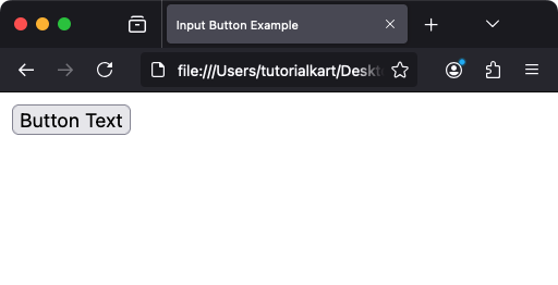
<input type="button" value="Button Text" onclick="javascriptFunction()">Here:
type="button": Specifies that the input element is a button.value: Sets the text that appears on the button.onclick: Specifies the JavaScript function to be executed when the button is clicked.
Screenshot

2 Creating a Simple Button
To create a button that displays a message when clicked, use the following example:
<input type="button" value="Click Me" onclick="showAlert()">

<script>
  function showAlert() {
    alert('Button clicked!');
  }
</script>
When you click the button, the `showAlert()` function is executed, which displays an alert box with the message “Button clicked!”.
Video
3 Adding Buttons to Forms
The <input type="button"> element is often used in forms to perform custom actions such as validation or submitting the form data programmatically.
3.1 Using JavaScript to Submit a Form
<form id="myForm" action="/next-page" method="post">
  <label for="username">Username:</label>
  <input type="text" id="username" name="username">
  <input type="button" value="Submit" onclick="submitForm()">
</form>

<script>
  function submitForm() {
    alert('submitting form..');
    document.getElementById('myForm').submit();
  }
</script>
Here, clicking the “Submit” button triggers the `submitForm()` function, which submits the form programmatically using the `submit()` method.
4 Styling Buttons with CSS
HTML input buttons can be styled using CSS to improve their appearance. Here’s an example:
<style>
  .custom-button {
    background-color: #4CAF50; /* Green background */
    color: white; /* White text */
    padding: 10px 20px; /* Padding inside the button */
    border: none; /* Remove border */
    border-radius: 5px; /* Rounded corners */
    cursor: pointer; /* Change cursor to pointer on hover */
  }

  .custom-button:hover {
    background-color: #45a049; /* Darker green on hover */
  }
</style>

<input type="button" value="Styled Button" class="custom-button" onclick="doSomething()">

<script>
  function doSomething() {
    alert('Styled button clicked!');
  }
</script>
This example creates a button with a green background, white text, and rounded corners. The background color changes when the button is hovered over.
5 Differences Between <input type=”button”> and <button>
While both <input type="button"> and <button> elements create clickable buttons, they have some key differences:
Content: The input element can only display text, whereas the button element can include any HTML content, such as text, images, or icons.
Flexibility: The <button> element is more flexible and is preferred for complex buttons.
Default Behavior: Inside forms, <button> defaults to submitting the form unless specified otherwise, while <input type="button"> has no default behavior.
6 Accessibility Considerations for Input Button
To ensure your buttons are accessible, consider the following:
- Use clear and descriptive text for the button label (via the `value` attribute).
- Provide keyboard accessibility by ensuring buttons are focusable and operable via the keyboard.
- Use ARIA attributes like `aria-label` or `aria-labelledby` for additional context if necessary.
7 Best Practices for Using Input Button
- Use
<input type="button">for simple buttons that rely on JavaScript for functionality. - Use
<button>for more complex buttons that include HTML content or need advanced styling. - Always include a descriptive label to make the button’s purpose clear to users.
- Ensure buttons are styled consistently across the website for a unified look and feel.
8 Real-World Use Cases for Input Button
Here are some practical examples of how <input type="button"> can be used:
- Interactive Forms: Perform validations, reset fields, or submit forms programmatically.
- Dynamic Content: Trigger JavaScript functions to update page content dynamically.
- Custom Actions: Use buttons to execute tasks such as downloading files, toggling UI elements, or opening modals.
9 Conclusion
The <input type="button"> element is a simple yet versatile tool for creating clickable buttons in HTML. When combined with JavaScript and CSS, it becomes a powerful component for interactive web applications. By understanding its properties, differences from other button types, and best practices, you can effectively use it to build functional and user-friendly interfaces.
