HTML Input Checkbox
The HTML <input> element with type="checkbox" creates a toggleable box that allows the user to select or deselect an option. Checkboxes are commonly used in forms to let users choose multiple options or agree to terms and conditions.
Unlike radio buttons, which restrict the user to a single selection within a group, checkboxes allow for multiple selections.
In this tutorial, we will learn the syntax, attributes, styling, and practical applications of the Input Checkbox <input type="checkbox">.
1 Basic Syntax
The basic syntax for a checkbox input is:
<input type="checkbox" name="option1" value="Option1">Here:
type="checkbox": Specifies that the input is a checkbox.name: Groups checkboxes together for form data submission.value: Defines the value sent to the server if the checkbox is selected.
2 Creating Multiple Checkboxes
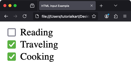
To create a list of checkboxes, simply use multiple <input type="checkbox"> elements:
<form>
  <label>
    <input type="checkbox" name="hobby" value="Reading"> Reading
  </label>
  <br>
  <label>
    <input type="checkbox" name="hobby" value="Traveling"> Traveling
  </label>
  <br>
  <label>
    <input type="checkbox" name="hobby" value="Cooking"> Cooking
  </label>
</form>
When the user selects multiple checkboxes, all their values are sent as part of the form data under the same name.
Video
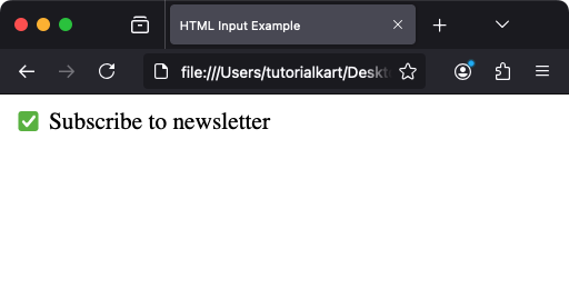
3 Preselecting a Checkbox
Use the checked attribute to preselect a checkbox:
<input type="checkbox" name="subscribe" value="Yes" checked> Subscribe to newsletterIn this example, the checkbox will be preselected when the page loads.
4 Associating Labels with Checkboxes
To improve usability and accessibility, associate a label with each checkbox using the <label> element:
<label for="accept">
  <input type="checkbox" id="accept" name="terms"> I accept the terms and conditions
</label>
Clicking the label will toggle the checkbox, enhancing the user experience.
Video
5 Styling Checkboxes
While checkboxes have a default appearance defined by the browser, you can style them using CSS.
5.1 Hiding the Default Checkbox
<style>
  .custom-checkbox {
    position: relative;
    cursor: pointer;
  }

  .custom-checkbox input {
    opacity: 0;
    position: absolute;
  }

  .custom-checkbox span {
    display: inline-block;
    width: 20px;
    height: 20px;
    background-color: #ccc;
    border-radius: 5px;
  }

  .custom-checkbox input:checked + span {
    background-color: #4CAF50;
  }
</style>

<label class="custom-checkbox">
  <input type="checkbox">
  <span></span> Custom Checkbox
</label>
This code hides the default checkbox and replaces it with a styled element. The :checked selector applies styles to the custom checkbox when selected.
Video
6 JavaScript and Checkboxes
Use JavaScript to interact with checkboxes dynamically. For example, you can check if a checkbox is selected:
<label for="confirm"><input type="checkbox" id="confirm" name="confirm"> Confirm</label>

<script>
  const checkbox = document.getElementById('confirm');
  checkbox.addEventListener('change', () => {
    if (checkbox.checked) {
      alert('Checkbox is checked!');
    } else {
      alert('Checkbox is unchecked!');
    }
  });
</script>
This script listens for changes to the checkbox and displays an alert based on its state.
Video
7 Practical Use Cases of Checkboxes
- Preferences: Allow users to select multiple preferences, such as hobbies or subscription topics.
- Agreements: Confirm user agreements to terms and conditions.
- Filters: Implement filters in applications, such as e-commerce sites, where users can select categories or features.
8 Accessibility Considerations for Checkboxes
To make checkboxes accessible:
- Always associate checkboxes with labels for screen reader support.
- Ensure sufficient contrast between the checkbox and background.
- Use ARIA attributes, such as
aria-checked, for advanced accessibility needs.
9 Conclusion
The HTML <input type="checkbox"> element is used for creating toggleable options in web forms. By combining it with labels, styling, and JavaScript, you can build user-friendly and accessible interfaces.