HTML Input Color Picker
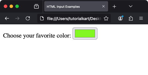
The HTML <input> element with type="color" allows users to pick a color from a color picker interface provided by their browser. This feature simplifies the process of selecting colors for various applications, such as customizing themes, choosing background colors, or personalizing content.
In this tutorial, we will learn about HTML Input Color Picker, how to define it in a HTML file, how to handle accessibility, set a default color value, handle color inputs selected by the user, styling of input color, and other aspects of it.
1 Syntax for the Color Input
The basic syntax for creating a color picker is:
<input type="color" name="favcolor" id="favcolor">When this element is rendered, it displays a color picker control in browsers that support the feature.
2 Adding a Label for Accessibility
It’s a good practice to include a `
<label for="favcolor">Choose your favorite color:</label>
<input type="color" name="favcolor" id="favcolor">
When you click on the label text, the color picker control becomes active, improving accessibility.

3 Setting a Default Color
You can predefine a default color using the `value` attribute. The value should be in hexadecimal format:
<label for="bgcolor">Pick a background color:</label>
<input type="color" id="bgcolor" name="bgcolor" value="#ff5733">
In this example, the default color is a shade of orange (#ff5733).
4 Handling Color Input with JavaScript
To dynamically use the selected color in your application, you can capture the input value using JavaScript:
<label for="colorPicker">Pick a color:</label>
<input type="color" id="colorPicker" name="colorPicker">

<script>
  const colorInput = document.getElementById('colorPicker');
  colorInput.addEventListener('input', (event) => {
    document.body.style.backgroundColor = event.target.value;
  });
</script>
This script changes the background color of the page to the selected color in real time.
5 Styling the Color Picker
The appearance of the color picker is browser-dependent and cannot be styled directly. However, you can wrap the input in a container and style the container:
<div style="padding: 10px; border: 1px solid #ccc; display: inline-block;">
  <label for="customColor">Choose color:</label>
  <input type="color" id="customColor" name="customColor">
</div>
This adds padding and borders to make the color picker visually distinct.
6 Accessibility Considerations
To ensure your color picker is accessible:
- Use descriptive labels to explain the purpose of the color picker.
- Ensure sufficient color contrast between the picker and its surroundings.
- Provide default values for context when necessary.
7 Browser Support
The color input type is supported by most modern browsers, including Chrome, Edge, Firefox, Safari, and Opera. For older browsers that do not support this input type, you can provide a fallback mechanism, such as a regular text input:
<label for="colorFallback">Enter a color:</label>
<input type="color" id="colorFallback" name="colorFallback" oninvalid="this.type='text'">
8 Real-World Applications
- Theme Customization: Allow users to select colors for themes or layouts.
- Graphics Applications: Implement color pickers for design tools.
- Data Visualization: Choose colors for charts and graphs.
Conclusion
The HTML color picker is a simple yet powerful tool for improving user interaction in web applications. By combining it with JavaScript and styling, you can create engaging and functional interfaces. Its wide browser support and accessibility make it a must-know feature for modern web development.
