HTML Input Password
The HTML <input> element with type="password" creates a single-line input field where users can securely enter sensitive information, such as passwords. The input characters are obscured (usually shown as dots or asterisks) to prevent others from viewing them on-screen.
In this tutorial, we will learn the syntax and how to use input element with password type, handling accessibility, placeholder, etc., with the help of detailed examples.
1 Basic Syntax
The basic syntax for a password input field is:
<input type="password" name="user_password">Here:
type="password": Specifies that the input field is for password entry.name: Associates a name with the input for form submission.
2 Adding a Label for Accessibility
To ensure the password field is accessible, include a <label> element:
<label for="password">Enter your password:</label>
<input type="password" id="password" name="password">
Clicking the label focuses the input field, improving usability for all users, including those using assistive technologies.
Example: index.html
<!DOCTYPE html>
<html lang="en">
<body>

<form action="/submit-form" method="post">
  <label for="password">Enter your password:</label>
  <input type="password" id="password" name="password">
</form>

</body>
</html>
Video
3 Placeholder Text
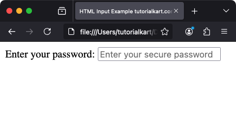
Use the placeholder attribute to provide a hint or example text inside the input field:
<input type="password" id="password" name="password" placeholder="Enter your secure password">This placeholder text disappears when the user starts typing.
Example: index.html
<!DOCTYPE html>
<html lang="en">
<body>

<form action="/submit-form" method="post">
  <label for="password">Enter your password:</label>
  <input type="password" id="password" name="password" placeholder="Enter your secure password">
</form>

</body>
</html>
Screenshot

4 Validation with Required Attribute
The required attribute ensures that the password field cannot be left blank when submitting the form:
<input type="password" id="password" name="password" required>When the user tries to submit the form without entering a password, the browser displays a validation error.
Example: index.html
<!DOCTYPE html>
<html lang="en">
<body>

<form action="/submit-form" method="post">
  <label for="password">Enter your password:</label>
  <input type="password" id="password" name="password" placeholder="Enter your secure password" required>
  <input type="submit" value="Submit">
</form>

</body>
</html>
Video
5 Adding Length Constraints
Use the minlength and maxlength attributes to define the allowed length for the password:
<input type="password" id="password" name="password" minlength="8" maxlength="20" required>In this example, the password must be between 8 and 20 characters long. If the length requirements are not met, the form cannot be submitted.
Example: index.html
<!DOCTYPE html>
<html lang="en">
<body>

<form action="/submit-form" method="post">
  <label for="password">Enter your password:</label>
  <input type="password" id="password" name="password" minlength="8" maxlength="20" required>
  <input type="submit" value="Submit">
</form>

</body>
</html>
Video
6 Show and Hide Password
For better user experience, you can use JavaScript to toggle the visibility of the password:
<label for="password">Password:</label>
<input type="password" id="password" name="password">
<button type="button" onclick="togglePassword()">Show Password</button>

<script>
  function togglePassword() {
    const passwordField = document.getElementById('password');
    if (passwordField.type === 'password') {
      passwordField.type = 'text';
    } else {
      passwordField.type = 'password';
    }
  }
</script>
This script toggles the input type between password and text, allowing the user to view or hide the entered password.
Example: index.html
<!DOCTYPE html>
<html lang="en">
<body>

<form action="/submit-form" method="post">
  <label for="password">Password:</label>
  <input type="password" id="password" name="password">
  <button type="button" onclick="togglePassword()">Show Password</button>

  <script>
    function togglePassword() {
      const passwordField = document.getElementById('password');
      if (passwordField.type === 'password') {
        passwordField.type = 'text';
      } else {
        passwordField.type = 'password';
      }
    }
  </script>
</form>

</body>
</html>
Video
7 Styling Password Fields
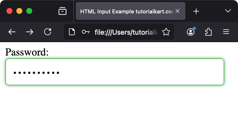
Use CSS to style the password field for better aesthetics:
<style>
  input[type="password"] {
    width: 90%;
    padding: 10px;
    font-size: 16px;
    border: 1px solid blue;
    border-radius: 5px;
  }

  input[type="password"]:focus {
    border-color: #4CAF50;
    outline: none;
    box-shadow: 0 0 5px #4CAF50;
  }
</style>

<label for="styled-password">Password:</label>
<input type="password" id="styled-password" name="styled-password">
This example styles the input field with rounded corners and a green border when focused.

8 Accessibility Considerations
To make password fields accessible:
- Use a descriptive
<label>to indicate the purpose of the field. - Provide clear instructions for password requirements using
aria-describedbyor placeholder text. - Ensure sufficient color contrast for text and backgrounds.
9 Real-World Use Cases
- User Login: Securely collect passwords for authentication.
- Account Registration: Collect new passwords with validation for length and complexity.
- Reset Password: Allow users to enter new passwords when resetting their credentials.
Conclusion
The HTML <input type="password"> element is used for creating secure and user-friendly forms. By combining labels, placeholders, JavaScript, and CSS, you can create an intuitive and accessible password input field for any application.
