HTML Input Radio
The HTML <input> element with type="radio" is used to create radio buttons in a form.
Radio buttons allow users to select one option from a group of predefined choices. They are ideal for scenarios where only a single selection is allowed, such as choosing a gender, a payment method, or a subscription plan.

In this tutorial, we will learn the syntax and how to use input element with radio type, creating a group, associating radio buttons with labels, styling radio buttons, etc., with the help of detailed examples.
1 Basic Syntax
The basic syntax for a radio button is:
<input type="radio" name="group1" value="Option1"> Option 1Here:
type="radio": Specifies that the input is a radio button.name: Groups radio buttons together. Only one button in a group can be selected at a time.value: Defines the value sent to the server when the radio button is selected.
Example: index.html
<!DOCTYPE html>
<html lang="en">
<body>

<form>
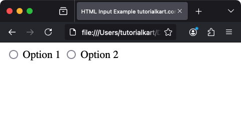
  <input type="radio" name="group1" value="Option1"> Option 1
  <input type="radio" name="group1" value="Option2"> Option 2
</form>

</body>
</html>
Video
2 Creating a Group of Radio Buttons
To create a group of radio buttons, ensure all buttons in the group have the same name attribute:
<form>
  <label>
    <input type="radio" name="gender" value="male"> Male
  </label>
  <br>
  <label>
    <input type="radio" name="gender" value="female"> Female
  </label>
  <br>
  <label>
    <input type="radio" name="gender" value="other"> Other
  </label>
</form>
In this example, the user can select only one gender option from the group.
Example: index.html
<!DOCTYPE html>
<html lang="en">
<body>

<form>
  <label>
    <input type="radio" name="gender" value="male"> Male
  </label>
  <br>
  <label>
    <input type="radio" name="gender" value="female"> Female
  </label>
  <br>
  <label>
    <input type="radio" name="gender" value="other"> Other
  </label>
</form>

</body>
</html>
Video
3 Preselecting a Radio Button
Use the checked attribute to preselect a radio button:
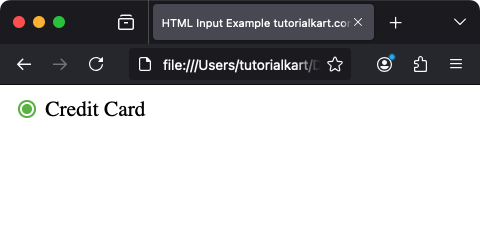
<input type="radio" name="payment" value="credit-card" checked> Credit CardIn this example, the “Credit Card” option is preselected when the page loads.
Example: index.html
<!DOCTYPE html>
<html lang="en">
<body>

<form>
  <label>
    <input type="radio" name="payment" value="credit-card" checked> Credit Card
  </label>
</form>

</body>
</html>
Video

4 Associating Labels with Radio Buttons
To enhance usability and accessibility, associate a <label> with each radio button:
<label for="visa">
  <input type="radio" id="visa" name="payment" value="visa"> Visa
</label>
Clicking the label will toggle the corresponding radio button, making the form more user-friendly.
5 Styling Radio Buttons
Although radio buttons have a default appearance defined by the browser, you can style them using CSS:
<style>
  .custom-radio {
    display: inline-block;
    width: 20px;
    height: 20px;
    border: 2px solid #ccc;
    border-radius: 50%;
    position: relative;
    cursor: pointer;
  }

  .custom-radio input {
    opacity: 0;
    position: absolute;
  }

  .custom-radio input:checked + span {
    background-color: #4CAF50;
    border-color: #4CAF50;
  }

  .custom-radio span {
    display: inline-block;
    width: 100%;
    height: 100%;
    border-radius: 50%;
    background-color: white;
  }
</style>

<label class="custom-radio">
  <input type="radio" name="custom" value="option1">
  <span></span> Option 1
</label>
This example hides the default radio button and replaces it with a styled custom circle that changes color when selected.
6 Using JavaScript with Radio Buttons
JavaScript can dynamically handle interactions with radio buttons. For example, detecting which button is selected:
<form id="form">
  <label>
    <input type="radio" name="size" value="small"> Small
  </label>
  <label>
    <input type="radio" name="size" value="medium"> Medium
  </label>
  <label>
    <input type="radio" name="size" value="large"> Large
  </label>
  <button type="button" onclick="getSelectedRadio()">Submit</button>
</form>

<script>
  function getSelectedRadio() {
    const radios = document.getElementsByName('size');
    let selectedValue = '';
    for (const radio of radios) {
      if (radio.checked) {
        selectedValue = radio.value;
        break;
      }
    }
    alert(`Selected size: ${selectedValue}`);
  }
</script>
This script checks which radio button is selected and displays its value in an alert box.
7 Accessibility Considerations
To ensure radio buttons are accessible:
- Use a descriptive
<label>for each radio button. - Group related radio buttons logically and use
fieldsetandlegendfor context. - Ensure sufficient contrast between the selected and unselected states.
8 Real-World Use Cases
- Gender Selection: Allow users to select a gender.
- Payment Options: Provide a choice of payment methods.
- Subscription Plans: Enable users to choose between different plans.
Conclusion
The HTML <input type="radio"> element is a simple yet powerful tool for creating single-choice input fields. By combining it with labels, JavaScript, and CSS, you can build user-friendly and accessible radio button groups for your web applications.
