HTML <input> Tag
The HTML <input> tag is used to create interactive form controls for collecting user input. It is one of the most versatile tags in HTML, supporting a wide variety of input types such as text, password, email, number, date, file, and more.
The <input> tag is self-closing and is usually placed inside a <form> element, although it can be used independently as well.
Basic Syntax of HTML <input> Tag
The basic structure of an <input> tag is:
<input type="type" name="name" value="value">The type attribute specifies the type of input, and the name attribute is used to identify the input field when the form is submitted.
Attributes of HTML <input> Tag
- type: Defines the type of input field. Common types include
text,password,email,number,checkbox,radio,submit, etc. - name: Specifies the name of the input field, used to identify the data when submitted.
- value: Defines the default value for the input field.
- placeholder: Provides a hint or example text inside the input field.
- required: Makes the field mandatory before form submission.
- readonly: Makes the input field read-only.
- disabled: Disables the input field.
- maxlength: Limits the maximum number of characters allowed.
- pattern: Specifies a regular expression pattern for validation.
- autofocus: Automatically focuses on the input field when the page loads.
Basic Example of HTML <input> Tag
Here’s a basic example of a form with different input fields:
index.html
<!DOCTYPE html>
<html>
    <body>
        <form action="/submit-form" method="POST">
            <label for="name">Name:</label>
            <input type="text" id="name" name="name" placeholder="Enter your name" required><br><br>

            <label for="email">Email:</label>
            <input type="email" id="email" name="email" placeholder="Enter your email" required><br><br>

            <label for="password">Password:</label>
            <input type="password" id="password" name="password" required><br><br>

            <button type="submit">Submit</button>
        </form>
    </body>
</html>
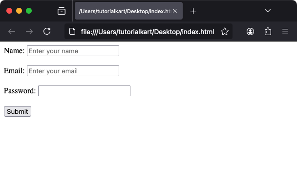
Explanation: The form collects a user’s name, email, and password. The required attribute ensures that these fields cannot be left blank.
Types of Input Fields
The type attribute allows you to create various input fields:
- Text:
<input type="text">for single-line text input. - Password:
<input type="password">for hidden text input. - Email:
<input type="email">for email address input with validation. - Number:
<input type="number">for numeric input. - Checkbox:
<input type="checkbox">for binary choices. - Radio:
<input type="radio">for mutually exclusive options. - File:
<input type="file">for file uploads. - Submit:
<input type="submit">for form submission. - Date:
<input type="date">for date input. - Color:
<input type="color">for color picker input.
Styling the <input> Tag with CSS
You can customize the appearance of input fields using CSS. Here’s an example:
index.html
<!DOCTYPE html>
<html>
    <head>
        <style>
            input {
                padding: 10px;
                margin: 10px 0;
                width: 100%;
                border: 1px solid #ccc;
                border-radius: 5px;
                box-sizing: border-box;
            }

            input:focus {
                border-color: #007BFF;
                outline: none;
                box-shadow: 0 0 5px rgba(0, 123, 255, 0.5);
            }

            button {
                background-color: #007BFF;
                color: white;
                padding: 10px 15px;
                border: none;
                border-radius: 5px;
                cursor: pointer;
            }

            button:hover {
                background-color: #0056b3;
            }
        </style>
    </head>
    <body>
        <form>
            <input type="text" placeholder="Styled input field">
            <button>Styled Button</button>
        </form>
    </body>
</html>
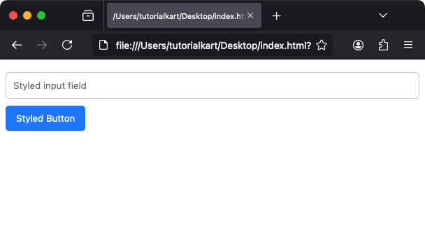
Result: The input fields and buttons have a polished design with hover and focus effects.
Practical Applications of the <input> Tag
- Login Forms: Collect usernames and passwords securely.
- Registration Forms: Gather user details like name, email, and contact information.
- Search Bars: Allow users to search content on the website.
- Feedback Forms: Let users submit comments or inquiries.
- File Uploads: Enable users to upload files like images or documents.
