HTML Input Elements
HTML input elements are fundamental components in web forms, enabling user interaction and data collection. This guide explores various input types, attributes, and best practices to enhance your web development skills.
1 Introduction to the <input> Element
The <input> element is a versatile HTML tag used to create interactive controls within web forms. It supports various types, each serving a specific purpose in data collection.
2 Common Input Types
HTML offers a range of input types to cater to different data collection needs:
text: Single-line text input.password: Text input that obscures entered characters.email: Input for email addresses, with validation.number: Input for numerical values.checkbox: Toggle between two states.radio: Select one option from a group.date: Input for date selection.file: Allows file uploads.submit: Submits the form data.
Each input type serves a unique function, enhancing the form’s usability and data integrity.
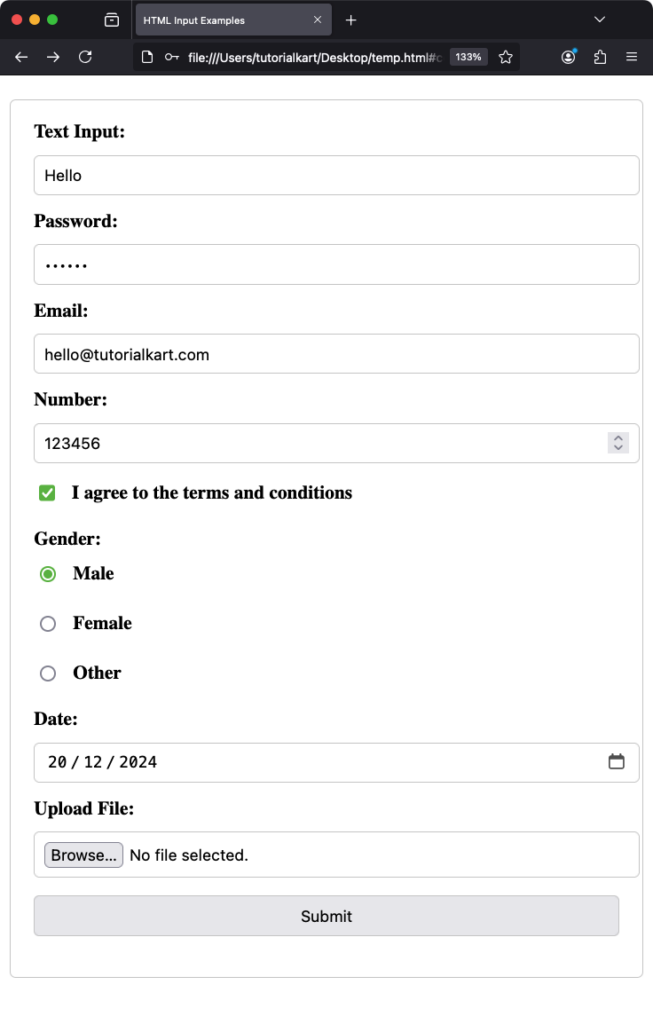
Let us see an example that covers all of these input types.
index.html
<!DOCTYPE html>
<html lang="en">
<head>
  <meta charset="UTF-8">
  <meta name="viewport" content="width=device-width, initial-scale=1.0">
  <title>HTML Input Examples</title>
  <style>
    form {
      max-width: 500px;
      margin: 20px auto;
      padding: 20px;
      border: 1px solid #ccc;
      border-radius: 5px;
    }
    label {
      display: block;
      margin-bottom: 10px;
      font-weight: bold;
    }
    input, select, button {
      width: 100%;
      padding: 8px;
      margin-bottom: 15px;
      border: 1px solid #ccc;
      border-radius: 4px;
    }
    input[type="checkbox"], input[type="radio"] {
      width: auto;
      margin-right: 10px;
    }
  </style>
</head>
<body>
  <form action="/submit" method="post">
    <!-- Text Input -->
    <label for="text-input">Text Input:</label>
    <input type="text" id="text-input" name="text-input" placeholder="Enter your text">

    <!-- Password Input -->
    <label for="password-input">Password:</label>
    <input type="password" id="password-input" name="password-input" placeholder="Enter your password">

    <!-- Email Input -->
    <label for="email-input">Email:</label>
    <input type="email" id="email-input" name="email-input" placeholder="Enter your email" required>

    <!-- Number Input -->
    <label for="number-input">Number:</label>
    <input type="number" id="number-input" name="number-input" min="1" max="100" placeholder="Enter a number">

    <!-- Checkbox -->
    <label>
      <input type="checkbox" id="checkbox-input" name="checkbox-input">
      I agree to the terms and conditions
    </label>

    <!-- Radio Buttons -->
    <label>Gender:</label>
    <label>
      <input type="radio" name="gender" value="male">
      Male
    </label>
    <label>
      <input type="radio" name="gender" value="female">
      Female
    </label>
    <label>
      <input type="radio" name="gender" value="other">
      Other
    </label>

    <!-- Date Input -->
    <label for="date-input">Date:</label>
    <input type="date" id="date-input" name="date-input">

    <!-- File Upload -->
    <label for="file-input">Upload File:</label>
    <input type="file" id="file-input" name="file-input" accept=".jpg,.png,.pdf">

    <!-- Submit Button -->
    <button type="submit">Submit</button>
  </form>
</body>
</html>
Output

3 Input Attributes
Attributes modify the behavior and appearance of input elements:
name: Identifies the input when form data is submitted.value: Sets the default value.placeholder: Provides a hint to the user.required: Specifies that the input must be filled out before submitting.readonly: Makes the input non-editable.disabled: Disables the input.maxlength: Limits the number of characters.minandmax: Define the range of acceptable values (for types likenumberanddate).pattern: Specifies a regular expression for input validation.
Utilizing these attributes ensures that the data collected is accurate and meets the desired criteria.
4 Grouping Inputs with <fieldset> and <legend>
The <fieldset> element groups related inputs, and the <legend> element provides a caption for the group:
<fieldset>
  <legend>Personal Information</legend>
  <label for="name">Name:</label>
  <input type="text" id="name" name="name" required>
  <br>
  <label for="email">Email:</label>
  <input type="email" id="email" name="email" required>
</fieldset>
This structure enhances form organization and accessibility.
5 Associating Labels with Inputs
Using the <label> element improves form usability by associating text labels with input elements:
<label for="username">Username:</label>
<input type="text" id="username" name="username">
Clicking the label focuses the corresponding input, enhancing user experience.
6 Advanced Input Types
HTML5 introduced new input types to enhance form functionality:
color: Opens a color picker.range: Slider control for selecting a value.tel: Input for telephone numbers.url: Input for web addresses.search: Input for search queries.datetime-local: Input for date and time without time zone.month: Input for selecting a month and year.week: Input for selecting a week and year.time: Input for selecting a time.
These input types provide native controls, improving user interaction and data validation.
7 File Uploads
The file input type allows users to upload files:
<label for="resume">Upload your resume:</label>
<input type="file" id="resume" name="resume" accept=".pdf,.doc,.docx">
The accept attribute restricts the file types that can be uploaded. In the example above, only PDF and Word documents are allowed. This is a helpful feature for ensuring the submitted files meet specific requirements.
8 Validation with Input Attributes
Input attributes like required, pattern, min, max, and maxlength provide built-in validation for form inputs. These attributes help ensure the collected data is valid and meets predefined criteria.
8.1 Example: Required Input
<label for="email">Email:</label>
<input type="email" id="email" name="email" required>
The required attribute ensures the user cannot submit the form without filling in the email field.
8.2 Example: Input Pattern
<label for="phone">Phone Number:</label>
<input type="tel" id="phone" name="phone" pattern="[0-9]{3}-[0-9]{3}-[0-9]{4}" placeholder="123-456-7890">
The pattern attribute ensures the phone number follows the specified format.
9 Styling Input Elements
CSS allows for extensive customization of input elements to enhance the user interface.
9.1 Basic Styling
input {
  width: 100%;
  padding: 10px;
  margin: 10px 0;
  border: 1px solid #ccc;
  border-radius: 5px;
}
This CSS applies consistent styling to all input fields, ensuring a clean and modern appearance.
9.2 Focus Styles
input:focus {
  border-color: #007BFF;
  outline: none;
  box-shadow: 0 0 5px #007BFF;
}
Focus styles improve accessibility and guide the user visually when interacting with form fields.
10 Accessible Forms
Accessibility is crucial in form design. Use labels, ARIA attributes, and semantic HTML to ensure forms are usable for all users, including those relying on screen readers.
10.1 Using ARIA Attributes
<input type="text" id="name" name="name" aria-label="Full Name">The aria-label attribute provides an accessible name for screen readers.
11 Conclusion
HTML input elements are versatile and essential for collecting user data. By understanding the various types, attributes, and best practices, you can create interactive, user-friendly, and accessible web forms. Experiment with the examples provided to build more engaging and effective forms for your projects.
