HTML <optgroup> Tag
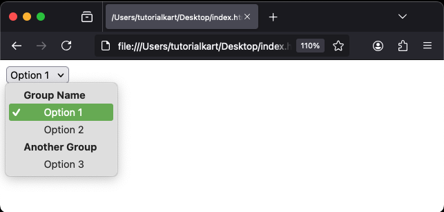
The HTML <optgroup> tag is used to group related options in a dropdown list created with the <select> element. This tag improves the organization and usability of large dropdown menus by categorizing options into logical groups.
The <optgroup> tag acts as a container for <option> elements. Each group is labeled with a label attribute, which helps users understand the purpose of the grouped options.
Basic Syntax of HTML <optgroup> Tag
The basic structure of the <optgroup> tag within a <select> element is:
<select>
    <optgroup label="Group Name">
        <option value="value1">Option 1</option>
        <option value="value2">Option 2</option>
    </optgroup>
    <optgroup label="Another Group">
        <option value="value3">Option 3</option>
    </optgroup>
</select>
The label attribute provides a title for the group of options.
Example of Grouped Options
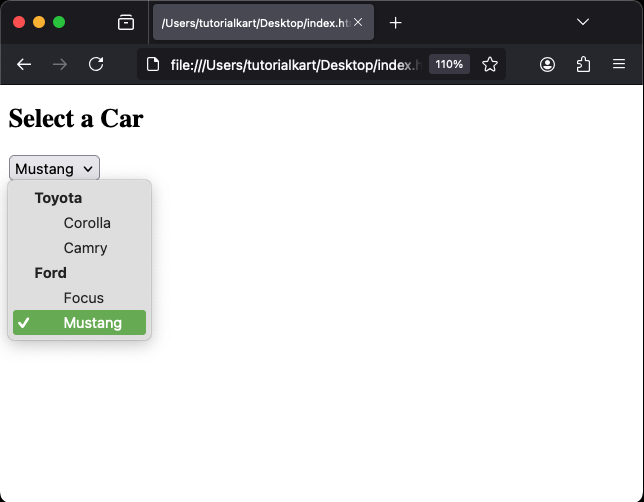
Here’s an example of a dropdown menu for selecting a car grouped by manufacturer:
index.html
<!DOCTYPE html>
<html>
    <body>
        <h2>Select a Car</h2>
        <select>
            <optgroup label="Toyota">
                <option value="corolla">Corolla</option>
                <option value="camry">Camry</option>
            </optgroup>
            <optgroup label="Ford">
                <option value="focus">Focus</option>
                <option value="mustang">Mustang</option>
            </optgroup>
        </select>
    </body>
</html>
Explanation: The options are grouped under “Toyota” and “Ford” headings, making it easier for users to find the desired car model.
Attributes of HTML <optgroup> Tag
- label: Specifies the name of the group and acts as the title for the grouped options. This attribute is required.
- disabled: Disables all options within the group, making them unselectable.
- Global Attributes: Supports all global attributes like
id,class, andstyle.
For example, you can use the disabled attribute to make a group of options unavailable:
<select>
    <optgroup label="Unavailable Cars" disabled>
        <option value="model1">Model 1</option>
        <option value="model2">Model 2</option>
    </optgroup>
</select>
Result: The “Unavailable Cars” group and its options will appear grayed out and cannot be selected by the user.
Styling <optgroup> Tag with CSS
While browsers provide default styles for the <optgroup> tag, you can customize its appearance using CSS:
index.html
<!DOCTYPE html>
<html>
    <head>
        <style>
            optgroup {
                font-weight: bold;
                color: #007BFF;
            }
            option {
                padding: 5px;
            }
        </style>
    </head>
    <body>
        <h2>Styled Dropdown</h2>
        <select>
            <optgroup label="Fruits">
                <option value="apple">Apple</option>
                <option value="banana">Banana</option>
            </optgroup>
            <optgroup label="Vegetables">
                <option value="carrot">Carrot</option>
                <option value="spinach">Spinach</option>
            </optgroup>
        </select>
    </body>
</html>
Result: The group labels “Fruits” and “Vegetables” are styled with bold text and a custom color, enhancing the dropdown’s appearance.
Practical Applications of the <optgroup> Tag
- Form Dropdowns: Organize related options in forms, such as countries grouped by continent.
- Product Selection: Categorize products by type or brand for better usability in e-commerce sites.
- Settings Menus: Group settings under relevant categories for clear navigation.
- Event Registration: Group ticket types or event options based on categories like seating or activities.
