HTML <option> Tag
The HTML <option> tag is used to define options within a dropdown list, created with the <select> element. Each <option> represents a single selectable item. Users can choose one or more options depending on the configuration of the <select> element (e.g., single selection or multiple selection).
The <option> tag is versatile and supports a range of attributes to customize its behavior and usability.
Basic Syntax of HTML <option> Tag
The basic structure of an option element inside a dropdown is:
<select>
    <option value="value1">Option 1</option>
    <option value="value2">Option 2</option>
</select>
The value attribute specifies the data sent to the server when the form is submitted, and the content inside the <option> is what users see in the dropdown.
Example of a Dropdown List using option tag
Here’s an example of a dropdown menu using the <option> tag:
index.html
<!DOCTYPE html>
<html>
    <body>
        <h2>Choose a Fruit</h2>
        <select>
            <option value="apple">Apple</option>
            <option value="banana">Banana</option>
            <option value="cherry">Cherry</option>
        </select>
    </body>
</html>
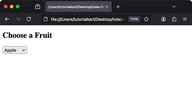
Explanation: The dropdown contains three options: Apple, Banana, and Cherry. When a user selects an item, the associated value is sent to the server.
Attributes of HTML <option> Tag
- value: Specifies the value associated with the option, sent to the server when submitted.
- selected: Marks the option as the default selected item when the page loads.
- disabled: Disables the option, making it unselectable by the user.
- label: Provides a short description for the option, often used for accessibility purposes.
- Global Attributes: Supports global attributes like
id,class, andstyle.
For example, you can set an option as selected or disabled:
<select>
    <option value="apple" selected>Apple</option>
    <option value="banana" disabled>Banana (Unavailable)</option>
    <option value="cherry">Cherry</option>
</select>
Result: “Apple” is pre-selected, and “Banana” is grayed out and cannot be selected.
Styling <option> Tag with CSS
The <option> tag can be styled using CSS, though its appearance inside dropdown menus may be limited by browser default styles. You can style dropdowns like this:
index.html
<!DOCTYPE html>
<html>
    <head>
        <style>
            select {
                width: 200px;
                padding: 5px;
                font-size: 16px;
            }
            option {
                color: #007BFF;
                font-weight: bold;
            }
        </style>
    </head>
    <body>
        <h2>Styled Dropdown</h2>
        <select>
            <option value="red">Red</option>
            <option value="green">Green</option>
            <option value="blue">Blue</option>
        </select>
    </body>
</html>
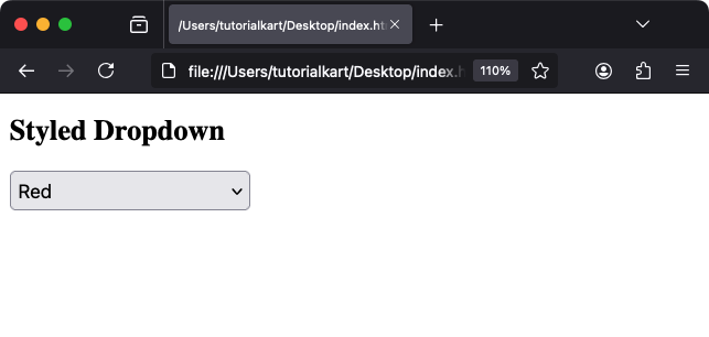
Result: The dropdown menu and options are styled with custom fonts and colors.
Using Multiple Selection
To allow users to select multiple options, add the multiple attribute to the <select> element:
<select multiple>
    <option value="cat">Cat</option>
    <option value="dog">Dog</option>
    <option value="bird">Bird</option>
</select>
Explanation: The multiple attribute allows users to select more than one option using Ctrl (Windows) or Cmd (Mac).
Practical Applications of the <option> Tag
- Forms: Create dropdown menus in forms for selecting options like countries, states, or categories.
- Search Filters: Provide users with a dropdown to filter or sort results by specific criteria.
- Dynamic Content: Populate dropdowns dynamically using JavaScript for user-interactive content.
- Accessibility: Combine the
labelanddisabledattributes for clear, accessible dropdown options.
