HTML <progress> Tag
The HTML <progress> tag is used to represent the completion progress of a task, such as downloading a file, uploading data, or completing a form. It provides a visual indicator of the task’s progress and is a self-contained element with built-in semantics for accessibility.
The <progress> tag works with two attributes: value (the current progress) and max (the total work or maximum value).
Basic Syntax of HTML <progress> Tag
The basic structure of the <progress> tag is:
<progress value="current-value" max="maximum-value"></progress>The value attribute represents the current progress, and the max attribute defines the total work. If the max attribute is omitted, its default value is 1. Progress is expressed as a fraction of value / max.
Example of a Progress Bar
Here’s an example of a progress bar representing the completion of a file download:
index.html
<!DOCTYPE html>
<html>
    <body>
        <h2>File Download Progress</h2>
        <progress value="50" max="100"></progress>
        <p>50% Complete</p>
    </body>
</html>
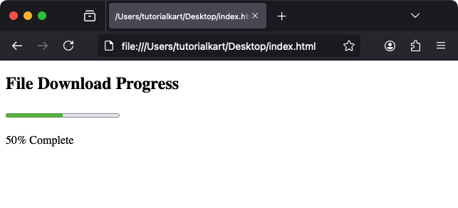
Explanation: The progress bar shows that the task is 50% complete because the value is 50 and the max is 100.
Attributes of HTML <progress> Tag
- value: Specifies the current progress of the task. This value must be a number greater than or equal to 0.
- max: Defines the maximum value or total work for the task. The default is 1 if omitted.
- Global Attributes: Supports all global attributes like
id,class, andstyle.
For example, if a progress bar is halfway complete:
<progress value="5" max="10"></progress>This renders a progress bar where 5/10 (50%) is complete.
Styling the <progress> Tag with CSS
You can style the <progress> tag to customize its appearance:
index.html
<!DOCTYPE html>
<html>
    <head>
        <style>
            progress {
                width: 100%;
                height: 20px;
                border: 1px solid #007BFF;
                border-radius: 5px;
            }
            progress::-webkit-progress-bar {
                background-color: #f3f3f3;
            }
            progress::-webkit-progress-value {
                background-color: #007BFF;
            }
            progress::-moz-progress-bar {
                background-color: #007BFF;
            }
        </style>
    </head>
    <body>
        <h2>Styled Progress Bar</h2>
        <progress value="70" max="100"></progress>
        <p>70% Complete</p>
    </body>
</html>
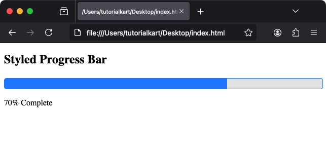
Result: The progress bar has a styled border, rounded corners, and a custom color for the filled section.
Dynamic Updates with JavaScript
The <progress> tag can be updated dynamically using JavaScript:
index.html
<!DOCTYPE html>
<html>
    <body>
        <h2>Dynamic Progress Bar</h2>
        <progress id="progressBar" value="0" max="100"></progress>
        <p>Progress: <span id="progressValue">0%</span></p>
        <button onclick="updateProgress()">Increase Progress</button>

        <script>
            function updateProgress() {
                const progressBar = document.getElementById('progressBar');
                const progressValue = document.getElementById('progressValue');
                if (progressBar.value < progressBar.max) {
                    progressBar.value += 10;
                    progressValue.textContent = progressBar.value + '%';
                }
            }
        </script>
    </body>
</html>
Explanation: Clicking the “Increase Progress” button increments the progress bar by 10% until it reaches 100%.
Practical Applications of the <progress> Tag
- File Uploads: Show upload progress in a form or file manager.
- Downloads: Indicate the progress of a file download or installation.
- Task Completion: Visualize task progress in applications or workflows.
- Game Mechanics: Represent health bars, experience points, or level progress in games.
