HTML <select> Tag
The HTML <select> tag is used to create a dropdown menu that allows users to choose one or more options from a list. Each option in the dropdown is defined using the <option> tag. The <select> tag is widely used in forms and interactive applications where users need to select from predefined choices.
The <select> element is a form control, and its selected value can be submitted with a form or accessed dynamically using JavaScript.
Basic Syntax of HTML <select> Tag
The basic structure of a <select> element is:
<select name="dropdown">
    <option value="value1">Option 1</option>
    <option value="value2">Option 2</option>
    <option value="value3">Option 3</option>
</select>
The name attribute specifies the name of the dropdown for form submission, and each <option> element defines a selectable item.
Example of a Basic Dropdown Menu
Here’s an example of a dropdown menu where users can select a fruit:
index.html
<!DOCTYPE html>
<html>
    <body>
        <h2>Choose a Fruit</h2>
        <form>
            <label for="fruits">Select your favorite fruit:</label>
            <select id="fruits" name="fruits">
                <option value="apple">Apple</option>
                <option value="banana">Banana</option>
                <option value="cherry">Cherry</option>
            </select>
        </form>
    </body>
</html>
Explanation: The user can choose one option (e.g., Apple) from the dropdown menu. When the form is submitted, the selected value (e.g., “apple”) is sent to the server.
Attributes of HTML <select> Tag
- name: Specifies the name of the dropdown for form submission.
- id: Provides a unique identifier for the
<select>element. - multiple: Allows multiple selections when added to the
<select>tag. - size: Specifies the number of visible options in the dropdown.
- disabled: Disables the dropdown, making it unselectable.
- Global Attributes: Supports all global attributes like
class,style, anddata-*.
For example, adding the multiple attribute allows users to select more than one option:
<select name="fruits" multiple>
    <option value="apple">Apple</option>
    <option value="banana">Banana</option>
    <option value="cherry">Cherry</option>
</select>
With the multiple attribute, users can hold down Ctrl (Windows) or Cmd (Mac) to select multiple options.
Styling the <select> Tag with CSS
You can customize the appearance of a <select> dropdown using CSS:
index.html
<!DOCTYPE html>
<html>
    <head>
        <style>
            select {
                width: 200px;
                padding: 5px;
                font-size: 16px;
                border: 1px solid #ccc;
                border-radius: 5px;
            }
        </style>
    </head>
    <body>
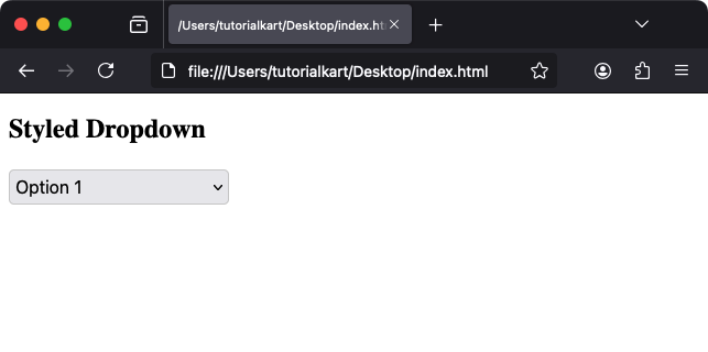
        <h2>Styled Dropdown</h2>
        <select>
            <option>Option 1</option>
            <option>Option 2</option>
            <option>Option 3</option>
        </select>
    </body>
</html>
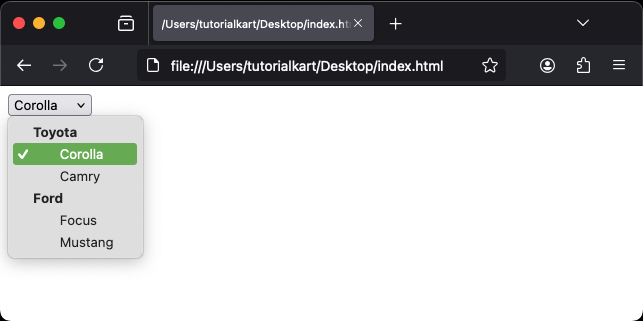
When you click on the drop down, you would see the following options list to choose from.

Result: The dropdown menu is styled with custom width, padding, and rounded corners.
Example of Grouped Options
Options can be grouped using the <optgroup> tag:
<select name="cars">
    <optgroup label="Toyota">
        <option value="corolla">Corolla</option>
        <option value="camry">Camry</option>
    </optgroup>
    <optgroup label="Ford">
        <option value="focus">Focus</option>
        <option value="mustang">Mustang</option>
    </optgroup>
</select>
Explanation: Options are categorized under “Toyota” and “Ford,” improving the organization of the dropdown menu.
Practical Applications of the <select> Tag
- Forms: Use dropdowns to collect user input, such as selecting a country, state, or category.
- Filters: Create dropdown menus for filtering search results or sorting items.
- Settings: Allow users to change preferences like themes or languages.
- Multi-Select Options: Enable users to select multiple items in applications like shopping carts.
The <select> tag is a powerful and versatile form control for creating dropdown menus that enhance user interactivity and data collection.
