Python Tkinter Button
The Button widget in Tkinter is used to create a clickable button that can execute a command when clicked.
Syntax
tkinter.Button(master, text, command, **options)Parameters
| Parameter | Type | Description |
|---|---|---|
master | Widget | The parent widget, usually a frame or root window. |
text | String | The text displayed on the button. |
command | Function | The function to execute when the button is clicked. |
**options | Various | Additional properties like background color, font, size, width, height, etc. |
Return Value
Returns a Button widget that can be displayed in a Tkinter window.
Examples
1. Creating a Simple Button
This example creates a basic button that prints a message when clicked.
import tkinter as tk

# Create the main application window
root = tk.Tk()
root.title("Tkinter Button Example - tutorialkart.com")
root.geometry("400x200")

# Define the button click function
def on_click():
    print("Button clicked!")

# Create a button
button = tk.Button(root, text="Click Me", command=on_click)

# Display the button
button.pack()

# Run the application
root.mainloop()
Screenshot in macOS

Screenshot in Windows
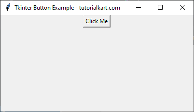
A button labeled Click Me appears. Clicking the button prints Button clicked! in the console.
2. Button with Styling
Adding styling options such as background color, text color, and font.
import tkinter as tk

root = tk.Tk()
root.title("Styled Button - tutorialkart.com")
root.geometry("400x200")

def on_click():
    print("Styled Button Clicked!")

# Create a styled button
button = tk.Button(root, text="Styled Button", command=on_click, fg="red", font=("Arial", 14, "bold"))

button.pack(pady=20)

root.mainloop()
Screenshot in macOS

Screenshot in Windows
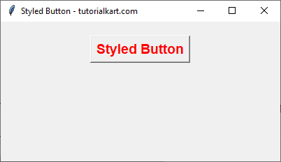
A styled button with red text, and bold Arial font appears.
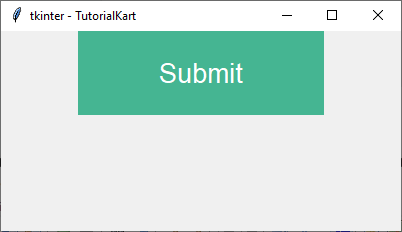
3 Tkinter Button – With Font Style, Background Color and Text Color, etc
In the following example, we will create a Tkinter GUI application with a button. We will change the font style, width, height, background color, text color.
example.py – Python Program
import tkinter as tk
import tkinter.font as font

root = tk.Tk(className='Tkinter - TutorialKart', )
root.geometry("400x200")

button_font = font.Font(family='Helvitica', size=20)

button_submit = tk.Button(root,
    text="Submit",
    bg='#45b592',
    fg='#ffffff',
    bd=0,
    font=button_font,
    height=2,
    width=15)
button_submit.pack()

root.mainloop()
Screenshot in Windows
4. Button with Variable Width and Height
Modifying the size of the button using the width and height parameters.
import tkinter as tk

root = tk.Tk()
root.title("Button Size Example - tutorialkart.com")
root.geometry("400x200")

def on_click():
    print("Large Button Clicked!")

# Create a large button
button = tk.Button(root, text="Large Button", command=on_click,
                   width=20, height=3)

button.pack(pady=20)

root.mainloop()
Screenshot in macOS

Screenshot in Windows
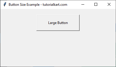
A large button with increased width and height is displayed.
5. Button with Image
In this example, we will display the following image instead of text on a button.
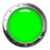
import tkinter as tk
from tkinter import PhotoImage

root = tk.Tk()
root.title("Image Button Example - tutorialkart.com")
root.geometry("400x200")

def on_click():
    print("Image Button Clicked!")

# Load an image
image = PhotoImage(file="button_icon.png")  # Replace with a valid image path

# Create an image button
button = tk.Button(root, image=image, command=on_click)

button.pack(pady=20)

root.mainloop()
Screenshot in macOS

Screenshot in Windows
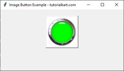
A button displaying an image instead of text appears.
Tkinter Button Options
Following table presents the possible options, with description and reference to example, that you can provide to a Button() constructor to alter its behavior or appearance.
| Option | Description | Example |
| activebackground | Background color when the button is under the cursor. | Tkinter Button activebackground |
| activeforeground | Foreground color when the button is under the cursor. | Tkinter Button activeforeground |
| anchor | Position of Text in Button. | Tkinter Button anchor |
| bd | Border width in pixels. Default is 2. | Tkinter Button bd |
| bg | Normal background color. | Tkinter Button bg |
| command | Function or method to be called when the button is clicked. | Tkinter Button command |
| fg | Normal foreground (text) color. | Tkinter Button fg |
| font | Text font to be used for the button’s label. | Tkinter Button font |
| height | Height of the button in text lines (for textual buttons) or pixels (for images). | Tkinter Button height |
| highlightcolor | The color of the focus highlight when the widget has focus. | Tkinter Button highlightcolor |
| image | Image to be displayed on the button (instead of text). | Tkinter Button image |
| justify | How to show multiple text lines: LEFT to left-justify each line; CENTER to center them; or RIGHT to right-justify. | Tkinter Button justify |
| padx | Additional padding left and right of the text. | Tkinter Button padx |
| pady | Additional padding above and below the text. | Tkinter Button pady |
| relief | Relief specifies the type of the border. Some of the values are SUNKEN, RAISED, GROOVE, and RIDGE. | Tkinter Button relief |
| state | Set this option to DISABLED to gray out the button and make it unresponsive. Has the value ACTIVE when the mouse is over it. Default is NORMAL. | Tkinter Button state |
| underline | Default is -1, meaning that no character of the text on the button will be underlined. If nonnegative, the corresponding text character will be underlined. | Tkinter Button underline |
| width | Width of the button in letters (if displaying text) or pixels (if displaying an image). | Tkinter Button width |
| wraplength | If this value is set to a positive number, the text lines will be wrapped to fit within this length. | Tkinter Button wraplength |