Tkinter Radiobutton
Tkinter Radiobutton widget allows user to select one of the many options.
In this tutorial, we will learn how to create a Radiobutton widget in Python GUI application, and the options available for Radiobutton widget class.
Create Tkinter Radiobutton Widget
To create a Radiobutton widget in your Python GUI application, use the following syntax,
widget = tk.Radiobutton(parent, option, ...)where parent is the root window or a frame in which we would like to pack this Radiobutton widget. You can provide one or more options supported for Radiobutton widget to change its appearance and behavior.
Example – Tkinter Radiobutton
In the following example, we will create a set of Radiobuttons to select the gender of a person.
Create as many number of Radiobutton widgets as that of options. All these Radiobutton widgets are bind using variable option.
Create a tkinter.IntVar() variable and assign to the variable option for all the Radiobutton widgets, which are considered as part a gender set.
example.py – Python Program
import tkinter as tk

window_main = tk.Tk(className='Tkinter - TutorialKart')
window_main.geometry('400x200')

gender = tk.IntVar()
radiobutton_1 = tk.Radiobutton(window_main, text='Male', variable=gender, value=1)
radiobutton_1.pack()
radiobutton_2 = tk.Radiobutton(window_main, text='Female', variable=gender, value=2)
radiobutton_2.pack()
radiobutton_3 = tk.Radiobutton(window_main, text='Other', variable=gender, value=3)
radiobutton_3.pack()

def submitFunction():
    print('You Selcted Option ', gender.get())

submit = tk.Button(window_main, text='Submit', command=submitFunction)
submit.pack()

window_main.mainloop()
The text option of Radiobutton is displayed in the GUI. value option is assigned to variable, when user selects an option. If no option is selected, the default value is zero.
Output
Run the above program, and you will get the following window.
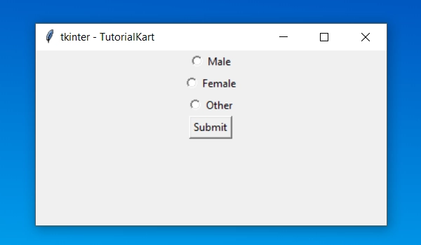
Select an Option and click on Submit button.
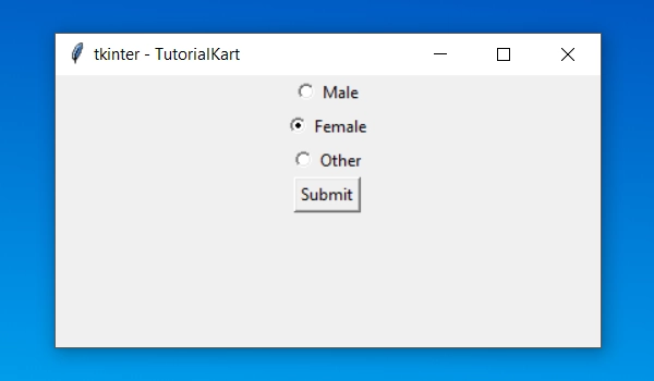
Based on the selection, you will get output looking similar to the following.
You Selcted Option  2
You Selcted Option  1
You Selcted Option  3
Tkinter Radiobutton Options
In the previous example, we have already gone through three options, namely: text, variable and value. In addition to these there are some other options which control the appearance or behavior of Radiobutton widget.
Following is the complete list of Options available for Radiobutton widget.
| activebackground | The background color of Radiobutton when the mouse clicks the widget and over it. |
| activeforeground | The foreground or text color when the mouse clicks the widget and over the Radiobutton. |
| anchor | The position of text in Radiobutton when it has more space than it requires. |
| bg or background | The background color of Radiobutton. |
| bitmap | To display a monochrome image on a Radiobutton. |
| bd or borderwidth | Border width around Radiobutton. |
| command | A procedure/function to be called when user changes the state of this Radiobutton. |
| compound | If both text and a bitmap options are specified, this option specifies where the graphic appears relative to the text. Values for compound: 1. tk.NONE (the default value), 2. tk.TOP 3. tk.BOTTOM 4. tk.LEFT 5. tk.RIGHT 6. tk.CENTER |
| cursor | The pattern for mouse cursor when it is over the Radiobutton. |
| disabledforeground | The foreground color for the text of a disabled Radiobutton. |
| font | The font object used for the text of this Radiobutton. |
| fg or foreground | Color for Radiobutton text. |
| height | The number of lines of text on the Radiobutton. |
| highlightbackground | The color of the focus highlight when the Radiobutton does not have focus. |
| highlightcolor | The color of the focus highlight when the Radiobutton has the focus. |
| highlightthickness | The thickness of the focus highlight. |
| image | To display a graphic image instead of text for this Radiobutton, set this option to an image object. |
| indicatoron | Normally a radiobutton displays its indicator. If you set this option to zero, the indicator disappears, and the entire widget becomes a “push-push” button that looks raised when it is cleared and sunken when it is set. You may want to increase the borderwidth value to make it easier to see the state of such a control. |
| justify | If the text contains multiple lines, this option controls how the text is justified: tk.CENTER (the default), tk.LEFT, or tk.RIGHT. |
| offrelief | If you suppress the indicator by asserting indicatoron=False, the offrelief option specifies the relief style to be displayed when the radiobutton is not selected. The default values is tk.RAISED. |
| overrelief | Specifies the relief style to be displayed when the mouse is over the radiobutton. |
| padx | How much space to leave to the left and right of the radiobutton and text. Default is 1. |
| pady | How much space to leave above and below the radiobutton and text. Default is 1. |
| relief | By default, a radiobutton will have tk.FLAT relief, so it doesn’t stand out from its background. See Section 5.6, “Relief styles” for more 3-d effect options. You can also use relief=tk.SOLID, which displays a solid black frame around the radiobutton. |
| selectcolor | The color of the radiobutton when it is set. Default is red. |
| selectimage | If you are using the image option to display a graphic instead of text when the radiobutton is cleared, you can set the selectimage option to a different image that will be displayed when the radiobutton is set. |
| state | The default is state=tk.NORMAL, but you can set state=tk.DISABLED to gray out the control and make it unresponsive. If the cursor is currently over the radiobutton, the state is tk.ACTIVE. |
| takefocus | By default, the input focus will pass through a Radiobutton. If you set takefocus=0, focus will not visit this Radiobutton. |
| text | The label displayed next to the Radiobutton. |
| textvariable | If you need to change the label on a radiobutton during execution, create a StringVar to manage the current value, and set this option to that control variable. Whenever the control variable’s value changes, the radiobutton’s annotation will automatically change to that text as well. |
| underline | With the default value of -1, none of the characters of the text label are underlined. Set this option to the index of a character in the text (counting from zero) to underline that character. |
| value | This value is assigned to control variable when this radiobutton is turned on by the user. |
| variable | The control variable that this radiobutton shares with the other radiobuttons in the group. Radiobutton can have a variable of type IntVar or StringVar. |
| width | Width of Radionbutton, in terms of number of characters. |
| wraplength | By default, text of Radiobutton is not wrapped. You can wrap the text to a maximum number of characters per line. |
Conclusion
In this Python Tutorial, we learned what a Radiobutton widget is, how to create one, and how to use some of its options to change its appearance.