React Sass Styling
Sass (Syntactically Awesome Stylesheets) is a CSS preprocessor that allows you to write more maintainable and flexible styles. React supports Sass, and it can be easily integrated into your project. Sass offers features like variables, nesting, mixins, and inheritance, which help simplify complex stylesheets.
Setting Up Sass in a React Project
To use Sass in your React project, follow these steps:
- Install Sass using npm:
npm install sass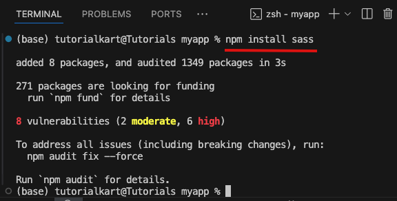
- Create a
.scssor.sassfile in your project. - Import the
.scssfile in your React component:
import './App.scss';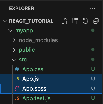
Example: Basic Styling with Variables
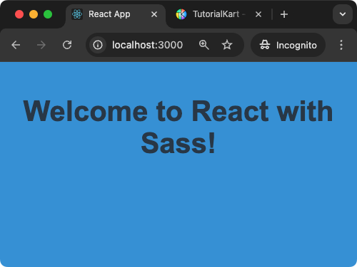
In this example, we use Sass variables to define colors and reuse them in styles. This makes it easier to maintain and update styles globally.
App.scss
$primary-color: #3498db;
$text-color: #2c3e50;

body {
  font-family: Arial, sans-serif;
  background-color: $primary-color;
  color: $text-color;
  text-align: center;
}
App.js
import React from 'react';
import './App.scss';

function App() {
  return <h1>Welcome to React with Sass!</h1>;
}

export default App;
Explanation:
$primary-colorand$text-color: Sass variables for reusability and consistency in styles.- Styles are applied globally to the
bodyelement. - This approach simplifies managing color schemes and theme updates.
Output:
Nesting Selectors in SCSS
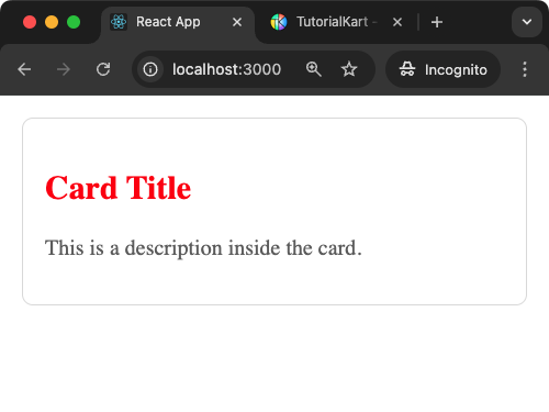
Sass allows you to nest selectors to keep styles organised and readable. This is particularly useful for structuring component-specific styles.
Example
In the following App.scss file, h2 and p are written inside .card.
App.scss
.card {
    background: #fff;
    border: 1px solid #ddd;
    padding: 16px;
    border-radius: 8px;

    h2 {
      color: red;
    }

    p {
      color: #666;
    }
  }
App.js
import React from 'react';
import './App.scss';

function Card() {
  return (
    <div className="card">
      <h2>Card Title</h2>
      <p>This is a description inside the card.</p>
    </div>
  );
}

export default Card;
Explanation:
.card: The parent class encapsulates styles for the card component.- Nesting: Child elements
h2andpare styled within the.cardblock for better readability. - This approach keeps related styles together and avoids clutter.
Output:
Using Mixins in SCSS
Mixins in Sass allow you to define reusable style blocks.
Example
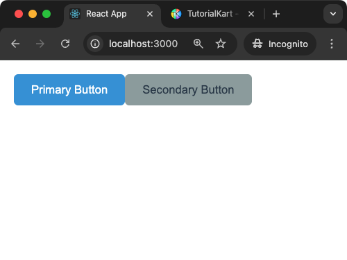
In this example, we create a mixin for a button and reuse it across different components.
App.scss
@mixin button-style($bg-color, $text-color) {
  background-color: $bg-color;
  color: $text-color;
  padding: 10px 20px;
  border: none;
  border-radius: 5px;
  cursor: pointer;
}

.button-primary {
  @include button-style(#3498db, #fff);
}

.button-secondary {
  @include button-style(#95a5a6, #2c3e50);
}
App.js
import React from 'react';
import './App.scss';

function Buttons() {
  return (
    <div>
      <button className="button-primary">Primary Button</button>
      <button className="button-secondary">Secondary Button</button>
    </div>
  );
}

export default Buttons;
Explanation:
@mixin button-style: Defines reusable styles for buttons with customizable parameters.@include: Includes the mixin in specific classes with different arguments.- This approach enhances reusability and consistency in component styles.
Output:
Partials and Importing in SCSS
Sass allows you to split styles into multiple files (partials) and import them into a main file. This helps organise styles for large projects.
Example
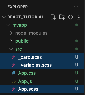
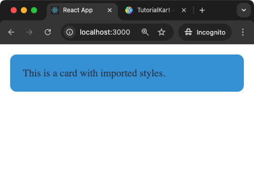
We will create _card.scss and _variables.scss and import these into App.scss using @import.
_variables.scss
$primary-color: #3498db;
$text-color: #2c3e50;
_card.scss
.card {
  background: $primary-color;
  color: $text-color;
  padding: 20px;
  border-radius: 10px;
}
App.scss
@import 'variables';
@import 'card';
App.js
import React from 'react';
import './App.scss';

function App() {
  return <div className="card">This is a card with imported styles.</div>;
}

export default App;
Explanation:
- Partials: Separate Sass files (e.g.,
_variables.scss,_card.scss) for modular styles. @import: Combines the partials into a single stylesheet inApp.scss.- This approach improves scalability and maintainability in large applications.
Output:
Conclusion
Sass extends the capabilities of CSS, making it more powerful and maintainable. By integrating Sass into your React project, you can take advantage of features like variables, nesting, mixins, and partials to build scalable and efficient stylesheets.
