SwiftUI – Button
In SwiftUI, a Button is a user-interactive control that triggers an action when tapped. Buttons are a fundamental component of user interfaces, and SwiftUI provides a highly customizable way to create buttons with various styles, actions, and appearances.
In this SwiftUI tutorial, we’ll explore how to create buttons, customize their styles, and add actions using SwiftUI.
Basic Syntax for Button
The basic syntax for creating a Button is:
Button("Button Title") {
    // Action to perform when button is tapped
}
Here:
"Button Title": The text displayed on the button.- The closure contains the action to execute when the button is tapped.
You can also use a label to provide a custom design for the button’s appearance.
Button(action: {
    // Action to perform
}) {
    // Custom label for the button
}
Examples
Let’s look at some examples to understand how to create and style buttons in SwiftUI.
Example 1: Simple Button
This example demonstrates a basic button with a text label:
Code Example:
import SwiftUI

struct ContentView: View {
    var body: some View {
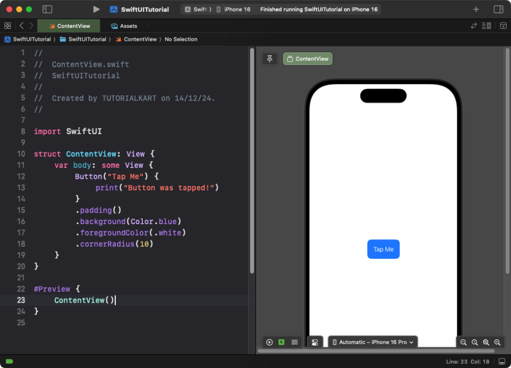
        Button("Tap Me") {
            print("Button was tapped!")
        }
        .padding()
        .background(Color.blue)
        .foregroundColor(.white)
        .cornerRadius(10)
    }
}
Explanation:

- The
Buttonhas a text label “Tap Me.” - When tapped, it prints a message to the console.
.background(Color.blue)and.foregroundColor(.white)style the button..cornerRadius(10)gives the button rounded edges.
Result: A tappable blue button with rounded corners and white text appears.
Example 2: Button with an Image and Text
You can create a button with both an image and text:
Code Example:
import SwiftUI

struct ContentView: View {
    var body: some View {
        Button(action: {
            print("Button with icon tapped!")
        }) {
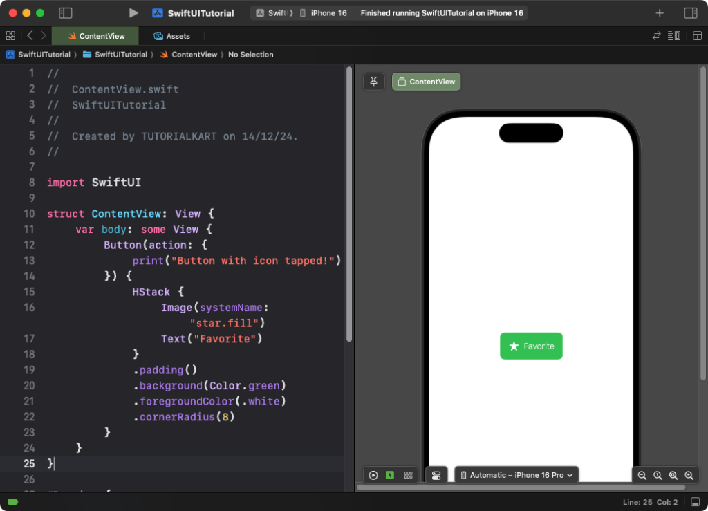
            HStack {
                Image(systemName: "star.fill")
                Text("Favorite")
            }
            .padding()
            .background(Color.green)
            .foregroundColor(.white)
            .cornerRadius(8)
        }
    }
}
Explanation:

- The button uses an
HStackto combine an SF Symbol imageImage(systemName: "star.fill")with text. - The action prints a message to the console when tapped.
- The button is styled with a green background, white text, and rounded corners.
Result: A button with a star icon and the label “Favorite” is displayed, styled with green and white colors.
Example 3: Custom Button Style
You can define custom button styles by creating a reusable style conforming to ButtonStyle:
Code Example:
import SwiftUI

struct CustomButtonStyle: ButtonStyle {
    func makeBody(configuration: Configuration) -> some View {
        configuration.label
            .padding()
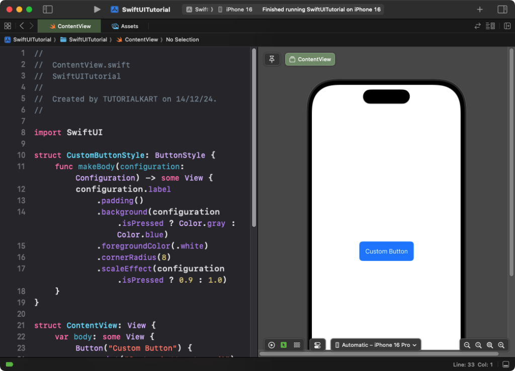
            .background(configuration.isPressed ? Color.gray : Color.blue)
            .foregroundColor(.white)
            .cornerRadius(8)
            .scaleEffect(configuration.isPressed ? 0.9 : 1.0)
    }
}

struct ContentView: View {
    var body: some View {
        Button("Custom Button") {
            print("Custom button tapped!")
        }
        .buttonStyle(CustomButtonStyle())
    }
}
Explanation:
- The custom button style changes the background color and scale when the button is pressed.
configuration.labelrefers to the button’s content, ensuring flexibility.
Result: A button styled with custom behaviors appears, including a press effect that changes its color and size.
Conclusion
The Button view in SwiftUI is a versatile tool for creating interactive elements. By combining actions, images, and custom styles, you can design buttons that fit seamlessly into your app’s user interface and enhance the user experience.
