SwiftUI – Button Background Color
In SwiftUI, the Button view is used to create interactive elements that respond to user actions. By default, a Button does not have a visible background color unless styled explicitly.
You can customise the background color of a Button using the .background() modifier or by wrapping it in a styled container.

This tutorial demonstrates how to customize the background color of a Button in SwiftUI with various practical examples.
Customizing Button Background Color
To change the background color of a Button, you can:
- Use the
.background()Modifier: Apply a solid or gradient background to theButtonlabel. - Style the Button: Customize the entire
Buttonusing a custom modifier or container view.
Examples
Let’s explore how to style Button background colors in SwiftUI.
Example 1: Simple Button with Solid Background
This example demonstrates how to apply a solid background color to a Button:
Code Example:
import SwiftUI

struct ContentView: View {
    var body: some View {
        Button(action: {
            print("Button tapped")
        }) {
            Text("Click Me")
                .foregroundColor(.white) // Text color
                .padding()
        }
        .background(Color.blue) // Background color
        .cornerRadius(8) // Rounded corners
        .padding()
    }
}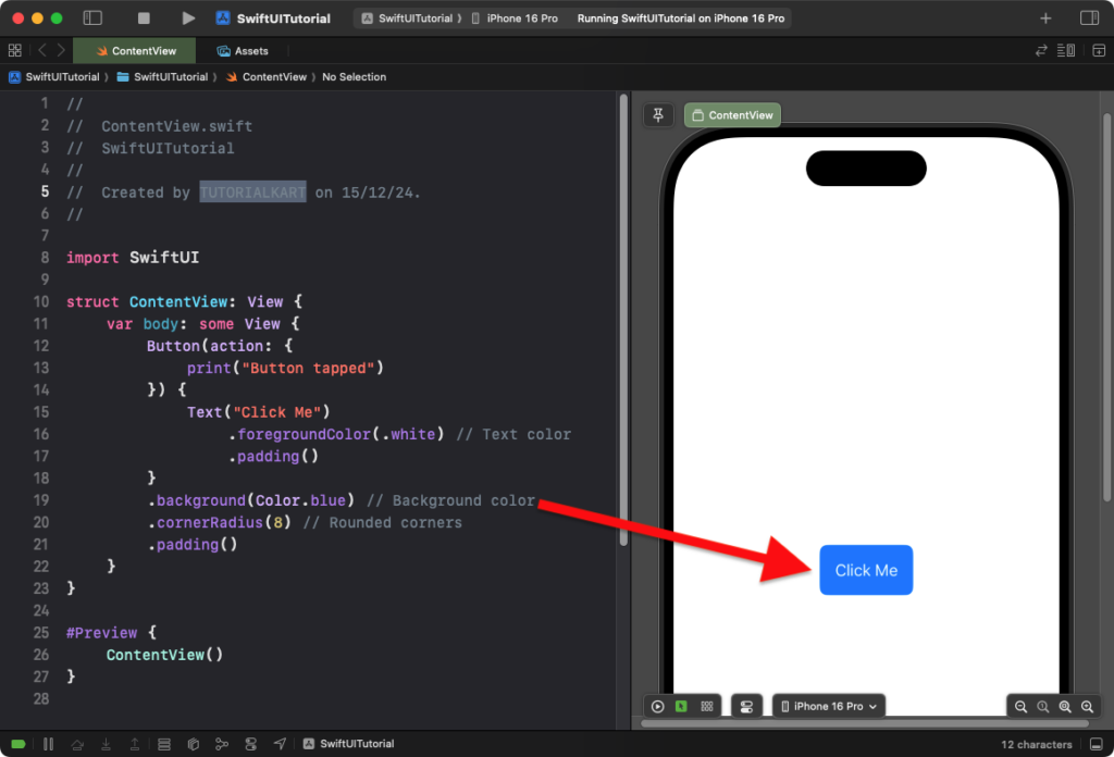
Explanation:
- The
.background(Color.blue)modifier applies a blue background to theButton. - The
.cornerRadius(8)modifier adds rounded corners to the button. - The
.foregroundColor(.white)ensures the button text is readable against the blue background.
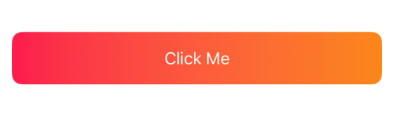
Result: A button with a blue background, white text, and rounded corners is displayed.
Example 2: Button with Gradient Background
This example demonstrates how to apply a gradient background to a Button:
Code Example:
import SwiftUI

struct ContentView: View {
    var body: some View {
        Button(action: {
            print("Gradient Button tapped")
        }) {
            Text("Click Me")
                .foregroundColor(.white)
                .padding()
                .frame(maxWidth: .infinity) // Expands the button to fill width
        }
        .background(
            LinearGradient(
                gradient: Gradient(colors: [Color.pink, Color.orange]),
                startPoint: .leading,
                endPoint: .trailing
            )
        )
        .cornerRadius(10)
        .padding()
    }
}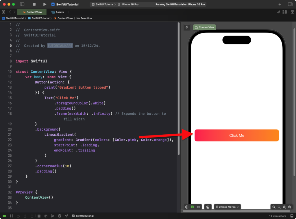
Explanation:
- The
LinearGradientcreates a gradient background that transitions from pink to orange. - The
.frame(maxWidth: .infinity)modifier makes the button stretch to fill the available width. - The
.cornerRadius(10)rounds the corners of the gradient background.
Result: A button with a gradient background, white text, and full-width styling is displayed.
Example 3: Dynamic Background Color
This example demonstrates how to dynamically change the background color based on a state variable:
Code Example:
import SwiftUI

struct ContentView: View {
    @State private var isTapped: Bool = false

    var body: some View {
        Button(action: {
            isTapped.toggle()
        }) {
            Text(isTapped ? "Tapped!" : "Tap Me")
                .foregroundColor(.white)
                .padding()
        }
        .background(isTapped ? Color.green : Color.red) // Green when tapped, red otherwise
        .cornerRadius(8)
        .padding()
    }
}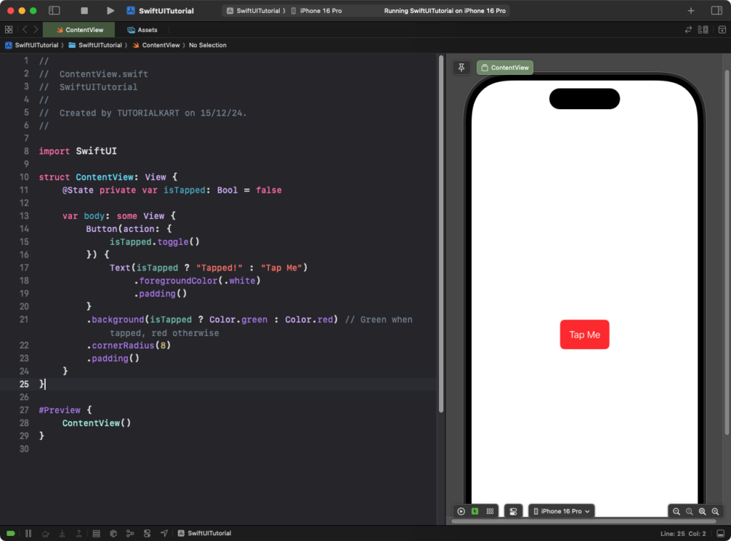
Explanation:
- The
isTappedstate variable toggles betweentrueandfalsewhen the button is pressed. - The background color changes dynamically between green and red based on the value of
isTapped. - The button text also updates to reflect the current state.
Result: The button dynamically changes its background color and label when tapped.
Conclusion
Customizing the background color of a SwiftUI Button enhances its visual appeal and helps create dynamic, user-friendly interfaces. Whether using solid colors, gradients, or dynamic styling, SwiftUI provides the flexibility to match your app’s design requirements.