SwiftUI – Button Disabled
In SwiftUI, buttons can be disabled conditionally based on your app’s logic. Disabling a button prevents user interaction while visually indicating that it is inactive. This can be achieved using the .disabled() modifier, which accepts a Boolean value to determine whether the button is active or not.
In this tutorial, we will explore how to disable buttons in SwiftUI with practical examples, including conditional and dynamic disabling.
Disabling a Button
The .disabled() modifier is used to control the enabled state of a button. When the value passed to .disabled() is true, the button is disabled, and when it is false, the button remains enabled.
Basic Syntax
The basic syntax for disabling a button is:
Button(action: {
    // Action
}) {
    Text("Button Label")
}
.disabled(isDisabled)
Here:
isDisabled: A Boolean value that determines whether the button is disabled (true) or enabled (false).
Examples
Let’s look at different ways to disable buttons in SwiftUI.
Example 1: Disabling a Button Conditionally
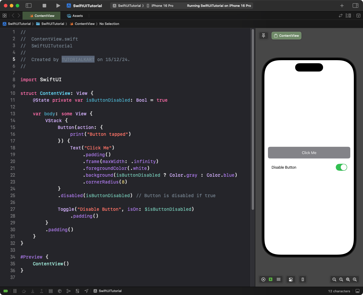
This example demonstrates a button that is disabled based on a Boolean state:
Code Example:
import SwiftUI

struct ContentView: View {
    @State private var isButtonDisabled: Bool = true

    var body: some View {
        VStack {
            Button(action: {
                print("Button tapped")
            }) {
                Text("Click Me")
                    .padding()
                    .frame(maxWidth: .infinity)
                    .foregroundColor(.white)
                    .background(isButtonDisabled ? Color.gray : Color.blue)
                    .cornerRadius(8)
            }
            .disabled(isButtonDisabled) // Button is disabled if true

            Toggle("Disable Button", isOn: $isButtonDisabled)
                .padding()
        }
        .padding()
    }
}
Explanation:
- The
isButtonDisabledstate determines whether the button is enabled or disabled. - The button’s background color changes to gray when disabled and blue when enabled for visual feedback.
- A
Toggleallows the user to enable or disable the button dynamically.
Result: The button is initially disabled, and the toggle enables or disables it dynamically.
Example 2: Disabling a Button Based on Input
This example disables a button until the user enters valid input:
Code Example:
import SwiftUI

struct ContentView: View {
    @State private var textInput: String = ""

    var body: some View {
        VStack {
            TextField("Enter at least 5 characters", text: $textInput)
                .padding()
                .textFieldStyle(RoundedBorderTextFieldStyle())

            Button(action: {
                print("Submitted: \(textInput)")
            }) {
                Text("Submit")
                    .padding()
                    .frame(maxWidth: .infinity)
                    .foregroundColor(.white)
                    .background(textInput.count >= 5 ? Color.green : Color.gray)
                    .cornerRadius(8)
            }
            .disabled(textInput.count < 5) // Disabled until input has 5+ characters
        }
        .padding()
    }
}
Explanation:
- The
TextFieldaccepts user input and updates thetextInputstate variable. - The button remains disabled (gray) until the input length is 5 or more characters, at which point it becomes enabled (green).
- The condition
textInput.count < 5dynamically controls the button’s.disabled()state.
Result: The button is disabled until the user enters at least 5 characters in the text field.
Example 3: Multiple Buttons with Different States
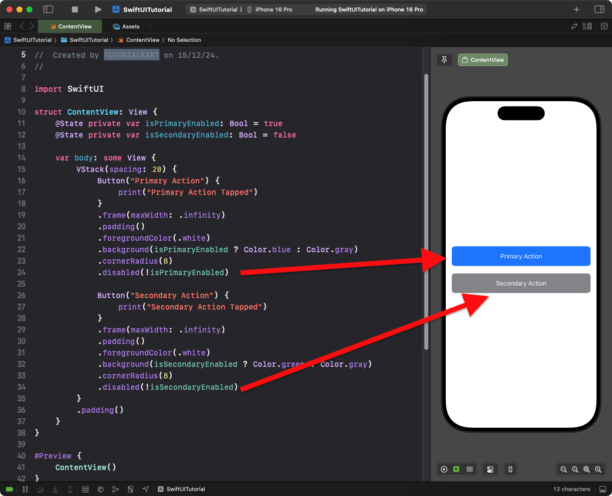
This example shows multiple buttons with individual enabled and disabled states:
Code Example:
import SwiftUI

struct ContentView: View {
    @State private var isPrimaryEnabled: Bool = true
    @State private var isSecondaryEnabled: Bool = false

    var body: some View {
        VStack(spacing: 20) {
            Button("Primary Action") {
                print("Primary Action Tapped")
            }
            .frame(maxWidth: .infinity)
            .padding()
            .foregroundColor(.white)
            .background(isPrimaryEnabled ? Color.blue : Color.gray)
            .cornerRadius(8)
            .disabled(!isPrimaryEnabled)

            Button("Secondary Action") {
                print("Secondary Action Tapped")
            }
            .frame(maxWidth: .infinity)
            .padding()
            .foregroundColor(.white)
            .background(isSecondaryEnabled ? Color.green : Color.gray)
            .cornerRadius(8)
            .disabled(!isSecondaryEnabled)
        }
        .padding()
    }
}
Explanation:
- The
isPrimaryEnabledandisSecondaryEnabledstates control the enabled/disabled status of each button. - Each button’s background color reflects its state (active or inactive).
- The
.disabled()modifier ensures each button behaves independently based on its state.
Result: Two buttons are displayed with separate enabled and disabled states.
Conclusion
The .disabled() modifier in SwiftUI allows you to control a button’s interaction based on dynamic conditions. By combining this with visual feedback, such as changing the button’s color, you can create intuitive and user-friendly designs for your app.
