SwiftUI – Button Full-Width
In SwiftUI, a Button can be styled to take up the full width of its container. Full-width buttons are commonly used in modern app designs to emphasize actions, such as login, sign-up, or primary calls-to-action. You can achieve this by setting the button’s frame to expand horizontally using the .frame() modifier.

This tutorial demonstrates how to create full-width buttons in SwiftUI with practical examples.
Making a Button Full-Width
To create a full-width button, you can:
- Use the
.frame(maxWidth: .infinity)Modifier: Expands the button to fill the available horizontal space. - Embed the Button in a Parent View: Use containers like
VStackorHStackto manage the button’s layout.
Examples
Let’s look at examples of how to create full-width buttons in SwiftUI.
Example 1: Simple Full-Width Button
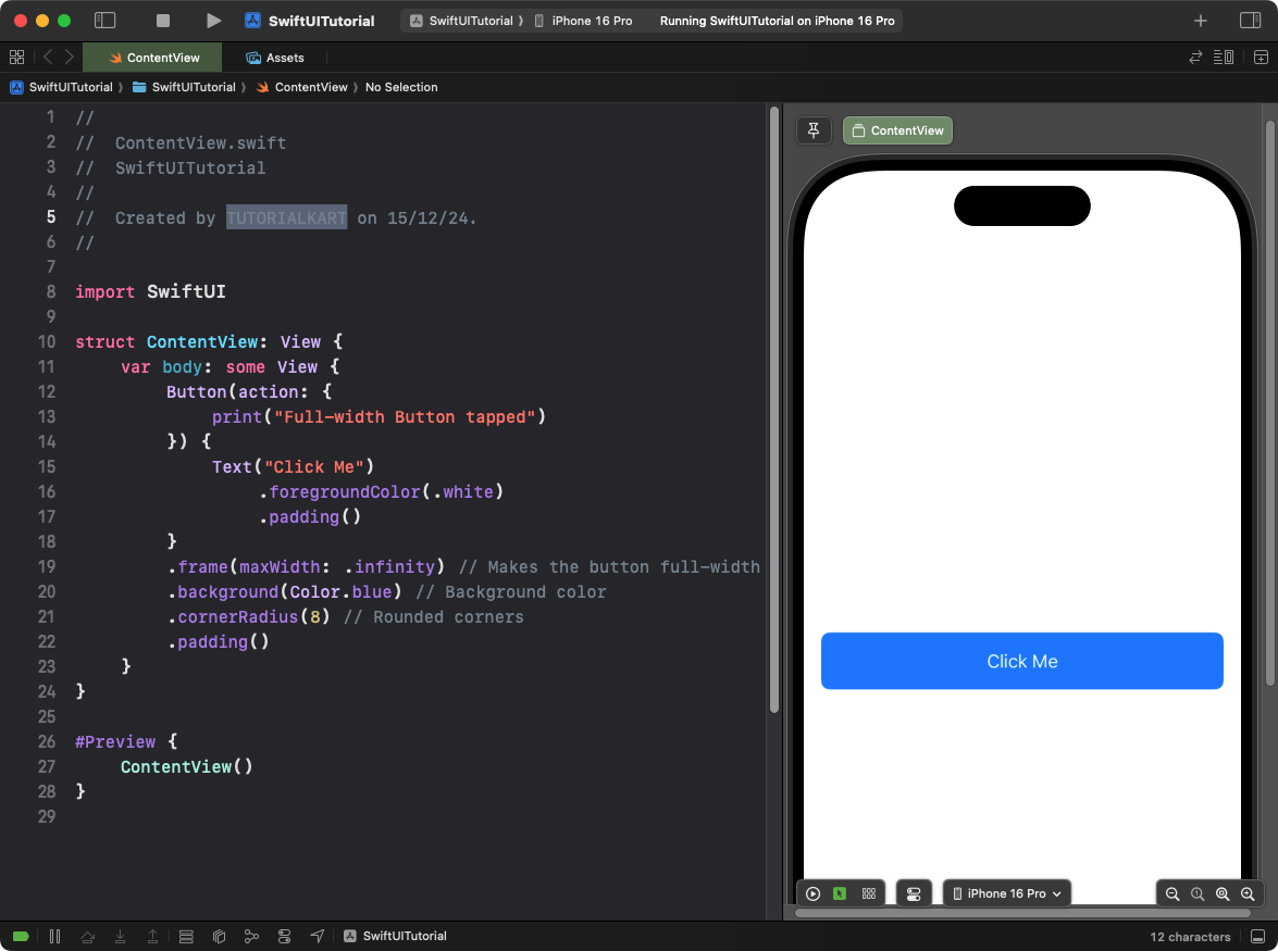
This example demonstrates how to create a simple full-width button:
Code Example:
import SwiftUI

struct ContentView: View {
    var body: some View {
        Button(action: {
            print("Full-width Button tapped")
        }) {
            Text("Click Me")
                .foregroundColor(.white)
                .padding()
        }
        .frame(maxWidth: .infinity) // Makes the button full-width
        .background(Color.blue) // Background color
        .cornerRadius(8) // Rounded corners
        .padding()
    }
}
Explanation:
- The
.frame(maxWidth: .infinity)modifier makes the button stretch to fill the horizontal space. - The
.background(Color.blue)adds a blue background to the button. - The
.cornerRadius(8)rounds the corners for a polished look.
Result: A full-width button with blue background and white text is displayed.
Example 2: Full-Width Button in a VStack
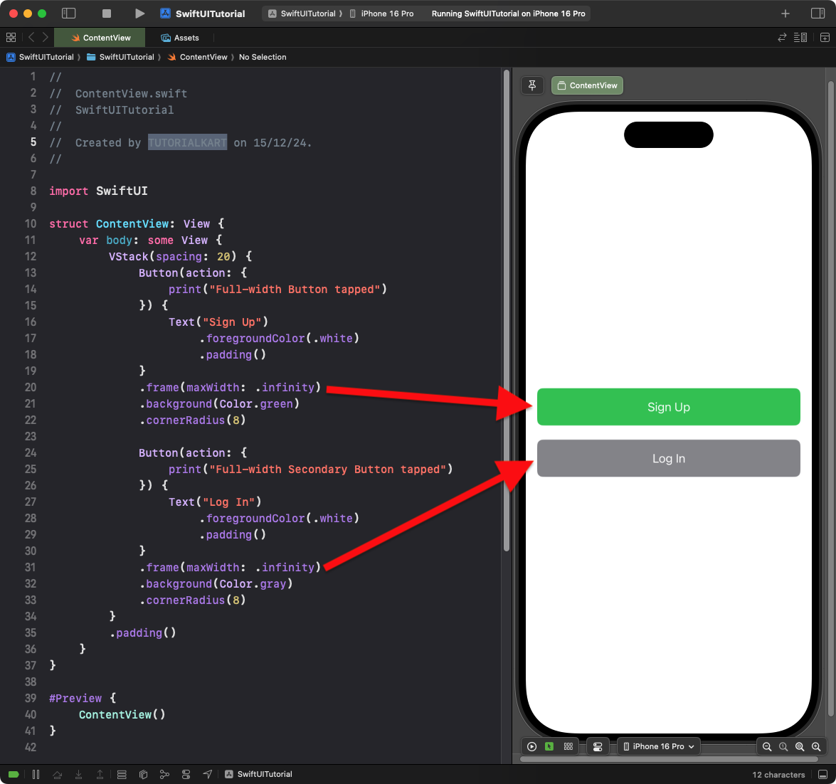
This example places the full-width button inside a vertical stack:
Code Example:
import SwiftUI

struct ContentView: View {
    var body: some View {
        VStack(spacing: 20) {
            Button(action: {
                print("Full-width Button tapped")
            }) {
                Text("Sign Up")
                    .foregroundColor(.white)
                    .padding()
            }
            .frame(maxWidth: .infinity)
            .background(Color.green)
            .cornerRadius(8)

            Button(action: {
                print("Full-width Secondary Button tapped")
            }) {
                Text("Log In")
                    .foregroundColor(.white)
                    .padding()
            }
            .frame(maxWidth: .infinity)
            .background(Color.gray)
            .cornerRadius(8)
        }
        .padding()
    }
}
Explanation:
- The
VStackvertically stacks multiple full-width buttons with 20 points of spacing between them. - Each button uses
.frame(maxWidth: .infinity)to fill the available width. - Different background colors (
Color.greenandColor.gray) differentiate the buttons visually.
Result: Two full-width buttons are displayed in a vertical stack with distinct styles.
Example 3: Dynamic Full-Width Button with Shadow
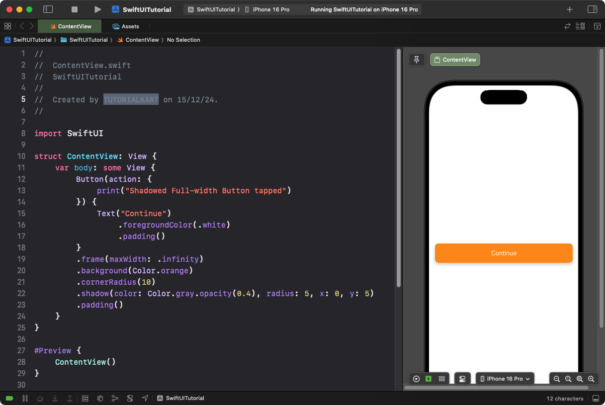
This example adds a shadow to the button for a more dynamic effect:
Code Example:
import SwiftUI

struct ContentView: View {
    var body: some View {
        Button(action: {
            print("Shadowed Full-width Button tapped")
        }) {
            Text("Continue")
                .foregroundColor(.white)
                .padding()
        }
        .frame(maxWidth: .infinity)
        .background(Color.orange)
        .cornerRadius(10)
        .shadow(color: Color.gray.opacity(0.4), radius: 5, x: 0, y: 5)
        .padding()
    }
}
Explanation:
- The
.shadow()modifier adds a gray shadow with 40% opacity, a blur radius of 5 points, and an offset of 5 points below the button. - The button spans the full width of the parent container due to
.frame(maxWidth: .infinity). - The
.cornerRadius(10)creates rounded corners for a softer look.
Result: A full-width button with an orange background, rounded corners, and a shadow effect is displayed.
Conclusion
Creating full-width buttons in SwiftUI is straightforward using the .frame(maxWidth: .infinity) modifier. Combining this with background colors, rounded corners, and shadow effects allows you to design visually appealing buttons that align with your app’s layout and design goals.
