SwiftUI – Button Rounded Corners
In SwiftUI, a Button is a fundamental UI element used for user interactions. To enhance its visual appeal, you can customize its appearance, including adding rounded corners. Rounded corners give buttons a softer, more modern look and are often used to align with current design trends.

This tutorial demonstrates how to create buttons with rounded corners in SwiftUI using practical examples.
Customizing Button Corners
You can add rounded corners to a Button using the .cornerRadius() modifier. This modifier allows you to specify the radius of the corners, creating the desired level of roundness. For more complex designs, you can combine .cornerRadius() with other modifiers like .background() or .overlay().
Basic Syntax
The general syntax for adding rounded corners is:
Button(action: {
    // Action
}) {
    Text("Button Label")
        .padding()
}
.background(Color.colorName)
.cornerRadius(cornerRadiusValue)
Here:
Color.colorName: The background color of the button.cornerRadiusValue: The radius of the corners, in points.
Examples
Let’s look at some practical examples of buttons with rounded corners.
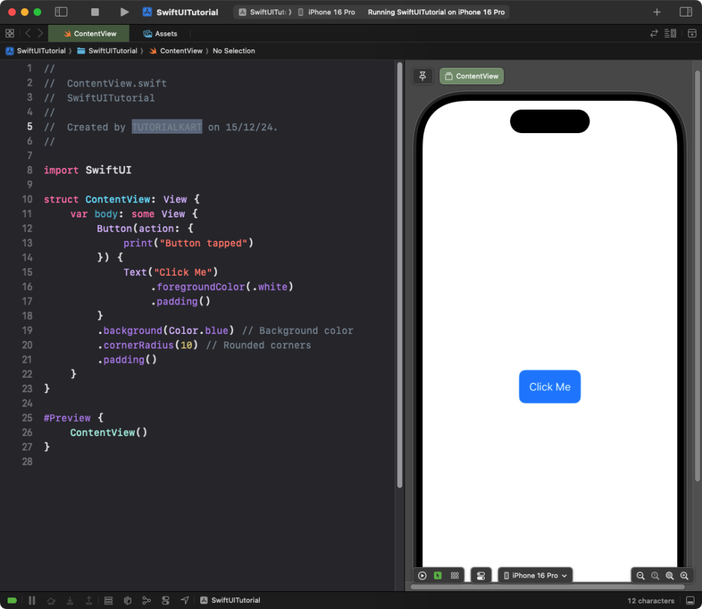
Example 1: Button with Simple Rounded Corners
This example demonstrates how to create a button with rounded corners using .cornerRadius():
Code Example:
import SwiftUI

struct ContentView: View {
    var body: some View {
        Button(action: {
            print("Button tapped")
        }) {
            Text("Click Me")
                .foregroundColor(.white)
                .padding()
        }
        .background(Color.blue) // Background color
        .cornerRadius(10) // Rounded corners
        .padding()
    }
}
Explanation:
- The
.background(Color.blue)modifier applies a blue background to the button. - The
.cornerRadius(10)modifier adds rounded corners with a radius of 10 points. - The
.foregroundColor(.white)ensures the text is readable against the background.
Result: A button with blue background, white text, and rounded corners is displayed.
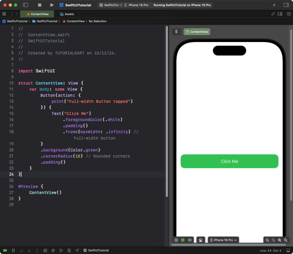
Example 2: Full-Width Button with Rounded Corners
This example creates a full-width button with rounded corners:
Code Example:
import SwiftUI

struct ContentView: View {
    var body: some View {
        Button(action: {
            print("Full-width Button tapped")
        }) {
            Text("Click Me")
                .foregroundColor(.white)
                .padding()
                .frame(maxWidth: .infinity) // Full-width button
        }
        .background(Color.green)
        .cornerRadius(15) // Rounded corners
        .padding()
    }
}
Explanation:
- The
.frame(maxWidth: .infinity)modifier makes the button stretch to fill the available width. - The
.cornerRadius(15)modifier rounds the corners of the button with a 15-point radius. - The
.background(Color.green)applies a green background to the button.
Result: A full-width button with a green background and rounded corners is displayed.
Conclusion
Adding rounded corners to a SwiftUI Button is simple using the .cornerRadius() modifier. Combining rounded corners with background colors, full-width styling, or shadows allows you to create visually appealing and functional buttons that align with modern design principles.
