SwiftUI – Button Size
In SwiftUI, you can customise the size of a Button to fit your app’s design. By default, a button’s size is determined by the size of its content, but you can adjust it using modifiers such as .frame(), .padding(), or by setting flexible layouts.


This tutorial demonstrates how to control and customise the size of buttons in SwiftUI with practical examples.
Customizing Button Size
To customize a button’s size, you can:
- Use the
.frame()Modifier: Specify fixed or flexible width and height. - Apply
.padding(): Add padding around the button’s content to make it larger. - Use Layout Modifiers: Combine with
.alignment,.spacer, or.layoutPriority()for dynamic sizing.
Examples
Let’s explore different ways to control button size in SwiftUI.
Example 1: Button with Fixed Size
This example demonstrates how to set a fixed size for a button:
Code Example:
import SwiftUI

struct ContentView: View {
    var body: some View {
        Button(action: {
            print("Fixed size button tapped")
        }) {
            Text("Click Me")
                .foregroundColor(.white)
                .bold()
        }
        .frame(width: 200, height: 50) // Fixed width and height
        .background(Color.blue)
        .cornerRadius(10)
    }
}
Explanation:
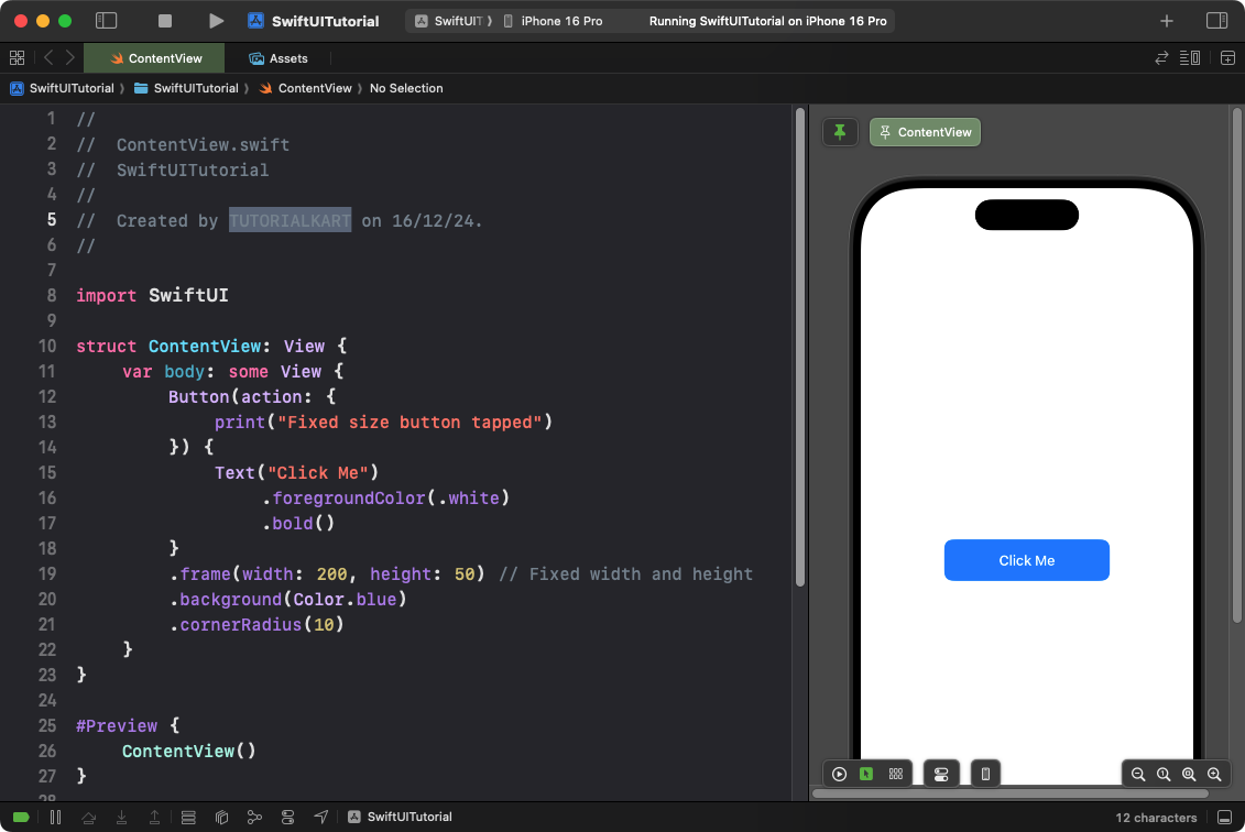
- The
.frame(width: 200, height: 50)modifier sets the button’s size to a fixed width and height. - The
.background(Color.blue)and.cornerRadius(10)give the button a blue background with rounded corners.
Result: A rectangular button with a fixed size is displayed.
Example 2: Full-Width Button
This example creates a button that stretches to fill the available width:
Code Example:
import SwiftUI

struct ContentView: View {
    var body: some View {
        Button(action: {
            print("Full-width button tapped")
        }) {
            Text("Tap Me")
                .foregroundColor(.white)
                .padding()
        }
        .frame(maxWidth: .infinity) // Stretches to full width
        .background(Color.green)
        .cornerRadius(8)
        .padding()
    }
}
Explanation:
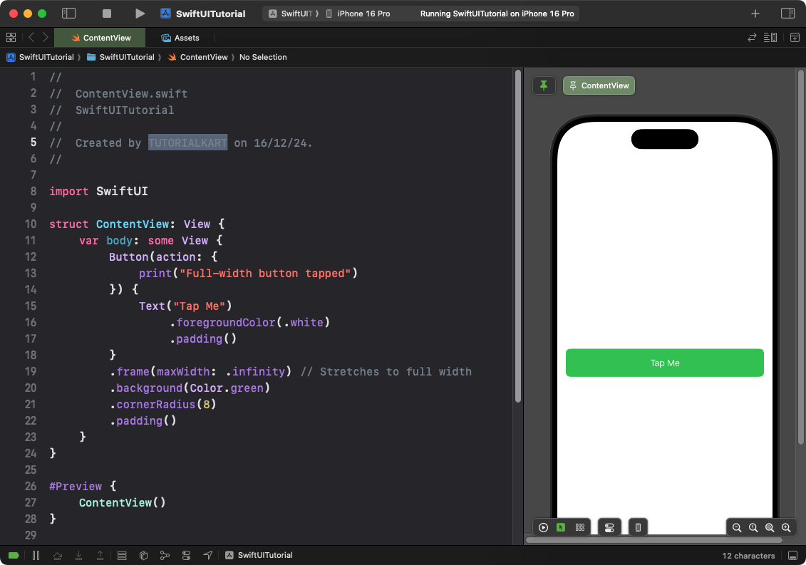
- The
.frame(maxWidth: .infinity)modifier makes the button stretch to fill the available width. - The
.padding()adds spacing around the button’s label. - The
.background(Color.green)adds a green background, and.cornerRadius(8)rounds the corners.
Result: A full-width button appears, taking up the entire horizontal space of its container.
Example 3: Dynamic Button Size with Padding
This example adjusts the button size dynamically by applying padding:
Code Example:
import SwiftUI

struct ContentView: View {
    var body: some View {
        Button(action: {
            print("Dynamic size button tapped")
        }) {
            Text("Click Me")
                .foregroundColor(.white)
                .padding(20) // Dynamic padding
                .background(Color.orange)
                .cornerRadius(12)
        }
    }
}
Explanation:
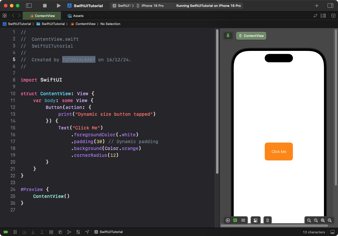
- The
.padding(20)adds dynamic padding, increasing the button’s size proportionally to its content. - The
.background(Color.orange)adds an orange background, while.cornerRadius(12)rounds the corners.
Result: The button dynamically resizes based on the padding applied.
Conclusion
SwiftUI provides multiple ways to control the size of buttons, ranging from fixed dimensions to dynamic layouts. By using modifiers like .frame(), .padding(), and .Spacer(), you can create buttons that adapt seamlessly to your app’s design requirements.
References:
