SwiftUI – Button with Image
In SwiftUI, you can create visually appealing buttons by combining text and images or using images alone. Buttons with images are commonly used for icons, action buttons, or buttons with both textual and visual representations to improve user experience.
This tutorial demonstrates how to create and customize buttons with images in SwiftUI using practical examples.
Creating Buttons with Images
SwiftUI allows you to use the Image view inside a Button. You can:
- Create a button with only an image.
- Combine text and image within the button.
- Customize the size, alignment, and appearance of the image.
Examples
Let’s explore examples of buttons with images in SwiftUI.
Example 1: Button with Only an Image
This example creates a button that displays only an image:
Code Example:
import SwiftUI

struct ContentView: View {
    var body: some View {
        Button(action: {
            print("Image button tapped")
        }) {
            Image(systemName: "star.fill") // SF Symbol
                .resizable()
                .frame(width: 50, height: 50)
                .foregroundColor(.yellow)
        }
        .padding()
    }
}
Explanation:
- The
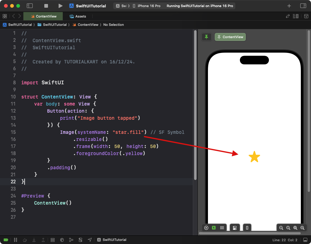
Image(systemName: "star.fill")uses an SF Symbol as the button’s content. - The
.resizable()modifier resizes the image to the specified width and height. - The
.foregroundColor(.yellow)sets the image color to yellow.
Result: A button with a yellow star icon is displayed.
Example 2: Button with Image and Text
This example demonstrates how to combine an image and text in a button:
Code Example:
import SwiftUI

struct ContentView: View {
    var body: some View {
        Button(action: {
            print("Button with text and image tapped")
        }) {
            HStack {
                Image(systemName: "paperplane.fill") // SF Symbol
                    .foregroundColor(.white)
                Text("Send")
                    .foregroundColor(.white)
                    .bold()
            }
            .padding()
        }
        .background(Color.blue)
        .cornerRadius(10)
    }
}
Explanation:
- The
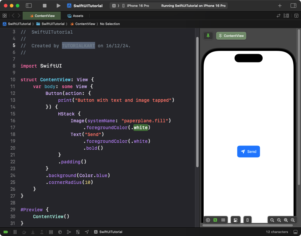
HStackarranges the image and text horizontally within the button. - The
Image(systemName: "paperplane.fill")displays an SF Symbol with a blue color. - The
Text("Send")is styled with white color and bold font for better contrast. - The
.background(Color.blue)and.cornerRadius(10)style the button with a rounded blue background.
Result: A button with a paper plane icon and “Send” text is displayed.
Example 3: Button with a Custom Image
This example uses a custom image asset in a button:
Code Example:
import SwiftUI

struct ContentView: View {
    var body: some View {
        Button(action: {
            print("Custom image button tapped")
        }) {
            Image("customImage") // Custom image from asset catalog
                .resizable()
                .frame(width: 100, height: 100)
        }
        .padding()
    }
}
Explanation:
- The
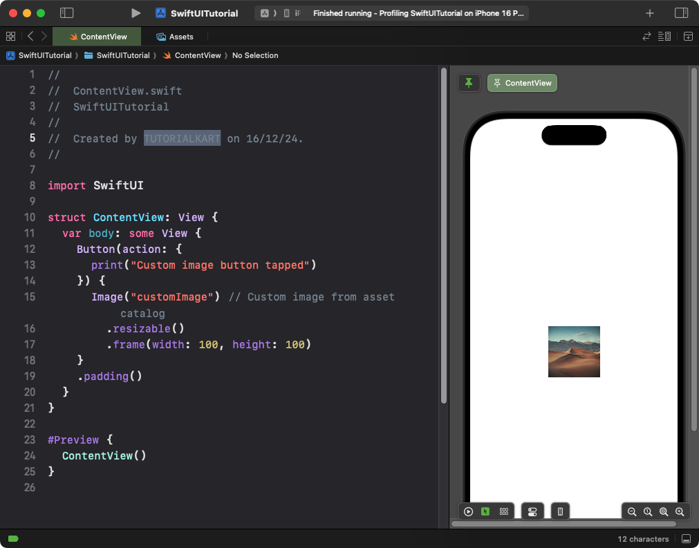
Image("customImage")displays an image from the asset catalog. - The
.resizable()modifier resizes the image to fit within the specified dimensions. - The
.frame(width: 100, height: 100)sets the button’s image size.
Result: A button with a custom image is displayed. When user clicks on the image, the print statement is executed, and the message is printed in the Console.
Example 4: Image Button with Accessibility
This example adds accessibility support for an image-only button:
Code Example:
import SwiftUI

struct ContentView: View {
    var body: some View {
        Button(action: {
            print("Accessibility button tapped")
        }) {
            Image(systemName: "heart.fill")
                .resizable()
                .frame(width: 50, height: 50)
                .foregroundColor(.red)
        }
        .accessibilityLabel("Favorite")
        .padding()
    }
}
Explanation:
- The
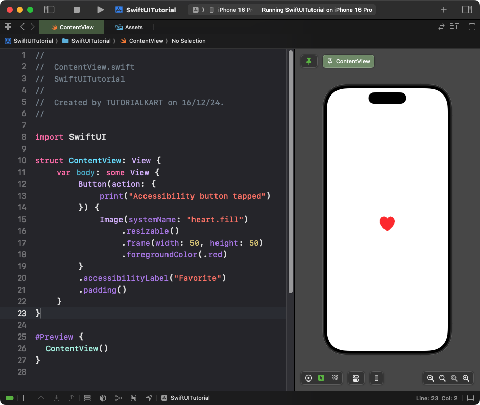
.accessibilityLabel("Favorite")provides a descriptive label for screen readers. - The heart icon is styled with red color and a fixed size of 50×50 points.
Result: A button with a red heart icon and accessible labelling is displayed.
Conclusion
In SwiftUI, buttons with images are versatile and easy to create. Whether you want a standalone image, an image combined with text, or a custom asset, SwiftUI provides powerful tools to design buttons that enhance user experience. Adding accessibility labels ensures your buttons are inclusive and functional for all users.
