SwiftUI – Button with Shadow
In SwiftUI, shadows can add depth and elevate the visual appeal of a Button. By applying the .shadow() modifier, you can easily customise the shadow’s color, radius, and offset, creating buttons that stand out or match your app’s design aesthetic.


This tutorial demonstrates how to create buttons with shadows in SwiftUI, grey shadows, coloured shadows, multicoloured shadows, using practical examples.
Adding Shadows to Buttons
The .shadow() modifier provides a straightforward way to add shadows to any view, including buttons. You can customize the following properties:
- Color: Sets the shadow color.
- Radius: Defines the blur radius of the shadow.
- Offset: Adjusts the shadow’s position using
x(horizontal) andy(vertical) values.
Examples
Let’s explore different ways to apply shadows to buttons in SwiftUI.
Example 1: Basic Button with Shadow
This example adds a simple shadow to a button:
Code Example:
import SwiftUI

struct ContentView: View {
    var body: some View {
        Button(action: {
            print("Button tapped")
        }) {
            Text("Click Me")
                .foregroundColor(.white)
                .padding()
        }
        .background(Color.blue)
        .cornerRadius(10)
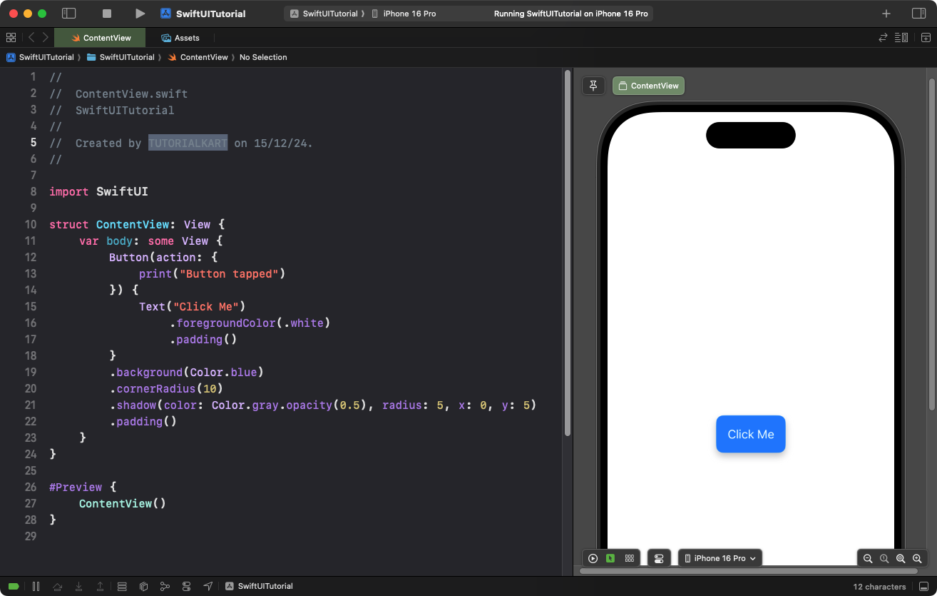
        .shadow(color: Color.gray.opacity(0.5), radius: 5, x: 0, y: 5) // Add shadow
        .padding()
    }
}
Explanation:

- The
.shadow()modifier adds a gray shadow with 50% opacity. - The
radiusparameter creates a blur effect with a value of 5 points. - The
xandyoffsets position the shadow 5 points below the button.
Result: A button with a gray shadow and rounded corners is displayed.
Example 2: Colored Shadow
You can use custom shadow colors to match your app’s theme:
Code Example:
import SwiftUI

struct ContentView: View {
    var body: some View {
        Button(action: {
            print("Colored Shadow Button tapped")
        }) {
            Text("Click Me")
                .foregroundColor(.white)
                .padding()
        }
        .background(Color.green)
        .cornerRadius(12)
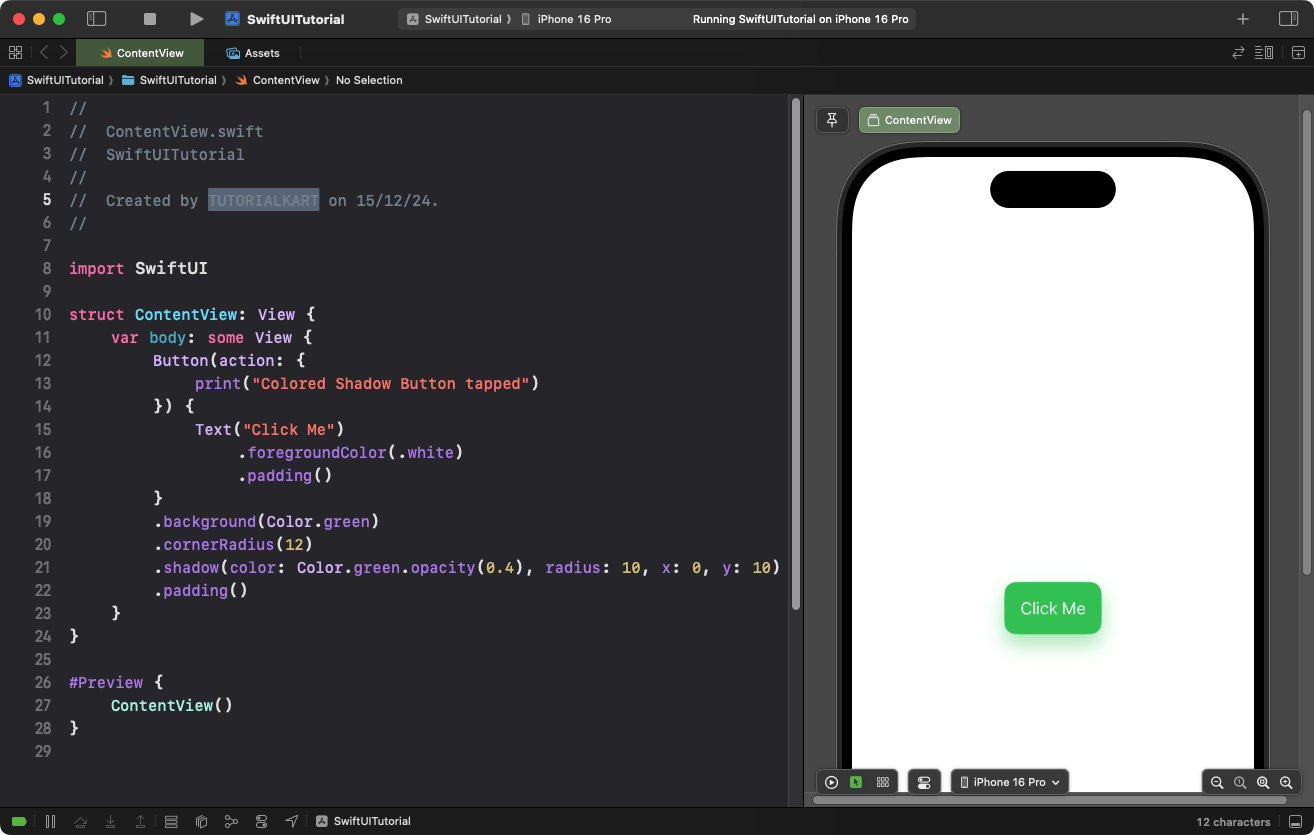
        .shadow(color: Color.green.opacity(0.4), radius: 10, x: 0, y: 10) // Green shadow
        .padding()
    }
}
Explanation:
- The shadow color matches the button’s background color (green) with 40% opacity.
- The larger
radius(10 points) creates a more diffused shadow. - The
xandyoffsets position the shadow 10 points below the button.
Result: A green button with a soft green shadow appears.
Example 3: Elevated Button with Multicolor Shadow
This example uses multiple shadows to create an elevated look:
Code Example:
import SwiftUI

struct ContentView: View {
    var body: some View {
        Button(action: {
            print("Elevated Button tapped")
        }) {
            Text("Click Me")
                .foregroundColor(.white)
                .padding()
                .frame(width: 200)
        }
        .background(Color.orange)
        .cornerRadius(15)
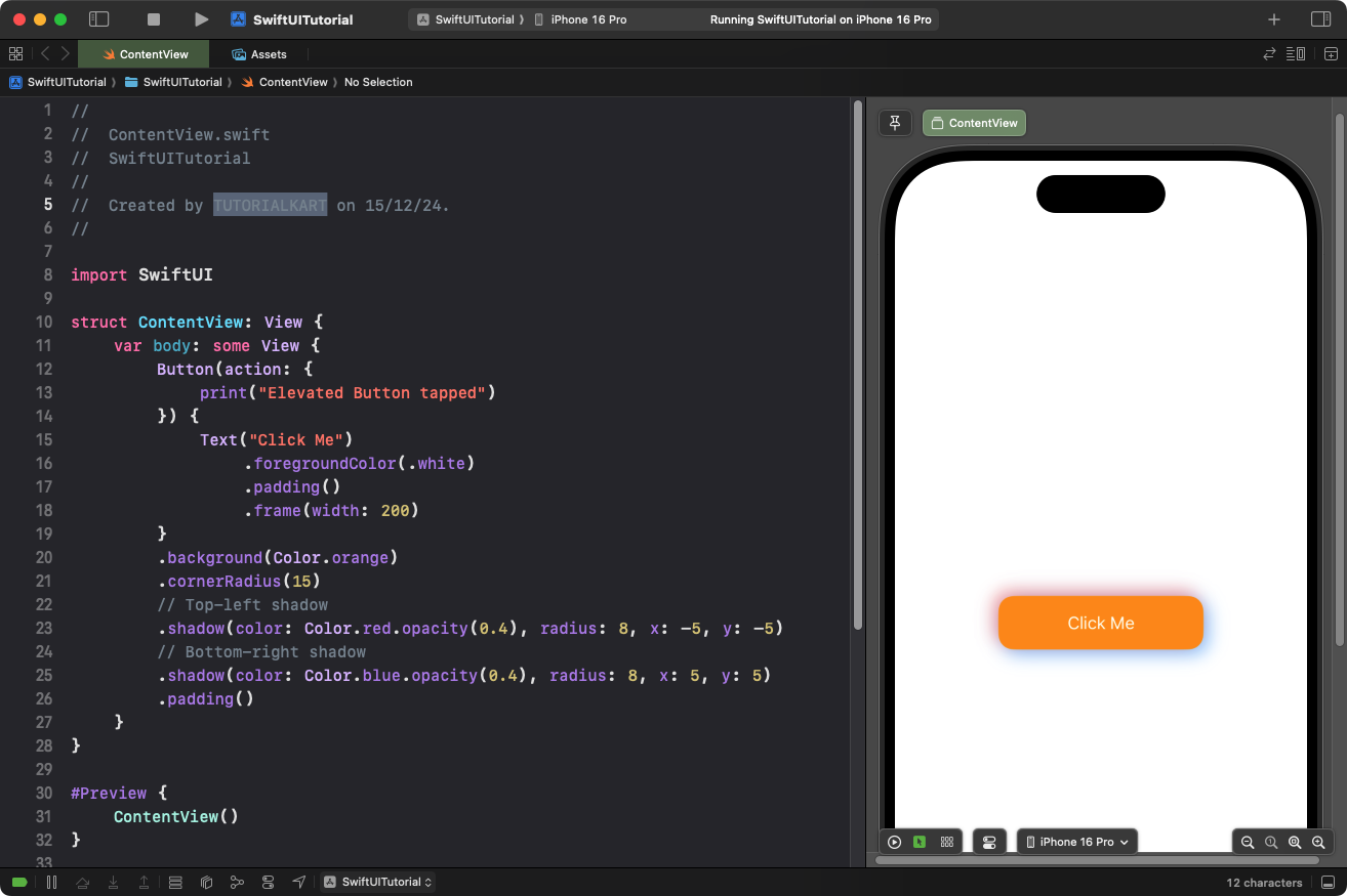
        .shadow(color: Color.red.opacity(0.4), radius: 8, x: -5, y: -5) // Top-left shadow
        .shadow(color: Color.blue.opacity(0.4), radius: 8, x: 5, y: 5) // Bottom-right shadow
        .padding()
    }
}
Explanation:
- Two shadows are applied to the button for a multi-directional, elevated effect.
- The first shadow (red) is positioned to the top-left using negative
xandyoffsets. - The second shadow (blue) is positioned to the bottom-right using positive
xandyoffsets. - The
.cornerRadius(15)ensures the shadows align with the button’s rounded corners.
Result: An orange button with a multicolor shadow effect is displayed, creating an elevated look.
Conclusion
Adding shadows to SwiftUI buttons enhances their visual appeal and helps them stand out. Whether you’re using simple shadows, colored shadows, or multi-shadow effects for elevation, SwiftUI’s .shadow() modifier provides the flexibility to create unique and engaging button designs.
