SwiftUI Circle
The Circle in SwiftUI is a simple and versatile shape used to create circular UI elements. It can be customised with colors, borders, gradients, and overlays, making it ideal for creating icons, buttons, and decorative elements in your app.

In this tutorial, we’ll explore how to use the Circle shape, customise it with various styles, and apply it in different contexts.
Basic Syntax of Circle
The basic syntax of a Circle is:
Circle()
    .frame(width: 100, height: 100)
    .foregroundColor(.blue)
Here:
Circle(): Creates a circular shape..frame(width: 100, height: 100): Sets the size of the circle..foregroundColor(.blue): Fills the circle with a blue color.
Examples of Circle in SwiftUI
Let’s look at examples demonstrating how to use and customise the Circle shape in SwiftUI.
Example 1: Basic Circle
This example creates a simple circle with a fixed size and color:
Code Example:
import SwiftUI

struct ContentView: View {
    var body: some View {
        Circle()
            .fill(Color.blue)
            .frame(width: 150, height: 150)
    }
}
Xcode Screenshot:
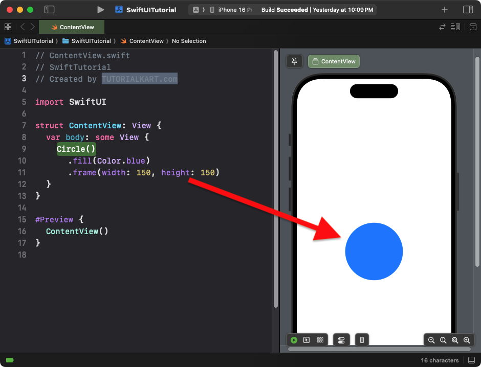
Explanation:
- The
Circleis filled with a blue color using.fill(Color.blue). - The
.framesets the circle’s size to 150×150.
Result: A blue circle with a diameter of 150 points.
Example 2: Circle with Border
This example adds a border to the circle:
Code Example:
import SwiftUI

struct ContentView: View {
    var body: some View {
        Circle()
            .stroke(Color.red, lineWidth: 5)
            .frame(width: 120, height: 120)
    }
}
Xcode Screenshot:
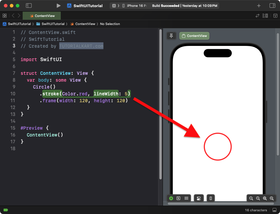
Explanation:
- The
.stroke()modifier adds a red border to the circle. - The
lineWidthspecifies the thickness of the border.
Result: A circle with a red border and no fill.
Example 3: Circle with Gradient
This example applies a gradient fill to the circle:
Code Example:
import SwiftUI

struct ContentView: View {
    var body: some View {
        Circle()
            .fill(LinearGradient(
                gradient: Gradient(colors: [.blue, .purple]),
                startPoint: .top,
                endPoint: .bottom
            ))
            .frame(width: 200, height: 200)
    }
}
Xcode Screenshot:
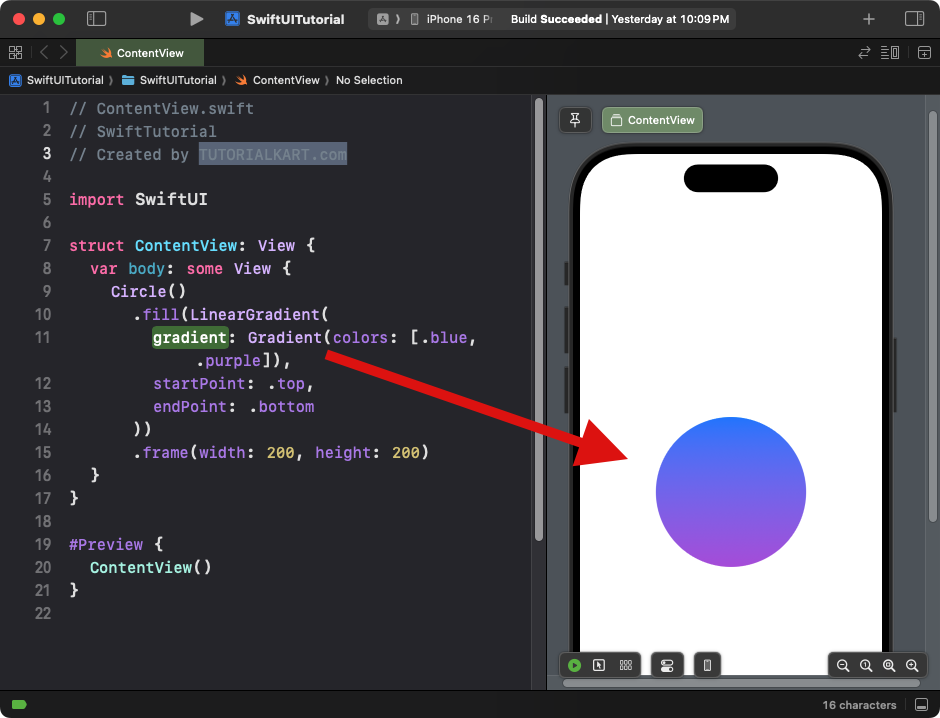
Explanation:
- The circle is filled with a gradient transitioning from blue to purple.
- The
.framesets the size of the circle to 200×200.
Result: A gradient-filled circle with smooth color transitions.
Example 4: Circle with Overlay
This example overlays text on top of the circle:
Code Example:
import SwiftUI

struct ContentView: View {
    var body: some View {
        Circle()
            .fill(Color.green)
            .frame(width: 150, height: 150)
            .overlay(
                Text("SwiftUI")
                    .font(.headline)
                    .foregroundColor(.white)
            )
    }
}
Xcode Screenshot:
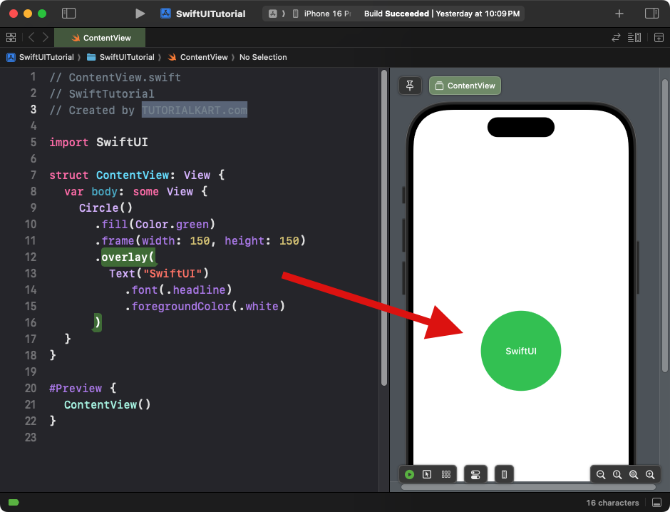
Explanation:
- The
.overlay()modifier places a text view on top of the circle. - The circle acts as a background for the text.
Result: A green circle with centered text saying “SwiftUI.”
Example 5: Circle as a Button
This example demonstrates how to use a circle as a button:
Code Example:
import SwiftUI

struct ContentView: View {
    var body: some View {
        Button(action: {
            print("Circle Button Tapped!")
        }) {
            Circle()
                .fill(Color.orange)
                .frame(width: 100, height: 100)
                .overlay(
                    Image(systemName: "star.fill")
                        .foregroundColor(.white)
                        .font(.largeTitle)
                )
        }
    }
}
Xcode Screenshot:
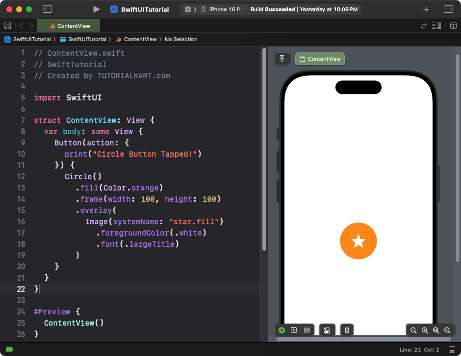
Explanation:
- The
Buttonwraps a circle with an orange fill. - An SF Symbol icon (star) is overlaid on the circle.
- The button is clickable, and an action is triggered when tapped.
Result: A circular button with a star icon in the center.
Conclusion
The Circle in SwiftUI is a powerful shape for creating simple, clean, and visually appealing UI elements. With modifiers like .fill(), .stroke(), .overlay(), and gradients, you can customise circles to fit a wide range of design requirements, from buttons to decorative components.
