SwiftUI DatePicker
In SwiftUI, the DatePicker is a built-in control that allows users to select dates and times. It is versatile, highly customizable, and supports date, time, and combined date-time selections. Date pickers are commonly used in forms, calendars, and scheduling features.
This tutorial will cover the usage of DatePicker in SwiftUI with practical examples, including its customisation and constraints.
Basic Syntax of DatePicker
The basic syntax for creating a DatePicker is:
DatePicker("Label", selection: $date)Here:
"Label": The label displayed next to the picker.$date: A binding to aDateproperty that stores the selected date and/or time.
You can further customize the DatePicker to display only dates, only times, or both, and specify date ranges.
Examples of DatePicker
Let’s explore how to use and customize DatePicker in SwiftUI with different scenarios.
Example 1: Basic DatePicker
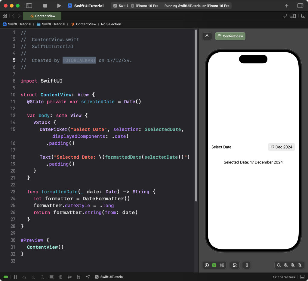
This example demonstrates a simple DatePicker that allows date selection:
Code Example:
import SwiftUI

struct ContentView: View {
    @State private var selectedDate = Date()

    var body: some View {
        VStack {
            DatePicker("Select Date", selection: $selectedDate, displayedComponents: .date)
                .padding()

            Text("Selected Date: \(formattedDate(selectedDate))")
                .padding()
        }
    }

    func formattedDate(_ date: Date) -> String {
        let formatter = DateFormatter()
        formatter.dateStyle = .long
        return formatter.string(from: date)
    }
}
Xcode Screenshot:

Explanation:
- The
DatePickeris bound to theselectedDatestate variable. - The
displayedComponents: .dateensures only the date is shown (not time). - The
Textview displays the formatted date using aDateFormatter.
Result: A date picker with a calendar interface to select a date.
Example 2: DatePicker with Time Selection
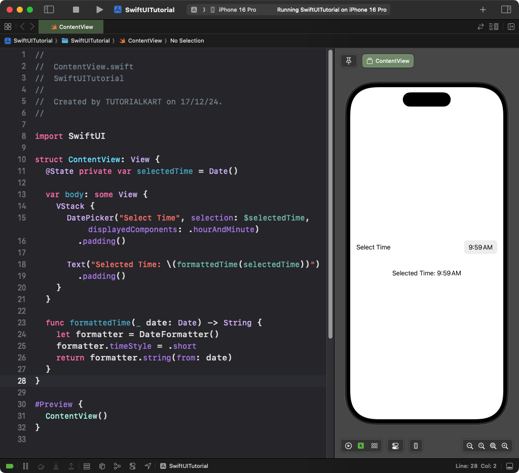
This example demonstrates how to use DatePicker for selecting time only:
Code Example:
import SwiftUI

struct ContentView: View {
    @State private var selectedTime = Date()

    var body: some View {
        VStack {
            DatePicker("Select Time", selection: $selectedTime, displayedComponents: .hourAndMinute)
                .padding()

            Text("Selected Time: \(formattedTime(selectedTime))")
                .padding()
        }
    }

    func formattedTime(_ date: Date) -> String {
        let formatter = DateFormatter()
        formatter.timeStyle = .short
        return formatter.string(from: date)
    }
}
Xcode Screenshot:

Explanation:
- The
displayedComponents: .hourAndMinuteensures only time (hours and minutes) is displayed. - The
formattedTimefunction formats the selected time using aDateFormatter.
Result: A time picker to select hours and minutes.
Example 3: DatePicker with Date Range
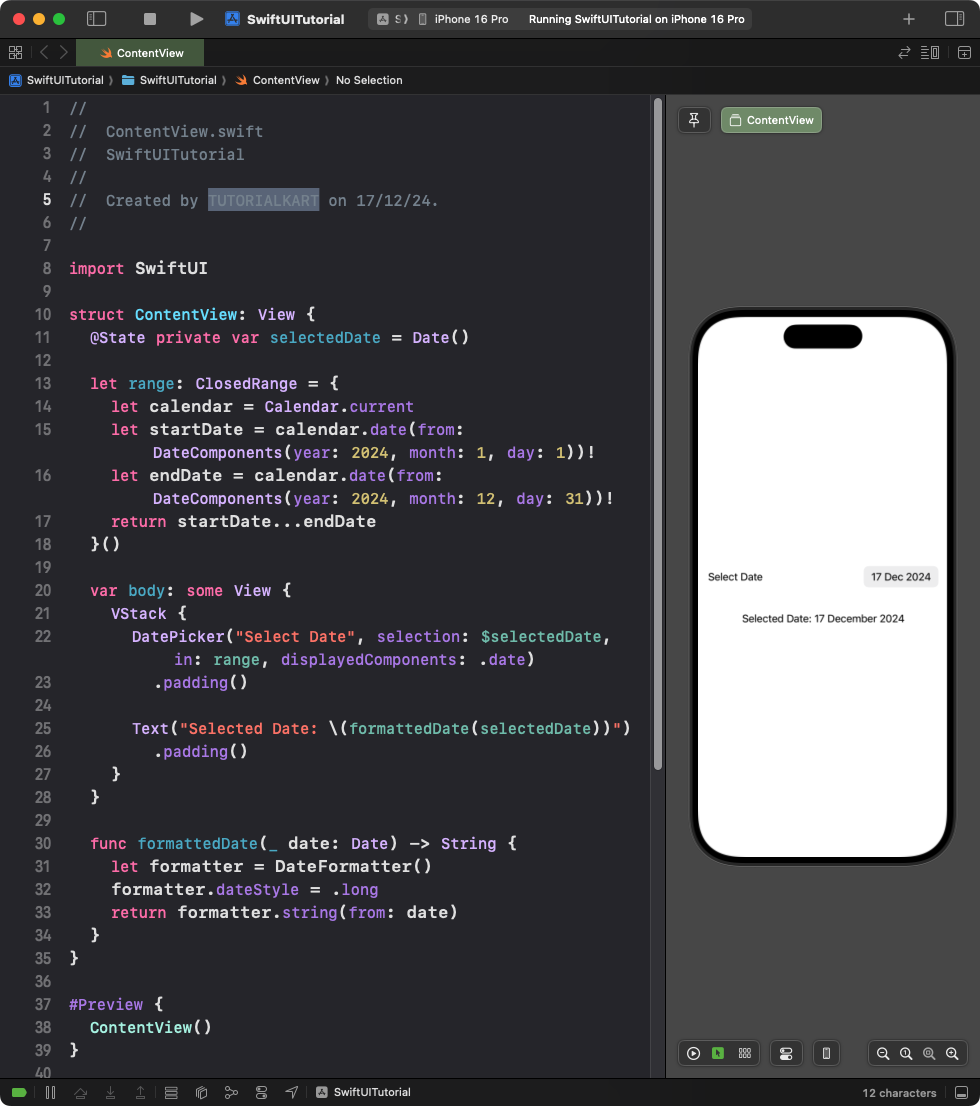
This example limits the date selection to a specific range:
Code Example:
import SwiftUI

struct ContentView: View {
    @State private var selectedDate = Date()

    let range: ClosedRange = {
        let calendar = Calendar.current
        let startDate = calendar.date(from: DateComponents(year: 2024, month: 1, day: 1))!
        let endDate = calendar.date(from: DateComponents(year: 2024, month: 12, day: 31))!
        return startDate...endDate
    }()

    var body: some View {
        VStack {
            DatePicker("Select Date", selection: $selectedDate, in: range, displayedComponents: .date)
                .padding()

            Text("Selected Date: \(formattedDate(selectedDate))")
                .padding()
        }
    }

    func formattedDate(_ date: Date) -> String {
        let formatter = DateFormatter()
        formatter.dateStyle = .long
        return formatter.string(from: date)
    }
}
Xcode Screenshot:

Explanation:
- The
rangedefines a closed date range from January 1 to December 31 of 2024. - The
in: rangeparameter restricts the date picker to this range.
Result: A date picker with a calendar restricted to a specific range.
Example 4: Inline DatePicker
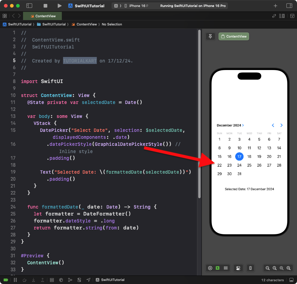
This example displays the date picker inline instead of as a dropdown:
Code Example:
import SwiftUI

struct ContentView: View {
    @State private var selectedDate = Date()

    var body: some View {
        VStack {
            DatePicker("Select Date", selection: $selectedDate, displayedComponents: .date)
                .datePickerStyle(GraphicalDatePickerStyle()) // Inline style
                .padding()

            Text("Selected Date: \(formattedDate(selectedDate))")
                .padding()
        }
    }

    func formattedDate(_ date: Date) -> String {
        let formatter = DateFormatter()
        formatter.dateStyle = .long
        return formatter.string(from: date)
    }
}
Xcode Screenshot:

Explanation:
- The
.datePickerStyle(GraphicalDatePickerStyle())modifier displays the date picker inline as a calendar. - This style is useful for displaying full-size date pickers in forms or scheduling interfaces.
Result: An inline date picker styled as a graphical calendar.
Conclusion
SwiftUI’s DatePicker is a versatile control for date and time selection. With support for range constraints, inline styles, and customisable components, it can adapt to various user interface needs, making it ideal for forms, calendars, and scheduling features.
Reference:
https://developer.apple.com/documentation/swiftui/datepicker
