SwiftUI Gauge
In SwiftUI, the Gauge view is a control used to display progress or a specific value within a defined range. It provides a visual representation, often in the form of a circular or linear indicator, making it ideal for tasks such as displaying battery levels, temperatures, or progress percentages.
Introduced in iOS 16, the Gauge view is a modern, flexible, and customisable component in SwiftUI.
Basic Syntax of Gauge
The basic syntax for creating a Gauge is as follows:
Gauge(value: currentValue, in: range) {
    Text("Label")
}
Here:
currentValue: The current value displayed by the gauge.range: The minimum and maximum range for the gauge.Label: Optional text that describes the gauge.
The gauge can be further customized with style modifiers to display circular or linear indicators.
Examples of SwiftUI Gauge
Let’s explore various examples to demonstrate how to use and customise the Gauge in SwiftUI.
Example 1: Basic Usage of Gauge
This example creates a basic gauge that displays a progress value:
Code Example:
import SwiftUI

struct ContentView: View {
    @State private var currentValue = 50.0

    var body: some View {
        VStack {
            Gauge(value: currentValue, in: 0...100) {
                Text("Progress")
            }
            .padding()

            Text("Value: \(Int(currentValue))%")
                .font(.headline)
        }
    }
}
Xcode Screenshot:
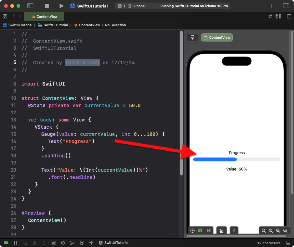
Explanation:
- The
Gaugedisplays thecurrentValuewithin a range of 0 to 100. - The text label
"Progress"provides a description for the gauge. - The current value is displayed as a percentage below the gauge.
Result: A gauge with a progress bar displaying 50% progress.
Example 2: Circular Gauge with Labels
This example creates a circular gauge with a custom range and current value label:
Code Example:
import SwiftUI

struct ContentView: View {
    @State private var progress = 30.0

    var body: some View {
        VStack {
            Gauge(value: progress, in: 0...100) {
                Text("Battery Level")
            } currentValueLabel: {
                Text("\(Int(progress))%")
            }
            .gaugeStyle(.accessoryCircular)
            .tint(.green)
            .frame(width: 150, height: 150)

            Slider(value: $progress, in: 0...100, step: 1)
                .padding()
        }
    }
}
Xcode Screenshot:
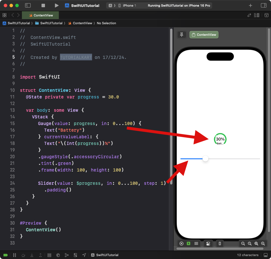
Explanation:
- The
.gaugeStyle(.accessoryCircular)modifier displays the gauge as a circular progress indicator. - The
currentValueLabelshows the current value inside the circular gauge. - The
Sliderallows dynamic updates to the gauge’s progress.
Result: A circular gauge displays the battery level as a percentage.
Example 3: Gauge with Range Labels
This example shows a gauge with minimum and maximum range labels:
Code Example:
import SwiftUI

struct ContentView: View {
    @State private var speed = 40.0

    var body: some View {
        VStack {
            Gauge(value: speed, in: 0...120) {
                Text("Speed")
            } currentValueLabel: {
                Text("\(Int(speed)) km/h")
            } minimumValueLabel: {
                Text("0")
            } maximumValueLabel: {
                Text("120")
            }
            .gaugeStyle(.linearCapacity)
            .tint(.orange)
            .padding()

            Slider(value: $speed, in: 0...120, step: 1)
                .padding()
        }
    }
}
Xcode Screenshot:
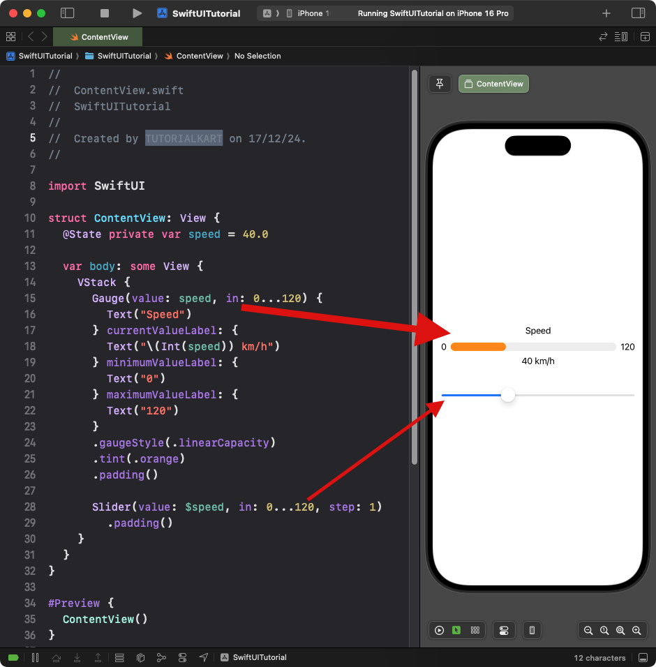
Explanation:
- The
minimumValueLabelandmaximumValueLabelshow the range limits of the gauge. - The
.gaugeStyle(.linearCapacity)modifier displays the gauge as a horizontal progress bar with range labels. - The
Sliderdynamically adjusts the speed value.
Result: A linear gauge with range labels displays the current speed value.
Conclusion
SwiftUI’s Gauge view is a flexible and customizable control for visually representing values within a range. Whether you need circular or linear progress indicators, the Gauge can be styled and adapted to suit your app’s requirements, such as progress tracking, battery levels, or speed indicators.