SwiftUI Grid
In SwiftUI, the Grid view is a layout container introduced in iOS 16 that arranges its child views into rows and columns. It is a flexible and powerful tool for creating structured layouts, such as dashboards, calendars, or gallery views.
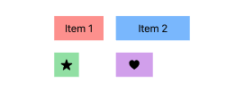
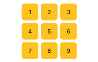
With the Grid, you can easily specify how views align within rows and columns and dynamically create grid structures to adapt to different content.
Basic Syntax of Grid
The basic structure of a SwiftUI Grid looks like this:
Grid {
    GridRow {
        View1()
        View2()
    }
    GridRow {
        View3()
        View4()
    }
}
Here:
Grid: A container that organizes its child views into rows and columns.GridRow: Defines a single row within the grid. Child views in a row are laid out horizontally.
Examples of SwiftUI Grid
Let’s explore how to use the Grid view with practical examples, including simple grids, grids with dynamic content, and customized layouts.
Example 1: Basic Grid with Static Content
This example demonstrates a simple grid with static content arranged into rows and columns.
Code Example:
import SwiftUI

struct ContentView: View {
    var body: some View {
        Grid {
            GridRow {
                Color.red.frame(width: 50, height: 50)
                Color.blue.frame(width: 50, height: 50)
                Color.green.frame(width: 50, height: 50)
            }
            GridRow {
                Text("Red") // row2, column1
                Text("Blue") // row2, column2
                Text("Green") // row2, column3
            }
        }
        .padding()
    }
}
Xcode Screenshot:
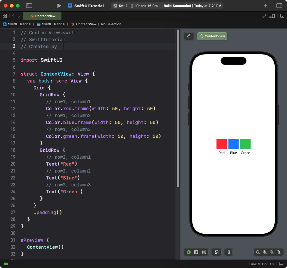
Explanation:
- The grid has two rows: the first row contains colored squares, and the second row contains text views.
- Each
GridRowarranges its child views horizontally in a row.
Result: A grid with two rows and three columns. The first row contains colored squares, and the second row contains text labels.
Example 2: Grid with Dynamic Content
This example dynamically generates a grid layout using a loop.
Code Example:
import SwiftUI

struct ContentView: View {
    let items = Array(1...9)

    var body: some View {
        Grid {
            ForEach(0..<3) { row in
                GridRow {
                    ForEach(0..<3) { column in
                        Text("\(items[row * 3 + column])")
                            .frame(width: 50, height: 50)
                            .background(Color.yellow)
                            .cornerRadius(8)
                    }
                }
            }
        }
        .padding()
    }
}
Xcode Screenshot:
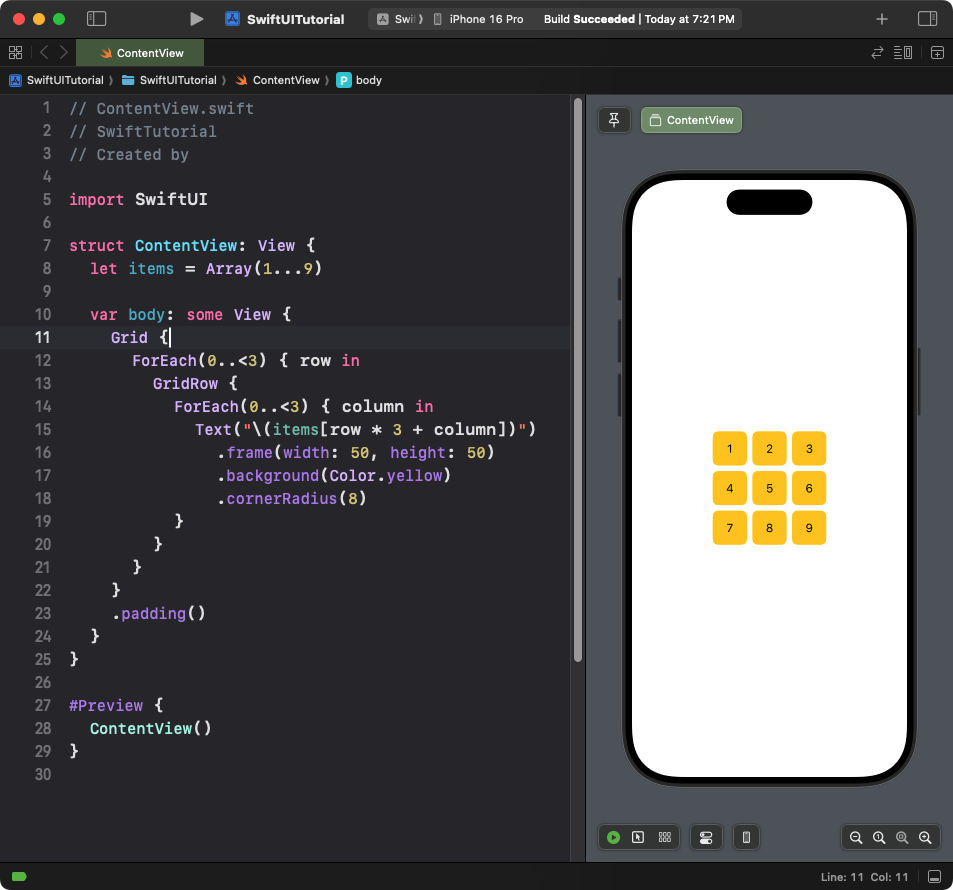
Explanation:
- The grid is dynamically generated using nested
ForEachloops. - The outer loop creates rows, and the inner loop creates columns within each row.
- Each grid cell displays a number from the
itemsarray.
Result: A 3×3 grid where each cell contains a number.
Example 3: Customised Grid Layout
This example customizes the grid layout with different view sizes and alignments.
Code Example:
import SwiftUI

struct ContentView: View {
    var body: some View {
        Grid(alignment: .leading, horizontalSpacing: 20, verticalSpacing: 20) {
            GridRow {
                Text("Item 1")
                    .frame(width: 80, height: 40)
                    .background(Color.red.opacity(0.5))
                Text("Item 2")
                    .frame(width: 120, height: 40)
                    .background(Color.blue.opacity(0.5))
            }

            GridRow {
                Image(systemName: "star.fill")
                    .frame(width: 40, height: 40)
                    .background(Color.green.opacity(0.5))
                Image(systemName: "heart.fill")
                    .frame(width: 60, height: 40)
                    .background(Color.purple.opacity(0.5))
            }
        }
        .padding()
    }
}
Xcode Screenshot:
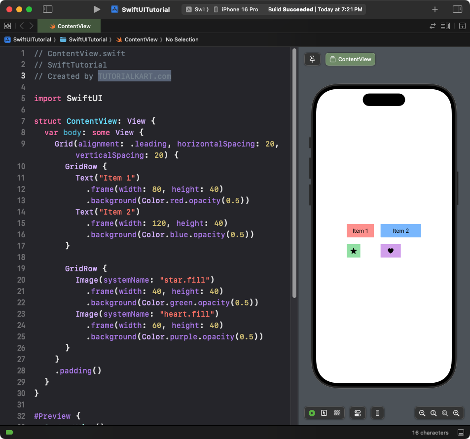
Explanation:
- The grid uses custom horizontal and vertical spacing with the
horizontalSpacingandverticalSpacingmodifiers. - Each row contains views of different sizes.
- The grid aligns its content to the leading edge.
Result: A grid with two rows and customized cell sizes, alignments, and spacing.
Example 4: Grid with Mixed Content
This example combines different types of views within a grid:
Code Example:
import SwiftUI

struct ContentView: View {
    var body: some View {
        Grid {
            GridRow {
                Text("Text Label")
                    .font(.headline)
                Image(systemName: "sun.max.fill")
                    .foregroundColor(.orange)
            }

            GridRow {
                Rectangle()
                    .fill(Color.pink)
                    .frame(width: 100, height: 50)
                Text("Custom Shape")
            }
        }
        .padding()
    }
}
Xcode Screenshot:
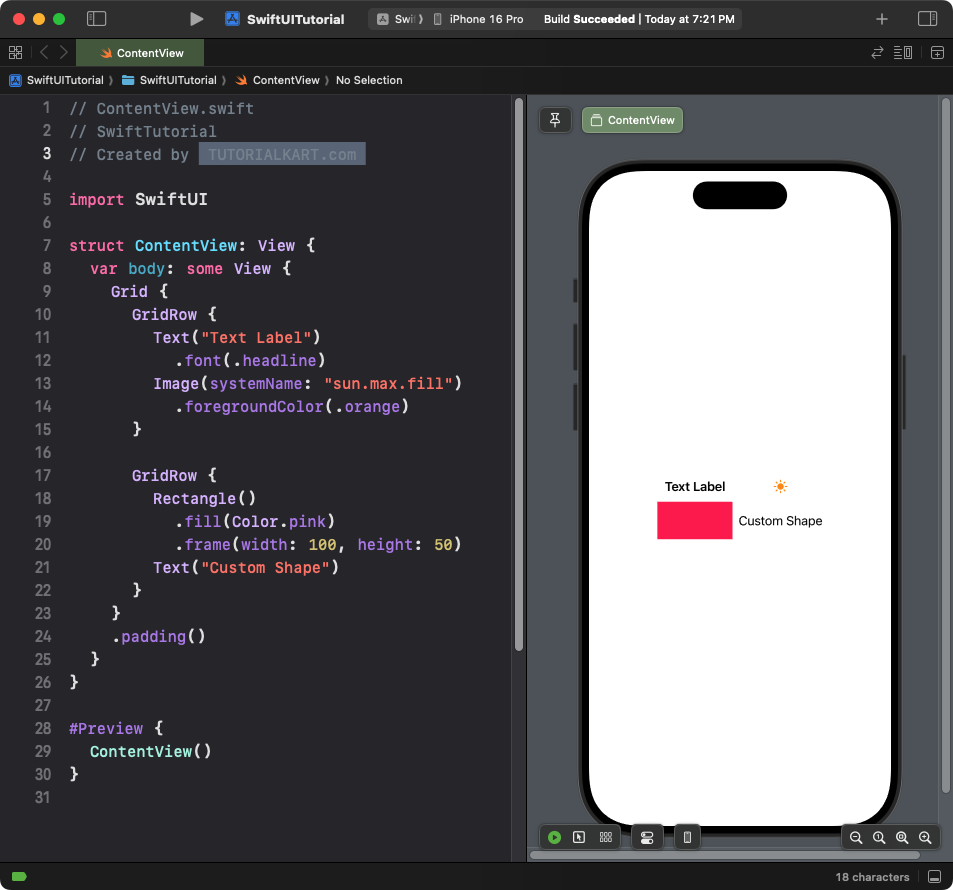
Explanation:
- The grid combines
Text,Image, and customRectangleviews. - Each row mixes different types of content to demonstrate the grid’s flexibility.
Result: A grid with mixed content types, including text, images, and shapes.
Conclusion
SwiftUI’s Grid view is a powerful layout tool for arranging views into rows and columns. It supports both static and dynamic content, custom spacing, and alignment, making it ideal for building complex and structured user interfaces in SwiftUI.
