SwiftUI – Image
In SwiftUI, the Image view is used to display images in your app. It supports both system-provided images (SF Symbols) and custom images added to your asset catalog. SwiftUI’s Image view offers several modifiers to customize the appearance and behavior of your images, making it a versatile tool for designing user interfaces.
In this SwiftUI tutorial, we’ll explore how to use the Image view, load images from different sources, and apply various customizations.
Basic Syntax for Image
The basic syntax for creating an Image view is:
Image("imageName")where:
"imageName": The name of the image file in your asset catalog or bundle.
For system images, you can use:
Image(systemName: "sfSymbolName")Here, sfSymbolName is the name of an SF Symbol from Apple’s icon library.
Examples
Let’s explore some examples to understand how to use and customize images in SwiftUI.
Example 1: Displaying an Image from Assets
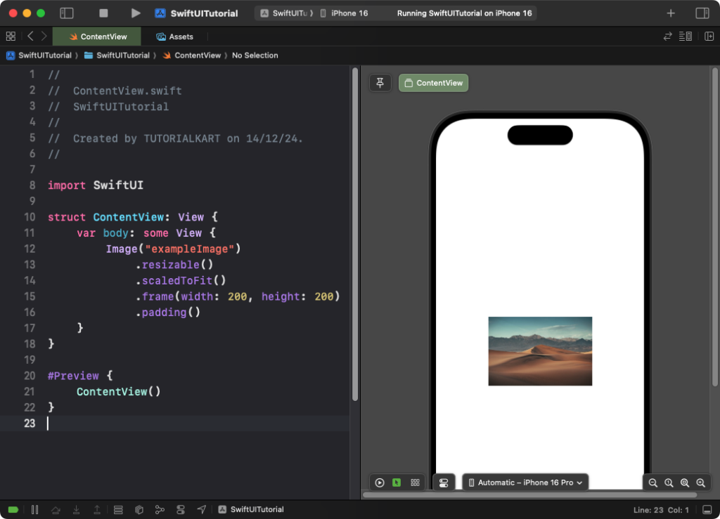
This example demonstrates how to display an image added to your asset catalog.
Code Example:
import SwiftUI

struct ContentView: View {
    var body: some View {
        Image("exampleImage")
            .resizable()
            .scaledToFit()
            .frame(width: 200, height: 200)
            .padding()
    }
}

Explanation:
.resizable(): Makes the image resizable to fit within the specified frame..scaledToFit(): Ensures the image retains its aspect ratio while fitting within the frame..frame(width: 200, height: 200): Defines the width and height of the image.
Result: The image from your assets is displayed in a 200×200 frame, maintaining its aspect ratio.
Example 2: Displaying a System Image
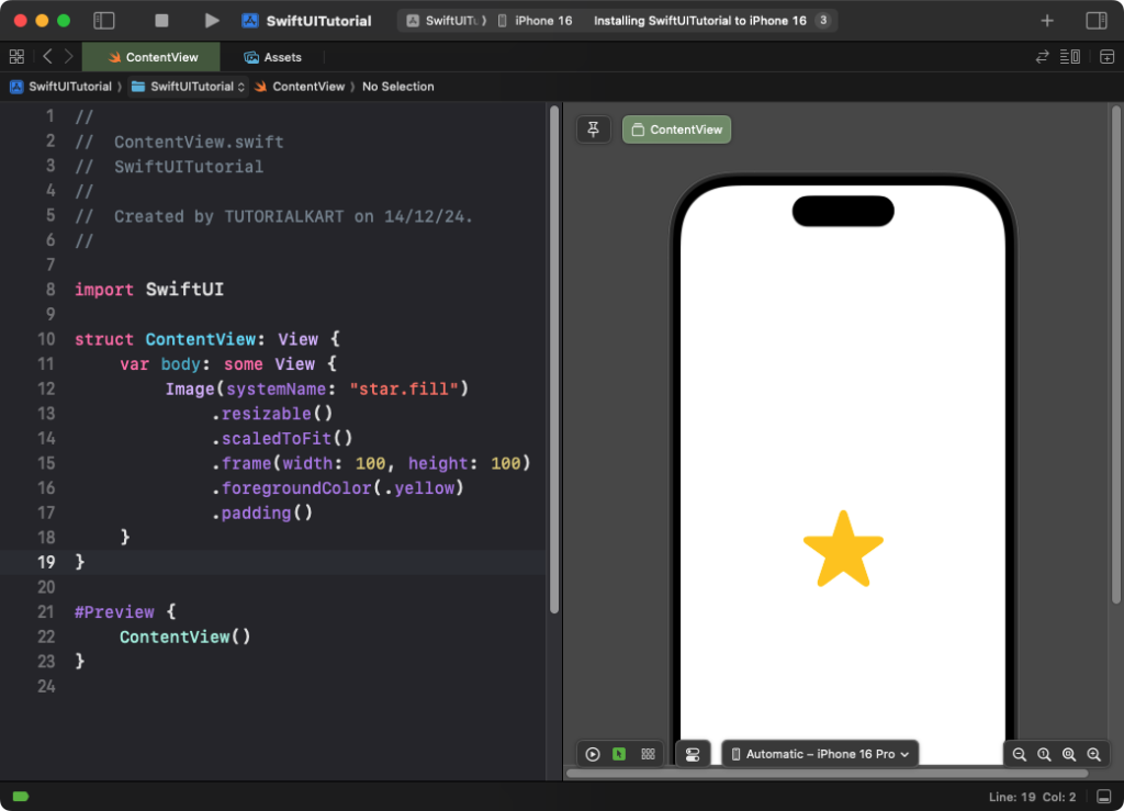
You can use SF Symbols to display system images:
Code Example:
import SwiftUI

struct ContentView: View {
    var body: some View {
        Image(systemName: "star.fill")
            .resizable()
            .scaledToFit()
            .frame(width: 100, height: 100)
            .foregroundColor(.yellow)
            .padding()
    }
}
Explanation:
Image(systemName: "star.fill"): Displays the SF Symbol for a filled star..foregroundColor(.yellow): Changes the color of the symbol to yellow..resizable()and.scaledToFit(): Ensure the image scales properly.
Result: A resizable, yellow star icon is displayed in a 100×100 frame.
Example 3: Adding a Background to an Image
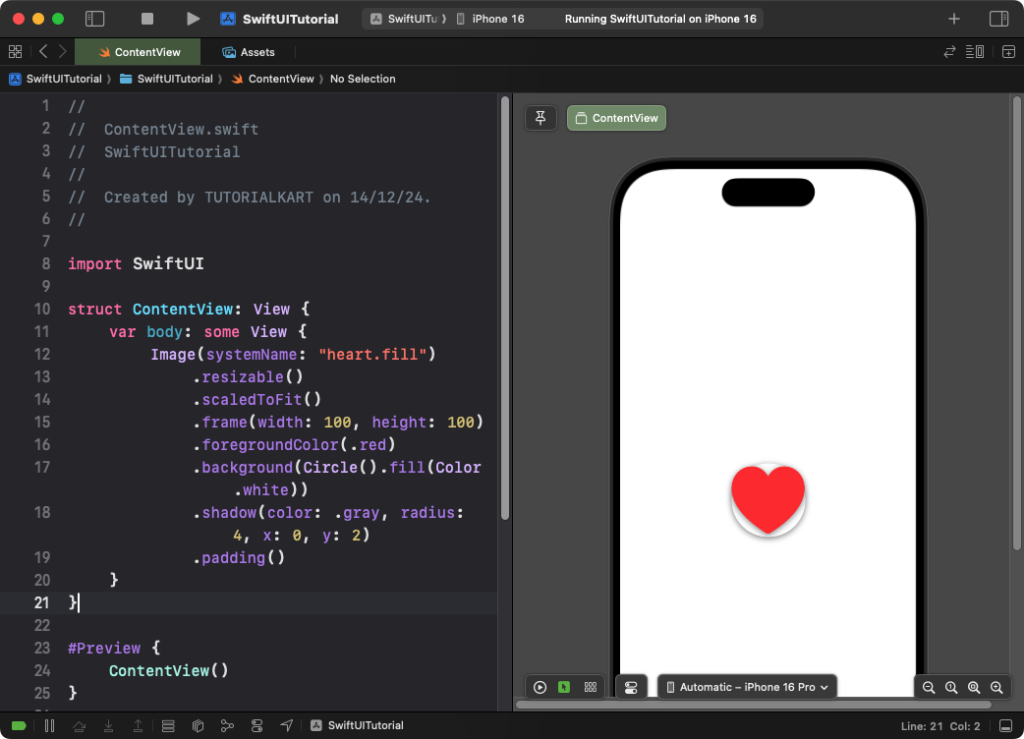
You can add a background and style the image further:
Code Example:
import SwiftUI

struct ContentView: View {
    var body: some View {
        Image(systemName: "heart.fill")
            .resizable()
            .scaledToFit()
            .frame(width: 100, height: 100)
            .foregroundColor(.red)
            .background(Circle().fill(Color.white))
            .shadow(color: .gray, radius: 4, x: 0, y: 2)
            .padding()
    }
}
Explanation:
.background(Circle().fill(Color.white)): Adds a circular white background behind the image..shadow(color: .gray, radius: 4, x: 0, y: 2): Adds a shadow to the image for depth.
Result: A red heart icon is displayed with a circular white background and a subtle shadow.
Conclusion
The Image view in SwiftUI provides a simple yet powerful way to display and customize images in your app. Whether you’re working with asset images or SF Symbols, SwiftUI offers numerous modifiers to create polished and professional image designs.
