SwiftUI Image Corner Radius
In SwiftUI, the .cornerRadius() modifier allows you to round the corners of an image easily. This feature is widely used to enhance the aesthetics of an app by softening sharp edges and creating a more polished design.


In this tutorial, we will demonstrate how to apply corner radius effects to images with examples.
When to Use Corner Radius
Applying a corner radius is useful in scenarios like:
- Designing card-like UI components with rounded edges.
- Creating soft, modern layouts.
- Highlighting images without harsh corners.
Syntax to Apply Corner Radius
Here’s the basic syntax for applying a corner radius to an image:
Image("imageName")
    .cornerRadius(radius)
Here, radius is a CGFloat value that determines the curvature of the corners.
Examples to Apply Corner Radius
In the following examples, we demonstrate how to apply corner radius effects to images and display them side by side with the original images.
Example 1: Applying Standard Corner Radius to Image
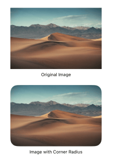
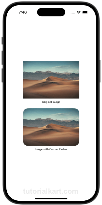
In this example, we apply a moderate corner radius to an image and display it below the original image.
File: ContentView.swift
// ContentView.swift
// Created by TUTORIALKART.com

import SwiftUI

struct ContentView: View {
  var body: some View {
    VStack {
      StandardCornerRadiusImageView()
    }
  }
}

struct StandardCornerRadiusImageView: View {
  var body: some View {
    VStack(spacing: 20) {
      VStack {
        Image("sampleImage")
          .resizable()
          .scaledToFit()
          .frame(width: 250)

        Text("Original Image")
          .font(.caption)
      }

      VStack {
        Image("sampleImage")
          .resizable()
          .scaledToFit()
          .frame(width: 250)
          .cornerRadius(20)

        Text("Image with Corner Radius")
          .font(.caption)
      }
    }
    .padding()
  }
}

#Preview {
  ContentView()
}
Detailed Explanation
- VStack: Aligns the original and corner-radius-applied images vertically for better visual presentation.
- Original Image: Displays the image without any corner radius.
- Modified Image: Applies a corner radius of 20 points using
.cornerRadius(20). - .frame: Sets the width of both images to 250 points for improved visibility.
Output

Example 2: Applying Large Corner Radius of 50 Points to Image
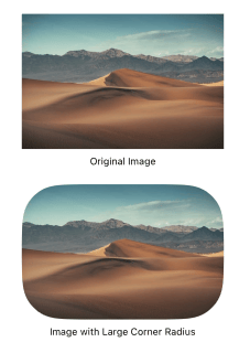
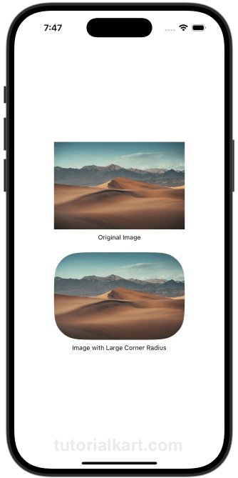
In this example, we apply a larger corner radius to an image for a more pronounced effect.
File: ContentView.swift
// ContentView.swift
// Created by TUTORIALKART.com

import SwiftUI

struct ContentView: View {
  var body: some View {
    VStack {
      LargeCornerRadiusImageView()
    }
  }
}

struct LargeCornerRadiusImageView: View {
  var body: some View {
    VStack(spacing: 20) {
      VStack {
        Image("sampleImage")
          .resizable()
          .scaledToFit()
          .frame(width: 250)

        Text("Original Image")
          .font(.caption)
      }

      VStack {
        Image("sampleImage")
          .resizable()
          .scaledToFit()
          .frame(width: 250)
          .cornerRadius(50)

        Text("Image with Large Corner Radius")
          .font(.caption)
      }
    }
    .padding()
  }
}

#Preview {
  ContentView()
}
Detailed Explanation
- VStack: Aligns the original and corner-radius-applied images vertically for better visual presentation.
- Original Image: Displays the image without any corner radius.
- Modified Image: Applies a corner radius of 50 points using
.cornerRadius(50)for a more dramatic effect. - .frame: Sets the width of both images to 250 points for improved visibility.
Output

Conclusion
Applying corner radius to images in SwiftUI is an easy and effective way to create polished, modern designs. By using the .cornerRadius() modifier, you can achieve subtle or dramatic rounding effects that fit your app’s aesthetic needs.
