SwiftUI Image Tint
In SwiftUI, the Image view allows you to apply a tint color to images. Tinted images are particularly useful when using system icons or creating consistent themes in your app. The .foregroundColor modifier can be used to set the tint color for an image.


In this tutorial, we will guide you through applying tint colors to images in SwiftUI with two examples.
When to Use Tint Colors
Applying tint colors is beneficial in scenarios like:
- Customizing the appearance of system icons.
- Maintaining a consistent theme or color palette in your app.
- Highlighting or visually distinguishing specific images.
Syntax to Apply Tint Color
Here’s a basic syntax for applying a tint color using the .foregroundColor modifier:
Image(systemName: "iconName")
    .foregroundColor(Color.tint)
For custom tint effects with transparency, you can use the following syntax:
ZStack {
    Image("imageName")
        .resizable()
        .scaledToFit()
        .frame(width: customWidth, height: customHeight)

    Rectangle()
        .fill(Color.tint.opacity(opacityValue))
        .blendMode(.overlay)
        .frame(width: customWidth, height: customHeight)
}
.compositingGroup()
Examples to Apply Tint Color
In the following examples, we take a system image and a custom image to demonstrate the use of tint colors.
Example 1: Tinting a System Image
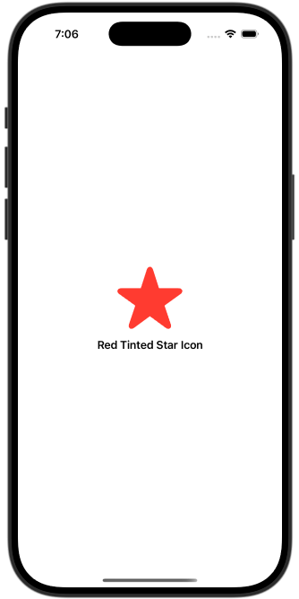
In this example, we apply a red tint color to a system image using the .foregroundColor modifier.
File: ContentView.swift
// ContentView.swift
// SwiftTutorial
// Created by TUTORIALKART.com

import SwiftUI

struct ContentView: View {
  var body: some View {
    VStack {
      SystemImageTintView()
    }
    .padding()
  }
}

struct SystemImageTintView: View {
  var body: some View {
    VStack {
      Image(systemName: "star.fill")
        .resizable()
        .scaledToFit()
        .frame(width: 100, height: 100)
        .foregroundColor(.red)

      Text("Red Tinted Star Icon")
        .font(.headline)
    }
    .padding()
  }
}

#Preview {
  ContentView()
}
Detailed Explanation
- Image: The
Imageview loads thestar.fillsystem icon. - .resizable(): Makes the image scalable.
- .foregroundColor: Applies a red tint color to the image.
- .frame: Sets the width and height of the image to 100 points.
Output

Example 2: Tinting a Custom Image
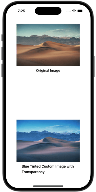
In this example, we apply a blue tint color with transparency to a custom image by layering it with a rectangle.
File: ContentView.swift
// ContentView.swift
// SwiftTutorial
// Created by TUTORIALKART.com

import SwiftUI

struct ContentView: View {
  var body: some View {
    VStack {
      CustomImageTintView()
    }
    .padding()
  }
}

struct CustomImageTintView: View {
  var body: some View {
    VStack {
      Image("sampleImage")
        .resizable()
        .scaledToFit()
        .frame(width: 300)
      Text("Original Image")
        .font(.headline)

      Spacer()

      ZStack {
        Image("sampleImage")
          .resizable()
          .scaledToFit()
          .frame(width: 300)

        Rectangle()
          .fill(Color.blue.opacity(0.5))
          .blendMode(.overlay)
          .frame(width: 300, height: 200)
      }
      .compositingGroup()

      Text("Blue Tinted Custom Image with Transparency")
        .font(.headline)
    }
    .padding()
  }
}

#Preview {
  ContentView()
}
Detailed Explanation
- Image: The
Imageview loads a custom image namedsampleImagefrom the app’s assets. - ZStack: Layers the image and the tinting rectangle.
- Rectangle: Adds a semi-transparent blue overlay using
blendMode(.overlay). - .compositingGroup(): Ensures the overlay effect is applied correctly.
- .opacity: Controls the transparency of the blue tint.
Output

Conclusion
Applying tint colors to images in SwiftUI allows for a consistent and visually appealing design. Using the .foregroundColor modifier for system images and layering techniques for custom images, you can achieve flexible and transparent tint effects tailored to your app’s theme.
