SwiftUI – ProgressView
In SwiftUI, the ProgressView is a control used to indicate the progress of a task. It can display both determinate progress (where progress is known, such as percentages) and indeterminate progress (for ongoing tasks with no known completion time).

This tutorial will guide you through using ProgressView to create progress indicators in SwiftUI, including customization and dynamic updates.
Basic Syntax of ProgressView
The basic syntax for a ProgressView is:
ProgressView("Label")Here:
"Label": Optional text that describes the purpose of the progress indicator.
To show determinate progress, you bind the ProgressView to a state variable.
Examples of ProgressView
Below are examples demonstrating both indeterminate and determinate progress indicators with custom styling.
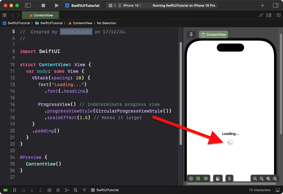
Example 1: Indeterminate ProgressView
This example demonstrates a basic indeterminate ProgressView that runs continuously:
Code Example:
import SwiftUI

struct ContentView: View {
    var body: some View {
        VStack(spacing: 20) {
            Text("Loading...")
                .font(.headline)

            ProgressView() // Indeterminate progress view
                .progressViewStyle(CircularProgressViewStyle())
                .scaleEffect(1.5) // Makes it larger
        }
        .padding()
    }
}
Xcode Screenshot:

Explanation:
ProgressView()creates an indeterminate progress indicator (spinner).- The
CircularProgressViewStyle()gives it a circular appearance. - The
.scaleEffect()modifier enlarges the progress indicator.
Result: A spinning circular progress indicator appears on the screen.
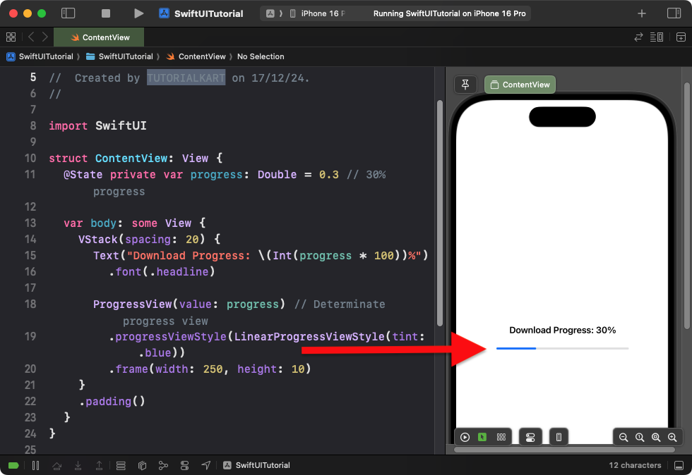
Example 2: Determinate ProgressView
This example shows a progress bar with a known completion percentage:
Code Example:
import SwiftUI

struct ContentView: View {
    @State private var progress: Double = 0.3 // 30% progress

    var body: some View {
        VStack(spacing: 20) {
            Text("Download Progress: \(Int(progress * 100))%")
                .font(.headline)

            ProgressView(value: progress) // Determinate progress view
                .progressViewStyle(LinearProgressViewStyle(tint: .blue))
                .frame(width: 250, height: 10)
        }
        .padding()
    }
}
Xcode Screenshot:

Explanation:
- The
valueparameter binds to theprogressstate variable, indicating progress. - The
LinearProgressViewStyle(tint: .blue)makes the progress bar linear with a blue tint. - The
.frame()modifier sets the width and height of the progress bar.
Result: A linear progress bar that shows 30% progress with a blue tint.
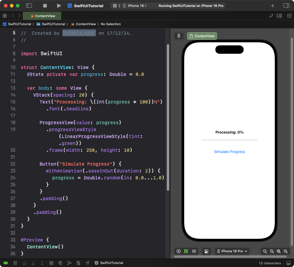
Example 3: Animated ProgressView
This example animates the progress bar to simulate progress over time:
Code Example:
import SwiftUI

struct ContentView: View {
    @State private var progress: Double = 0.0

    var body: some View {
        VStack(spacing: 20) {
            Text("Processing: \(Int(progress * 100))%")
                .font(.headline)

            ProgressView(value: progress)
                .progressViewStyle(LinearProgressViewStyle(tint: .green))
                .frame(width: 250, height: 10)

            Button("Simulate Progress") {
                withAnimation(.easeInOut(duration: 2)) {
                    progress = Double.random(in: 0.0...1.0)
                }
            }
            .padding()
        }
        .padding()
    }
}
Xcode Screenshot:

Explanation:
- The progress value is updated randomly when the button is tapped.
- The
withAnimationmodifier animates the progress bar smoothly over 2 seconds. - The progress bar uses a green tint with a linear style.
Result: Tapping the button smoothly animates the progress bar to a random value.
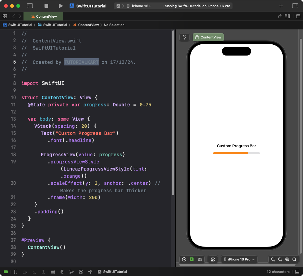
Example 4: Customizing ProgressView Style

This example uses a custom progress bar with a modified style and size:
Code Example:
import SwiftUI

struct ContentView: View {
    @State private var progress: Double = 0.75

    var body: some View {
        VStack(spacing: 20) {
            Text("Custom Progress Bar")
                .font(.headline)

            ProgressView(value: progress)
                .progressViewStyle(LinearProgressViewStyle(tint: .orange))
                .scaleEffect(y: 2, anchor: .center) // Makes the progress bar thicker
                .frame(width: 200)
        }
        .padding()
    }
}
Xcode Screenshot:

Explanation:
- The
LinearProgressViewStyleuses an orange tint. - The
.scaleEffect(y: 2)increases the height of the progress bar. - The
.frame()sets a custom width for the progress bar.
Result: A thick, orange-tinted progress bar is displayed.
Conclusion
SwiftUI’s ProgressView is a versatile control for displaying progress. It supports both determinate and indeterminate progress indicators and can be customized using styles, tints, and animations. Whether you’re showing loading spinners or progress bars, SwiftUI makes it easy to integrate progress views into your app.
