SwiftUI Rectangle
The Rectangle in SwiftUI is a simple and flexible shape used to create rectangular elements. It can be customised with different colors, sizes, and styles, making it a versatile tool for backgrounds, borders, or UI components.

In this tutorial, we’ll explore the Rectangle shape, starting with basic usage and progressing to practical examples such as using it as a background or styled UI element.
Basic Syntax of Rectangle
The simplest way to use a Rectangle in SwiftUI is:
Rectangle()
    .frame(width: 100, height: 50)
    .foregroundColor(.blue)
Here:
Rectangle(): Creates a rectangular shape..frame(width: 100, height: 50): Specifies the size of the rectangle..foregroundColor(.blue): Sets the rectangle’s fill color to blue.
Examples of Rectangle in SwiftUI
Let’s explore different ways to use the Rectangle shape with practical examples.
Example 1: Basic Rectangle
This example shows how to create a simple rectangle with a specified size and color:
Code Example:
import SwiftUI
struct ContentView: View {
var body: some View {
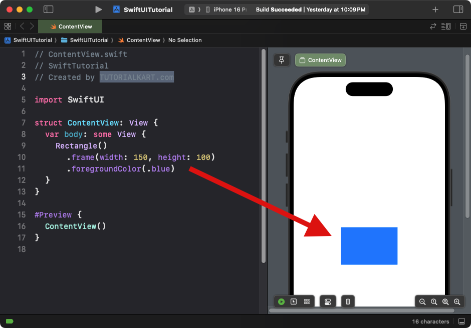
Rectangle()
.frame(width: 150, height: 100)
.foregroundColor(.blue)
}
}Xcode Screenshot:
Explanation:
- The
Rectangleis sized with a width of 150 and a height of 100. - The
.foregroundColor(.blue)modifier fills the rectangle with a blue color.
Result: A blue rectangle with a width of 150 and a height of 100.
Example 2: Rectangle with Rounded Corners
This example shows how to create a simple rectangle with a specified corner radius:
Code Example:
import SwiftUI
struct ContentView: View {
var body: some View {
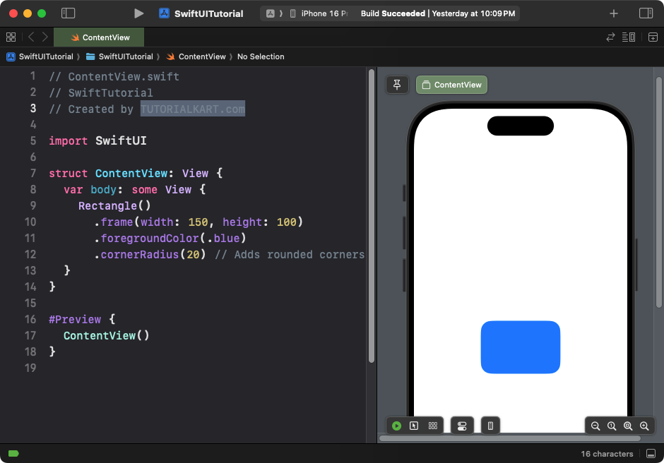
Rectangle()
.frame(width: 150, height: 100)
.foregroundColor(.blue)
.cornerRadius(10) // Adds rounded corners
}
}Xcode Screenshot:
Explanation:
- The
.cornerRadius(10)adds rounded corners to the rectangle.
Result: A blue rectangle with rounded corners.
Example 3: Using Rectangle as a Background
You can use a Rectangle as a background for other content:
Code Example:
import SwiftUI
struct ContentView: View {
var body: some View {
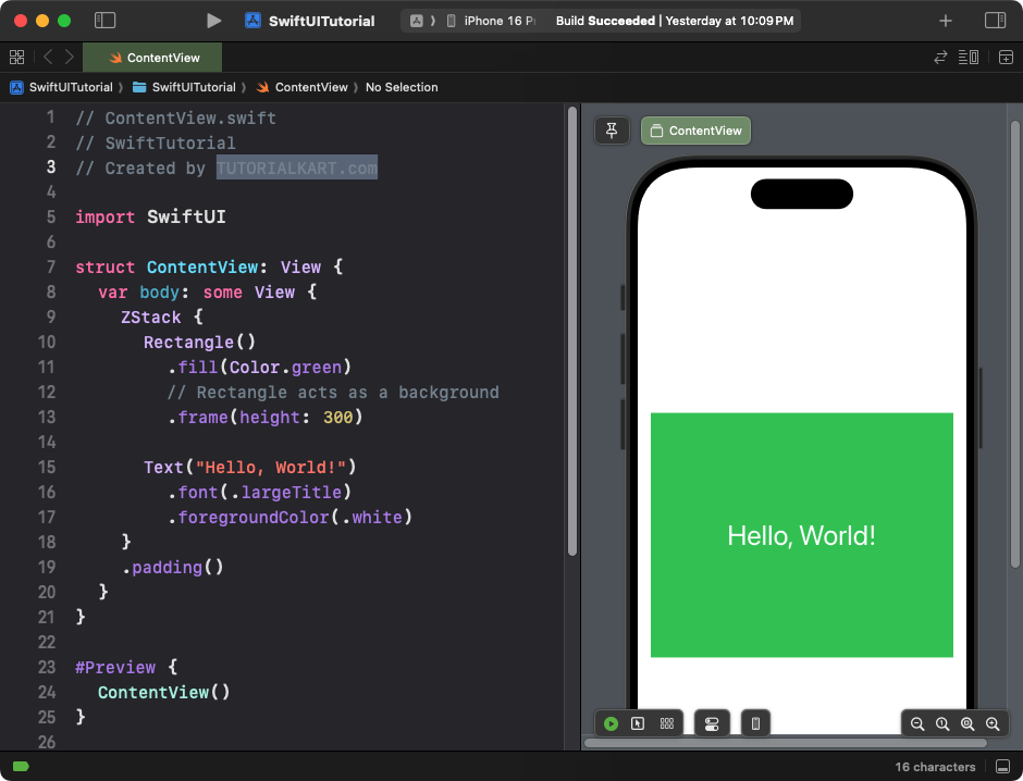
ZStack {
Rectangle()
.fill(Color.green)
.frame(height: 300) // Rectangle acts as a background
Text("Hello, World!")
.font(.largeTitle)
.foregroundColor(.white)
}
.padding()
}
}Xcode Screenshot:
Explanation:
- The
ZStacklayers the rectangle behind the text. - The rectangle is filled with green and has a fixed height of 300.
- The
Textview is styled to appear on top of the rectangle.
Result: A rectangle background with centered white text.
Example 4: Rectangle with Border
This example shows how to add a border to a rectangle:
Code Example:
import SwiftUI
struct ContentView: View {
var body: some View {
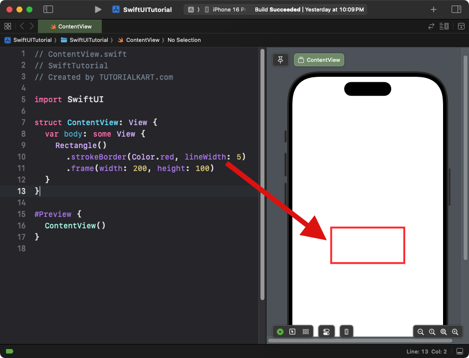
Rectangle()
.strokeBorder(Color.red, lineWidth: 5)
.frame(width: 200, height: 100)
}
}Xcode Screenshot:
Explanation:
- The
.strokeBorder()modifier adds a red border to the rectangle. - The border has a thickness of 5 points.
Result: A rectangle with a red border and no fill.
Example 5: Rectangle with Gradient
This example demonstrates how to apply a gradient fill to a rectangle:
Code Example:
import SwiftUI

struct ContentView: View {
    var body: some View {
        Rectangle()
            .fill(LinearGradient(
                gradient: Gradient(colors: [.blue, .purple]),
                startPoint: .top,
                endPoint: .bottom
            ))
            .frame(width: 200, height: 150)
            .cornerRadius(15)
    }
}
Xcode Screenshot:
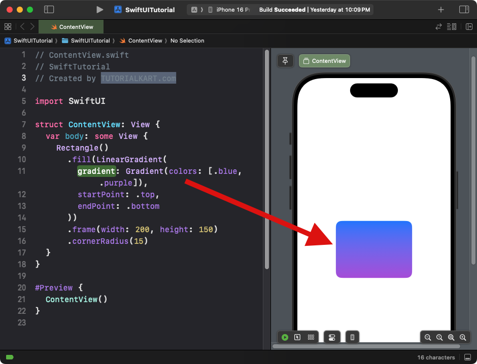
Explanation:
- The rectangle is filled with a linear gradient transitioning from blue to purple.
- The
.cornerRadius(15)adds rounded corners to the gradient-filled rectangle.
Result: A gradient-filled rectangle with smooth color transitions and rounded corners.
Example 6: Rectangle with Overlay
This example demonstrates how to overlay content on top of a rectangle:
Code Example:
import SwiftUI

struct ContentView: View {
    var body: some View {
        Rectangle()
            .fill(Color.gray)
            .frame(width: 250, height: 150)
            .overlay(
                Text("SwiftUI Rectangle")
                    .font(.headline)
                    .foregroundColor(.white)
            )
            .cornerRadius(10)
    }
}
Xcode Screenshot:
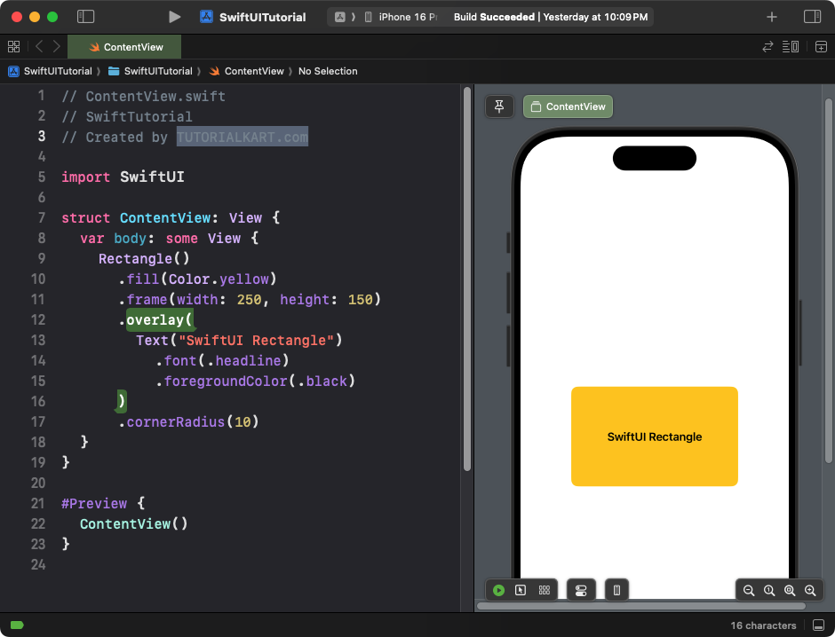
Explanation:
- The
.overlay()modifier places a text view on top of the rectangle. - The rectangle acts as the background for the text.
Result: A labeled rectangle with text centered inside it.
Conclusion
SwiftUI’s Rectangle is a versatile shape that can be used for a variety of purposes, such as creating UI elements, backgrounds, or decorative borders. With modifiers like .fill(), .stroke(), .overlay(), and .cornerRadius(), you can customise the rectangle to fit your design needs.