SwiftUI SecureField Placeholder
In SwiftUI, the SecureField is a specialized input field designed for entering secure or sensitive information, such as passwords. The placeholder is the text displayed inside the field when it is empty, serving as a hint to users about the expected input. Proper usage of the placeholder can enhance usability by providing clear guidance to users.
In this tutorial, you will learn how to use placeholders in SecureField, with a well-formed example and a detailed explanation of the code.
When is SecureField Placeholder Used?
The placeholder in SecureField is typically used to:
- Provide a hint about the type of information the user needs to input, such as “Enter your password”.
- Ensure a clean and minimal design without additional labels.
- Improve accessibility by offering guidance for first-time users.
Syntax for SwiftUI SecureField Placeholder
The SecureField in SwiftUI allows you to display a placeholder text to guide users about the expected input. Here’s the syntax for using a SecureField with a placeholder:
SecureField("Placeholder Text", text: $bindingVariable)Parameters:
"Placeholder Text":- A
Stringthat acts as the placeholder. - This text is displayed inside the field when it is empty.
- A
text: $bindingVariable:- A
Binding<String>that connects the input field to a state variable. - Updates the variable whenever the user types in the field.
- A
Example
In this example, we will use a placeholder in SecureField to guide the user to input their password.
File: ContentView.swift
import SwiftUI

struct ContentView: View {
    @State private var password: String = ""

    var body: some View {
        VStack(spacing: 20) {
            SecureField("Enter your password", text: $password)
                .padding()
                .textFieldStyle(RoundedBorderTextFieldStyle())

            Text("Password: \(password.isEmpty ? "Not entered" : password)")
                .font(.headline)

            Spacer()
        }
        .padding()
    }
}

struct ContentView_Previews: PreviewProvider {
    static var previews: some View {
        ContentView()
    }
}
Detailed Explanation for the Example
- Importing SwiftUI: The example begins by importing the SwiftUI framework, which provides the tools needed to build the UI.
- State Variable: The
@Statepropertypasswordstores the user’s input. This allows SwiftUI to update the UI dynamically as the user types. - SecureField: The
SecureFieldincludes the placeholder text “Enter your password” to guide the user. It is bound to thepasswordstate variable using$password. - Password Display: A
Textview shows the entered password or a placeholder message if the password field is empty. This demonstrates how thepasswordstate variable updates dynamically. - Layout: The
VStackorganizes the components vertically with padding and spacing for a clean and user-friendly design. - Preview: The
ContentView_Previewsstruct enables you to preview the UI in Xcode’s canvas during development.
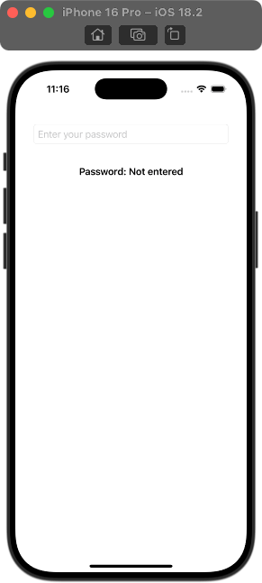
Output:

The SecureField displays “Enter your password” when empty and dynamically updates the state variable as the user types.
Conclusion
The placeholder in SwiftUI’s SecureField is a simple yet powerful feature for enhancing user experience. It provides clear guidance and ensures a clean, intuitive design. By following this example, you can easily implement placeholders in your own SecureField components.
