SwiftUI – SecureField Show/Hide Password
The SecureField in SwiftUI is used to securely accept sensitive input, such as passwords. By default, the text entered in a SecureField is masked to enhance privacy. However, you may want to provide users with the option to reveal the password for better usability.
In this tutorial, we will demonstrate how to create a password field with a toggle to show or hide the password in SwiftUI.
Example 1: SecureField with Show/Hide Password
To implement a password field with a toggle to show the password, you need to use a combination of SecureField, a regular TextField, and a state variable to control visibility.
File: ContentView.swift
// ContentView.swift
// SwiftTutorial
// Created by TUTORIALKART.com

import SwiftUI

struct ContentView: View {
    @State private var password: String = ""
    @State private var isPasswordVisible: Bool = false

    var body: some View {
        VStack {
            HStack {
                if isPasswordVisible {
                    TextField("Enter your password", text: $password)
                        .textFieldStyle(RoundedBorderTextFieldStyle())
                } else {
                    SecureField("Enter your password", text: $password)
                        .textFieldStyle(RoundedBorderTextFieldStyle())
                }

                Button(action: {
                    isPasswordVisible.toggle()
                }) {
                    Image(systemName: isPasswordVisible ? "eye.slash" : "eye")
                }
                .buttonStyle(PlainButtonStyle())
            }
            .padding()

            Text("Your password: \(password)")
                .padding()
        }
        .padding()
    }
}
Explanation
@StatevariablespasswordandisPasswordVisibleare used to manage the text input and toggle state respectively.- A
HStackis used to place the text field and the toggle button side by side. - When
isPasswordVisibleis true, aTextFieldis displayed to show the plain text password. When false, aSecureFieldis displayed to mask the password. - The button toggles the visibility of the password by flipping the
isPasswordVisiblestate. - The
Imageinside the button changes dynamically based on the state, showing either an “eye” or “eye.slash” icon.
Output:

Video:
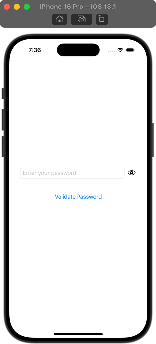
Example 2: Validation for Password along with Show/Hide
You can extend the functionality to include password validation. Here’s how:
File: ContentView.swift
// ContentView.swift
// SwiftTutorial
// Created by TUTORIALKART.com

import SwiftUI

struct ContentView: View {
    @State private var password: String = ""
    @State private var isPasswordVisible: Bool = false
    @State private var message: String = ""

    var body: some View {
        VStack {
            HStack {
                if isPasswordVisible {
                    TextField("Enter your password", text: $password)
                        .textFieldStyle(RoundedBorderTextFieldStyle())
                } else {
                    SecureField("Enter your password", text: $password)
                        .textFieldStyle(RoundedBorderTextFieldStyle())
                }

                Button(action: {
                    isPasswordVisible.toggle()
                }) {
                    Image(systemName: isPasswordVisible ? "eye.slash" : "eye")
                }
                .buttonStyle(PlainButtonStyle())
            }
            .padding()

            Button(action: validatePassword) {
                Text("Validate Password")
            }
            .padding()

            Text(message)
                .foregroundColor(.red)
                .padding()
        }
        .padding()
    }

    func validatePassword() {
        if password.isEmpty {
            message = "Password cannot be empty."
        } else if password.count < 6 {
            message = "Password must be at least 6 characters long."
        } else {
            message = "Password is valid!"
        }
    }
}
Explanation
- The
validatePasswordfunction checks if the password meets certain criteria, such as non-empty and minimum length. - The validation result is displayed in the
messagestate variable, which updates dynamically. - The button triggers the validation function, providing real-time feedback to the user.
Output

Video
Conclusion
With this approach, you can create a flexible and user-friendly password input field in SwiftUI that includes an option to toggle password visibility. You can also integrate password validation to enhance functionality and user experience.
