SwiftUI Shapes
SwiftUI provides built-in shapes like Rectangle, Circle, Ellipse, Capsule, and RoundedRectangle to create beautiful and customisable user interfaces. Shapes are highly flexible, and you can modify their size, color, stroke, and more using modifiers.
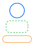
In this tutorial, we will explore how to use different SwiftUI shapes, customize them, and combine them to create visually appealing designs.
Built-in Shapes in SwiftUI
SwiftUI comes with several built-in shapes, which include:
Rectangle: A simple rectangular shape.Circle: A perfect circle shape.Ellipse: An oval shape.Capsule: A pill-shaped rounded rectangle.RoundedRectangle: A rectangle with rounded corners.
Let’s look at practical examples of how to use and customize these shapes.
Examples of SwiftUI Shapes
Below are examples demonstrating how to use and customize different shapes in SwiftUI.
Example 1: Basic Shapes
This example displays basic SwiftUI shapes with default properties.
Code Example:
import SwiftUI

struct ContentView: View {
    var body: some View {
        VStack(spacing: 20) {
            Rectangle()
                .fill(Color.blue)
                .frame(width: 100, height: 50)

            Circle()
                .fill(Color.red)
                .frame(width: 100, height: 100)

            Ellipse()
                .fill(Color.green)
                .frame(width: 150, height: 80)

            Capsule()
                .fill(Color.orange)
                .frame(width: 150, height: 50)

            RoundedRectangle(cornerRadius: 20)
                .fill(Color.purple)
                .frame(width: 150, height: 70)
        }
        .padding()
    }
}
Xcode Screenshot:
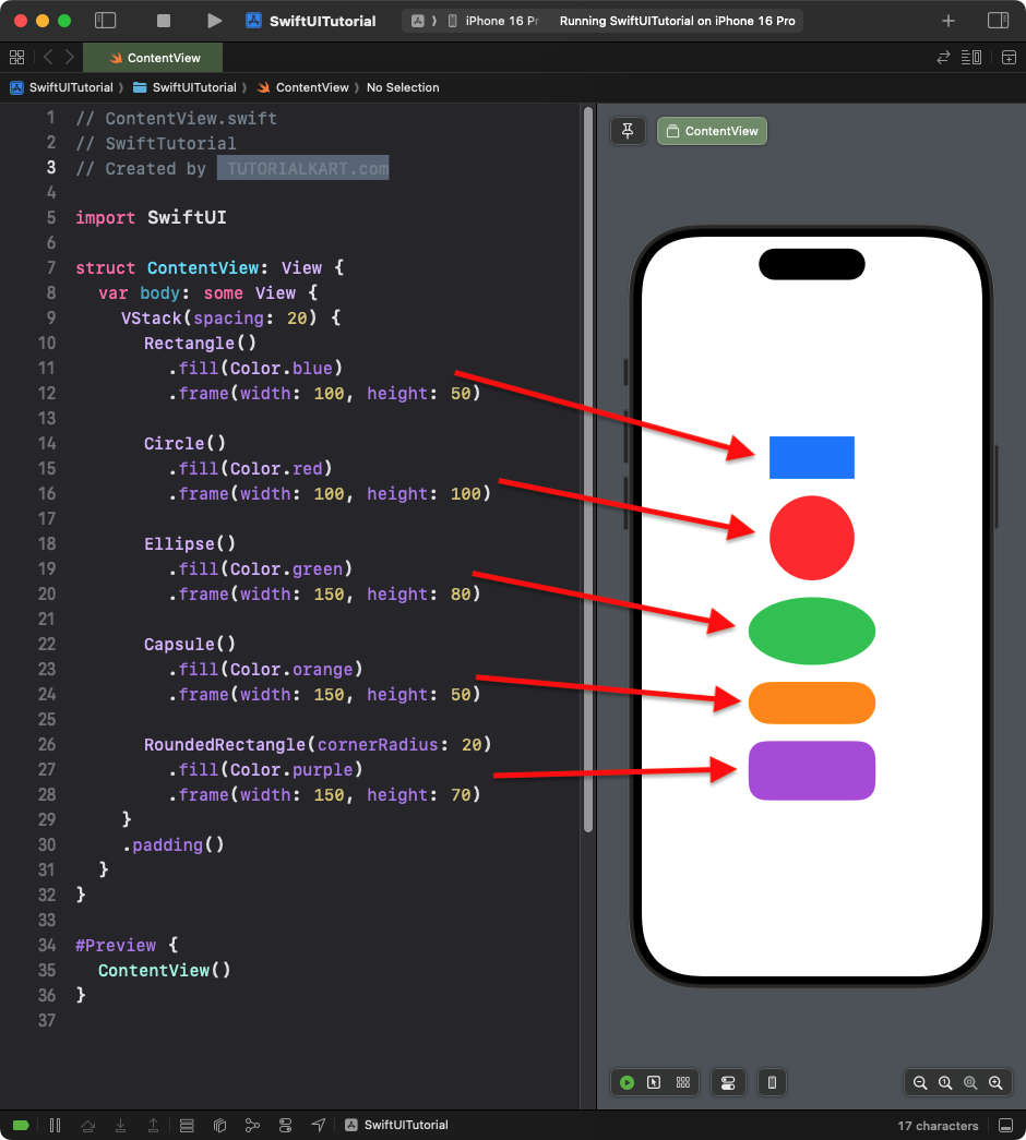
Explanation:
Rectangle: A blue rectangular shape.Circle: A red circle with equal width and height.Ellipse: A green oval shape with a customized frame.Capsule: A pill-like orange shape.RoundedRectangle: A purple rectangle with rounded corners.
Result: A vertical stack of five different shapes with distinct colors and sizes.
Example 2: Adding Text Inside Shapes
You can easily overlay text on top of shapes to create labeled shapes or buttons. Here’s a modified version of the first example with text added inside each shape.
Code Example:
import SwiftUI

struct ContentView: View {
    var body: some View {
        VStack(spacing: 20) {
            ZStack {
                Rectangle()
                    .fill(Color.blue)
                    .frame(width: 150, height: 70)
                Text("Rectangle")
                    .font(.headline)
                    .foregroundColor(.white)
            }

            ZStack {
                Circle()
                    .fill(Color.red)
                    .frame(width: 100, height: 100)
                Text("Circle")
                    .font(.headline)
                    .foregroundColor(.white)
            }

            ZStack {
                Ellipse()
                    .fill(Color.green)
                    .frame(width: 200, height: 100)
                Text("Ellipse")
                    .font(.headline)
                    .foregroundColor(.white)
            }

            ZStack {
                Capsule()
                    .fill(Color.orange)
                    .frame(width: 200, height: 50)
                Text("Capsule")
                    .font(.headline)
                    .foregroundColor(.white)
            }

            ZStack {
                RoundedRectangle(cornerRadius: 20)
                    .fill(Color.purple)
                    .frame(width: 200, height: 70)
                Text("RoundedRectangle")
                    .font(.headline)
                    .foregroundColor(.white)
            }
        }
        .padding()
    }
}
Xcode Screenshot:
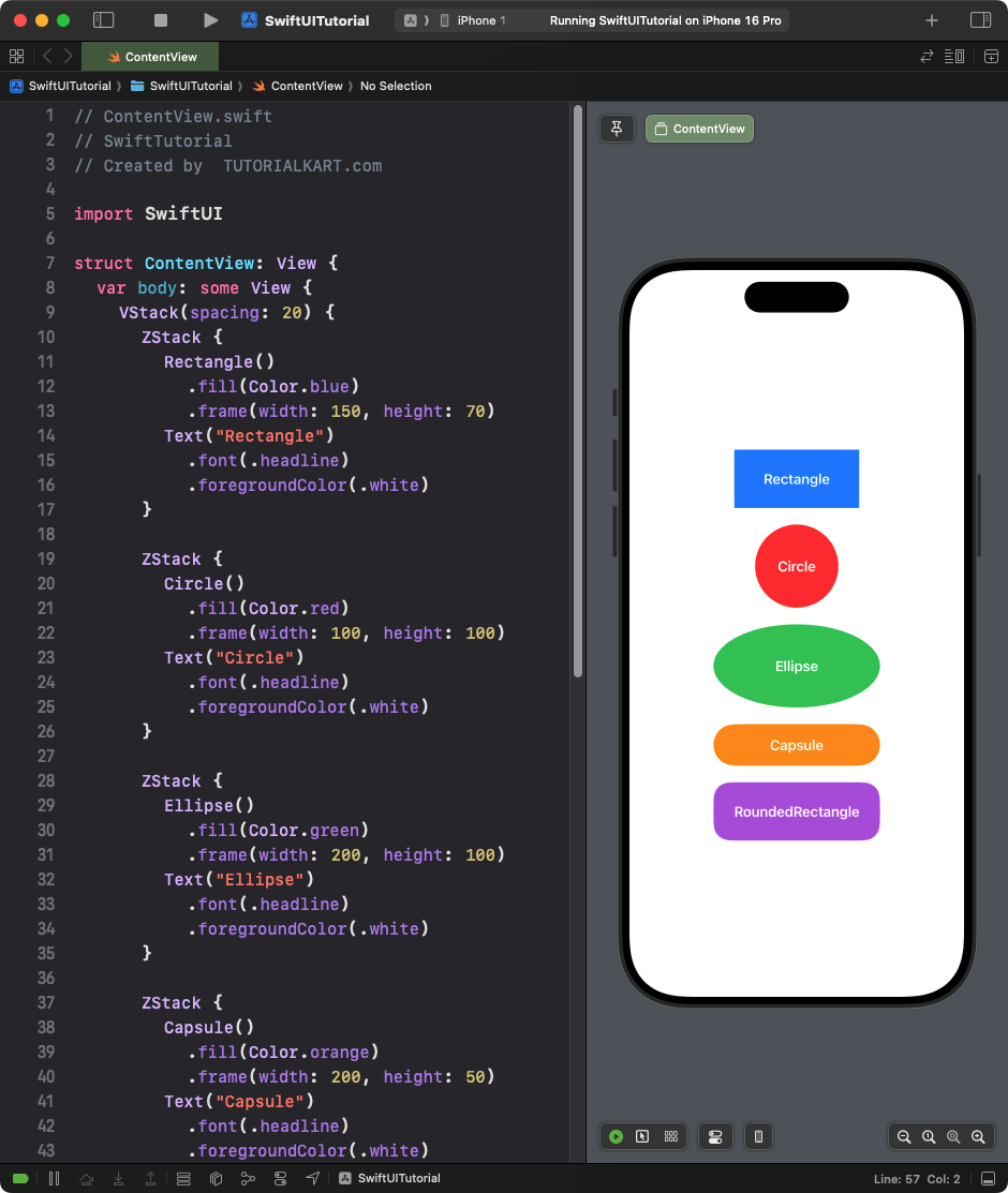
Explanation:
- Each shape is wrapped inside a ZStack to overlay a
Textview on top of it. - The text is centered automatically inside the shape.
- The
.foregroundColor(.white)modifier ensures the text is visible on top of colored shapes.
Result: A vertical stack of labeled shapes, each displaying a text description centered inside.
This approach is useful when you need to create buttons, badges, or labeled UI elements in your SwiftUI app.
Example 3: Customising Shape Borders
You can customize shapes with borders, stroke width, and colors. Here’s an example:
Code Example:
import SwiftUI

struct ContentView: View {
    var body: some View {
        VStack(spacing: 20) {
            Circle()
                .stroke(Color.blue, lineWidth: 5)
                .frame(width: 100, height: 100)

            RoundedRectangle(cornerRadius: 25)
                .stroke(Color.green, style: StrokeStyle(lineWidth: 4, dash: [10]))
                .frame(width: 150, height: 80)

            Capsule()
                .strokeBorder(Color.orange, lineWidth: 3)
                .frame(width: 200, height: 50)
        }
        .padding()
    }
}
Xcode Screenshot:
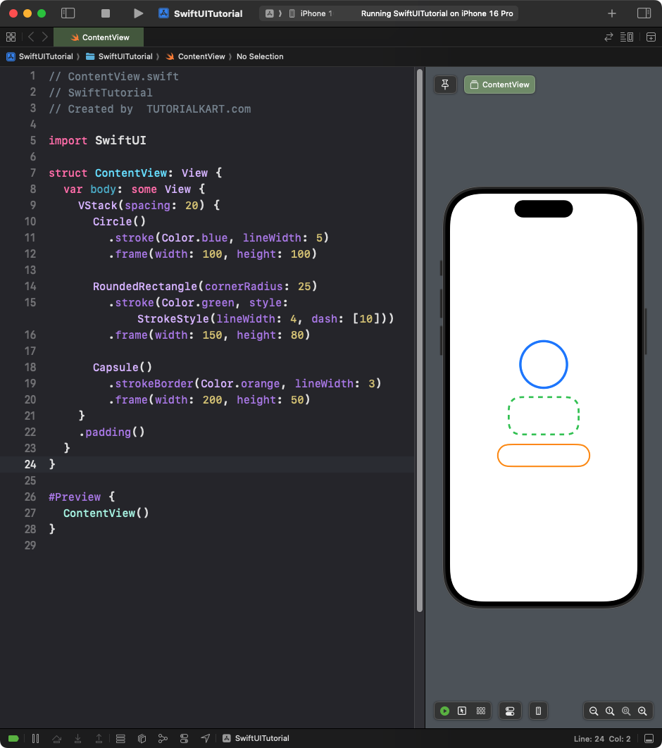
Explanation:
.stroke: Applies a border to the shape with the specified color and line width..strokeBorder: Applies a border without affecting the size of the shape.- Custom styles like dashed lines are added using
StrokeStyle.
Result: A vertical stack of shapes with styled borders, dashed lines, and colors.
Example 4: Combining Shapes
This example combines multiple shapes to create a layered visual design.
Code Example:
import SwiftUI

struct ContentView: View {
    var body: some View {
        ZStack {
            Circle()
                .fill(Color.yellow)
                .frame(width: 150, height: 150)

            RoundedRectangle(cornerRadius: 20)
                .fill(Color.red)
                .frame(width: 100, height: 100)

            Text("SwiftUI")
                .font(.headline)
                .foregroundColor(.white)
        }
    }
}
Xcode Screenshot:
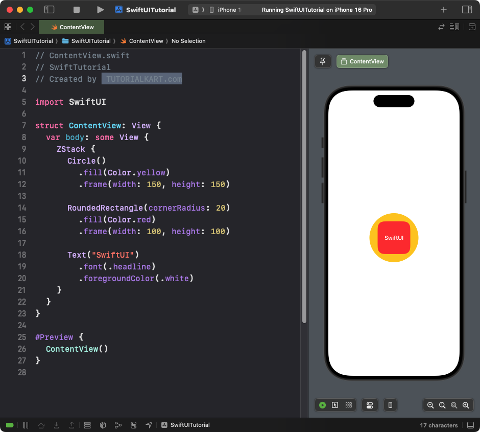
Explanation:
ZStack: Overlays views on top of each other.- A yellow circle serves as the background.
- A red rounded rectangle sits in the center.
- The
Textview overlays the shapes to display a label.
Result: A visually layered design combining a circle, rounded rectangle, and text.
Example 5: Animating Shapes
You can animate shapes to create dynamic user interfaces. Here’s an example of animating a circle’s size:
Code Example:
import SwiftUI

struct ContentView: View {
    @State private var isExpanded = false

    var body: some View {
        VStack {
            Circle()
                .fill(isExpanded ? Color.pink : Color.blue)
                .frame(width: isExpanded ? 200 : 100, height: isExpanded ? 200 : 100)
                .animation(.easeInOut(duration: 1), value: isExpanded)

            Button("Animate") {
                isExpanded.toggle()
            }
            .padding()
        }
    }
}
Xcode Screenshot:
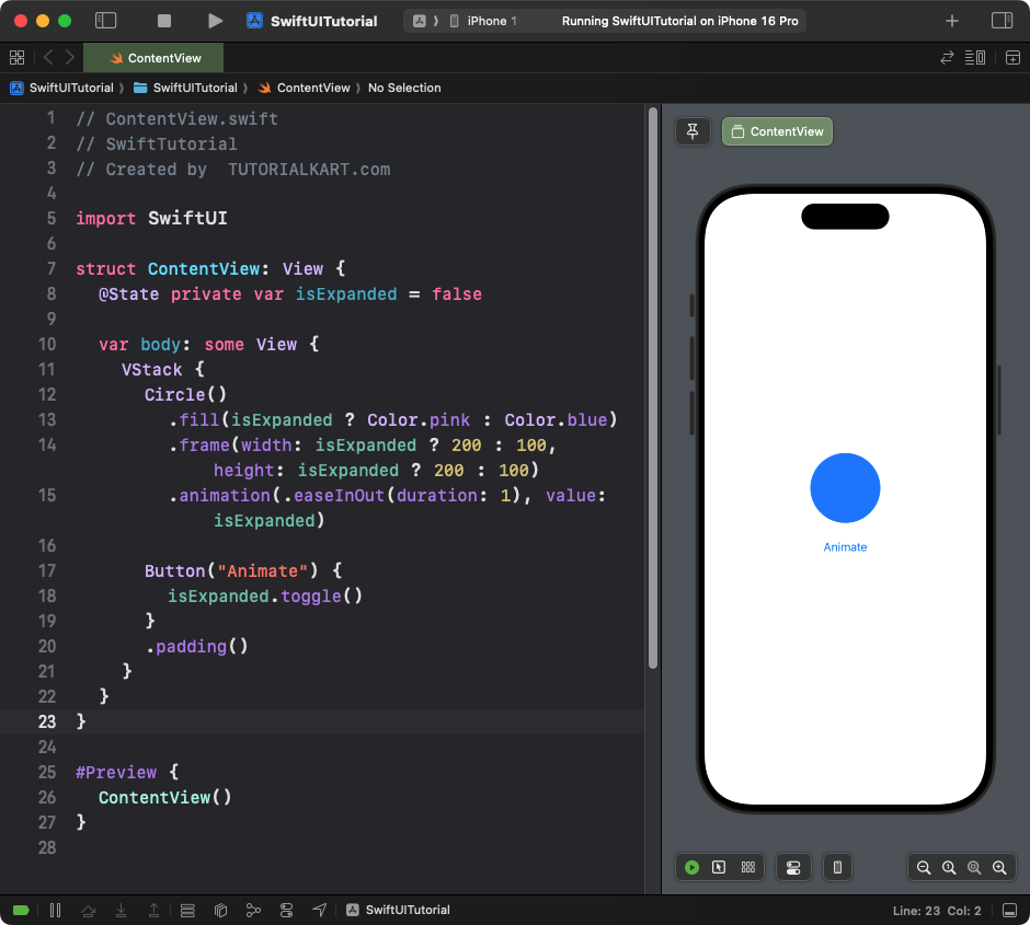
Explanation:
- The circle changes its size and color when the button is tapped.
- The
.animationmodifier adds a smooth transition effect.
Result: A circle that smoothly animates between two sizes and colors.
Conclusion
SwiftUI shapes, such as Rectangle, Circle, Ellipse, Capsule, and RoundedRectangle, provide a simple way to create and customize visual elements. You can combine, style, and animate shapes to create interactive and beautiful user interfaces for your apps.
