SwiftUI Slider
In SwiftUI, the Slider view is used to create a user interface control that allows users to select a value from a continuous or discrete range. It is commonly used in scenarios where users need to adjust settings, such as volume, brightness, or progress.
This SwiftUI tutorial covers the basic usage of the Slider, customisation options, and practical examples to help you incorporate sliders into your SwiftUI app.
Basic Syntax for Slider
The basic syntax for creating a Slider is:
Slider(value: $value, in: range, step: stepValue)Here:
$value: A binding to a@Statevariable that holds the slider’s current value.range: The minimum and maximum range for the slider.stepValue(optional): The interval at which the slider increments or decrements.
If the stepValue is omitted, the slider operates as a continuous control.
Examples
Let’s explore how to use the Slider in SwiftUI with some examples.
Example 1: Simple Slider
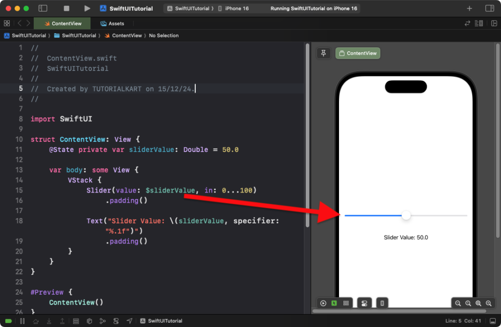
This example demonstrates a basic slider that selects a value between 0 and 100:
Code Example:
import SwiftUI

struct ContentView: View {
    @State private var sliderValue: Double = 50.0

    var body: some View {
        VStack {
            Slider(value: $sliderValue, in: 0...100)
                .padding()

            Text("Slider Value: \(sliderValue, specifier: "%.1f")")
                .padding()
        }
    }
}
Explanation:
- The
sliderValuestate variable tracks the slider’s current value. - The slider allows values between 0 and 100.
- The
Textview displays the current slider value, formatted to one decimal place.
Result: A slider with a range of 0 to 100 is displayed, and the selected value is dynamically shown below the slider.
Example 2: Slider with Step Values
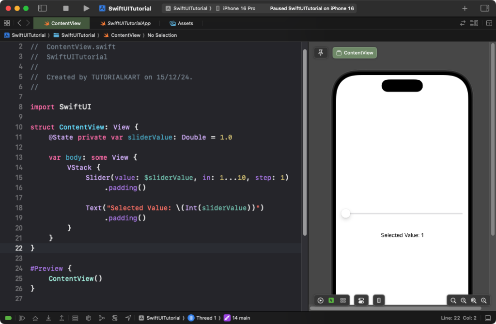
You can create a discrete slider by specifying step values:
Code Example:
import SwiftUI

struct ContentView: View {
    @State private var sliderValue: Double = 1.0

    var body: some View {
        VStack {
            Slider(value: $sliderValue, in: 1...10, step: 1)
                .padding()

            Text("Selected Value: \(Int(sliderValue))")
                .padding()
        }
    }
}
Explanation:
- The slider value ranges from 1 to 10, and the
stepparameter ensures that the slider increments by 1. - The
Textview converts the slider value to an integer for display.
Result: A slider with discrete steps from 1 to 10 is displayed, and the selected value updates dynamically.
Example 3: Customizing the Slider Appearance
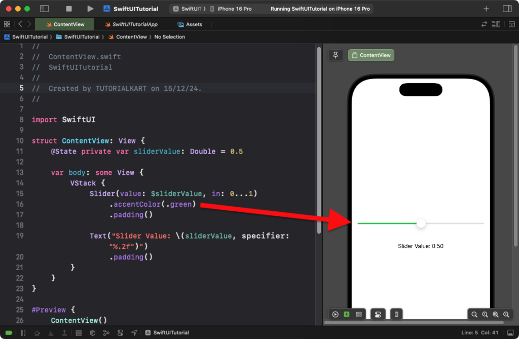
You can customize the appearance of the slider using modifiers:
Code Example:
import SwiftUI

struct ContentView: View {
    @State private var sliderValue: Double = 0.5

    var body: some View {
        VStack {
            Slider(value: $sliderValue, in: 0...1)
                .accentColor(.green) // Customize the slider's track color
                .padding()

            Text("Slider Value: \(sliderValue, specifier: "%.2f")")
                .padding()
        }
    }
}
Explanation:
- The
.accentColor(.green)changes the slider’s track and thumb color to green. - The slider range is set between 0 and 1, and the value is displayed with two decimal places.
Result: A green slider with a range of 0 to 1 is displayed, and the value updates dynamically.
Conclusion
The Slider view in SwiftUI is a versatile and powerful control for selecting values. By combining range, step values, and styling options, you can create sliders tailored to your app’s specific needs, whether for continuous adjustments or discrete selections.
