SwiftUI – Spacer
In SwiftUI, the Spacer view is a flexible layout tool that creates space between other views in a stack. It automatically adjusts its size to take up the available space, pushing other views apart while maintaining the layout’s structure. The Spacer is particularly useful for aligning views, creating padding, or distributing elements evenly.
In this SwiftUI tutorial, we’ll explore how to use the Spacer in SwiftUI, in a vertical stack, horizontal stack, and multiple spaces, with practical examples.
Basic Syntax for Spacer
The basic syntax for using a Spacer is:
Spacer()The Spacer automatically expands to fill the available space in the stack it resides in. By placing it strategically, you can control the spacing between views.
Examples
Let’s explore how to use Spacer with practical examples.
Example 1: Spacer in a Vertical Stack
This example demonstrates how to use a Spacer in a VStack to distribute content vertically:
Code Example:
import SwiftUI

struct ContentView: View {
    var body: some View {
        VStack {
            Text("Top")
            Spacer()
            Text("Bottom")
        }
        .padding()
    }
}
Explanation:

- The
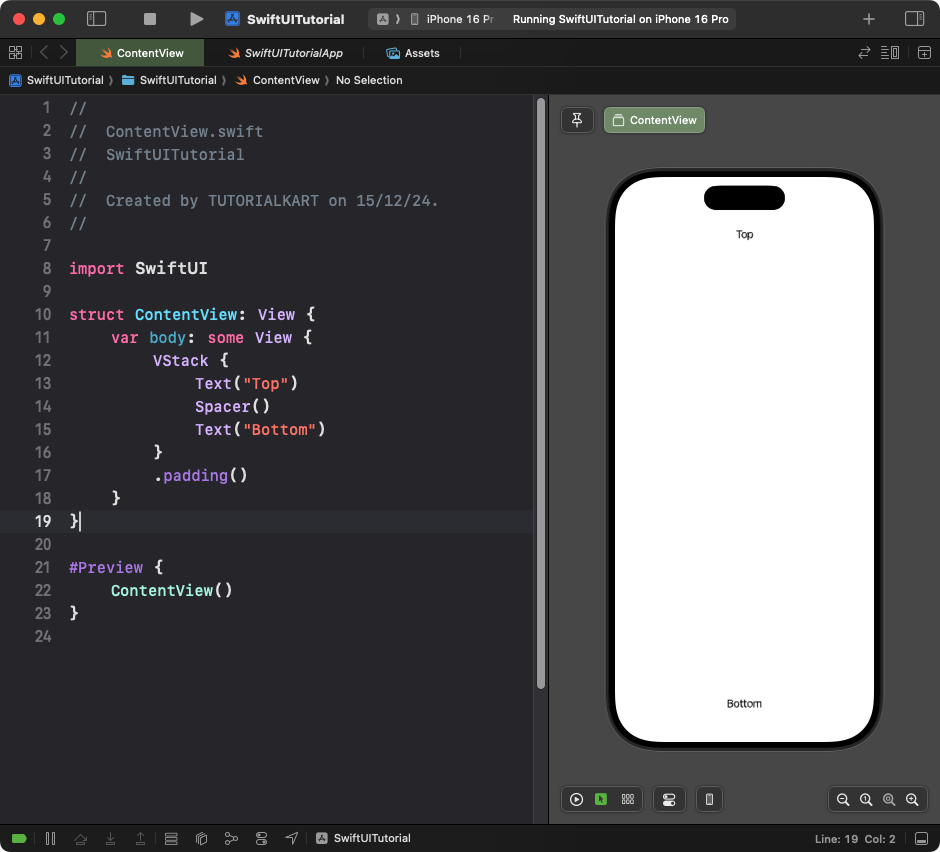
Spacerpushes the “Top” text to the top and the “Bottom” text to the bottom of the screen. - The
.padding()modifier adds space around the stack for better spacing.
Result: The “Top” text appears at the top of the view, and the “Bottom” text appears at the bottom, with a spacer in between.
Example 2: Spacer in a Horizontal Stack
This example shows how to use a Spacer in an HStack to align content horizontally:
Code Example:
import SwiftUI

struct ContentView: View {
    var body: some View {
        HStack {
            Text("Left")
            Spacer()
            Text("Right")
        }
        .padding()
    }
}
Explanation:
- The
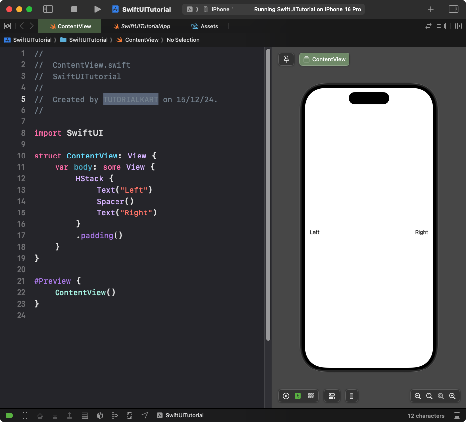
Spacerpushes the “Left” text to the left and the “Right” text to the right of the screen. - The
.padding()modifier ensures the content doesn’t touch the edges of the screen.
Result: The “Left” and “Right” text are aligned to the edges of the view, with a spacer in between.
Example 3: Multiple Spacers
You can use multiple Spacer views to distribute content evenly:
Code Example:
import SwiftUI

struct ContentView: View {
    var body: some View {
        HStack {
            Text("First")
            Spacer()
            Text("Second")
            Spacer()
            Text("Third")
        }
        .padding()
    }
}
Explanation:
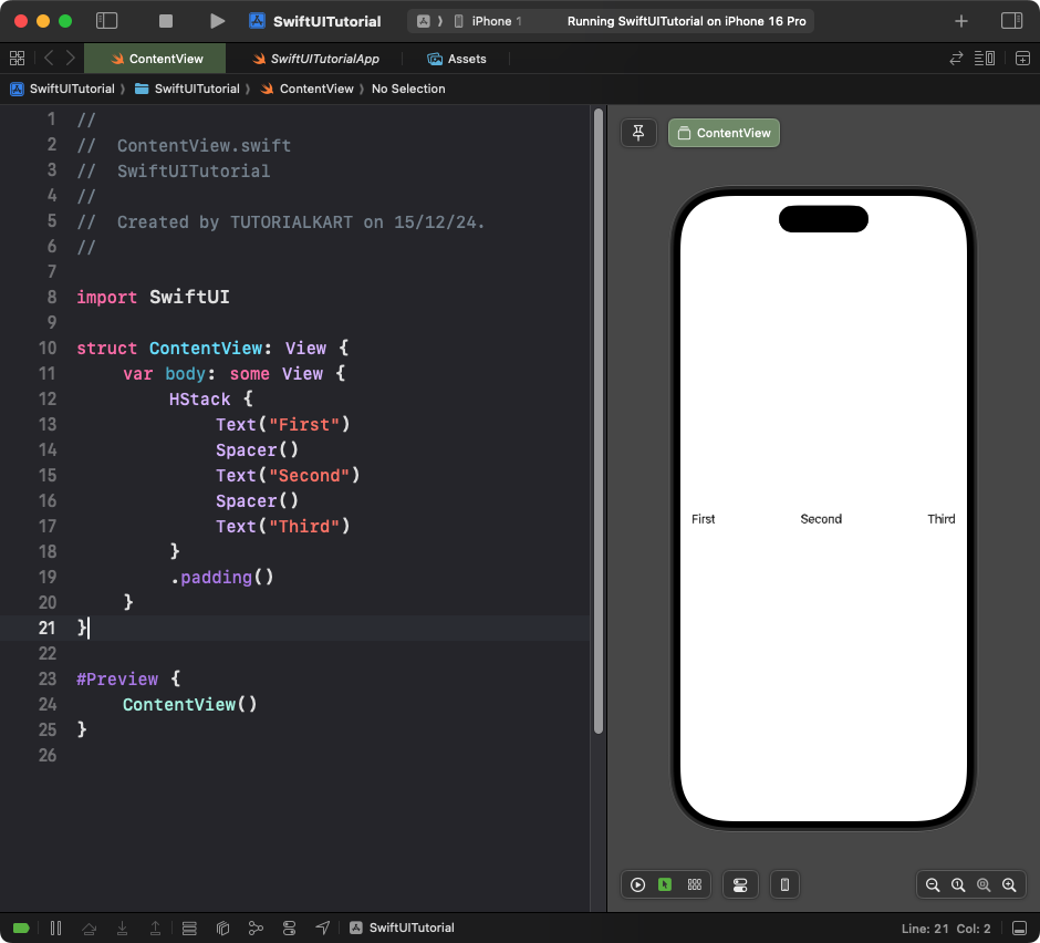
- The spacers evenly distribute the three text views across the horizontal stack.
- The content aligns dynamically based on the available space.
Result: The “First,” “Second,” and “Third” text are evenly spaced horizontally within the view.
Conclusion
The Spacer view in SwiftUI is a simple but powerful tool for creating flexible and adaptive layouts. By strategically placing spacers in your stacks, you can easily control the alignment and spacing of views, making your UI more dynamic and visually appealing.
