SwiftUI – Stacks
In SwiftUI, stacks are powerful layout containers used to arrange views in a linear or grid-like structure. There are three types of stacks:
HStack: Arranges views horizontally.VStack: Arranges views vertically.ZStack: Overlays views on top of each other.
Stacks allow for flexible and adaptive layouts, enabling developers to build clean and organised user interfaces.
In this SwiftUI tutorial, you will get introduced to these three types of stacks, with syntax and basic examples.
Basic Syntax for Stacks
The syntax for creating a stack is:
// HStack
HStack {
    // Add views here
}

// VStack
VStack {
    // Add views here
}

// ZStack
ZStack {
    // Add views here
}
Each type of stack aligns and arranges its child views based on the type specified.
Examples
Let’s explore how to use each type of stack with examples.
Example 1: Using an HStack
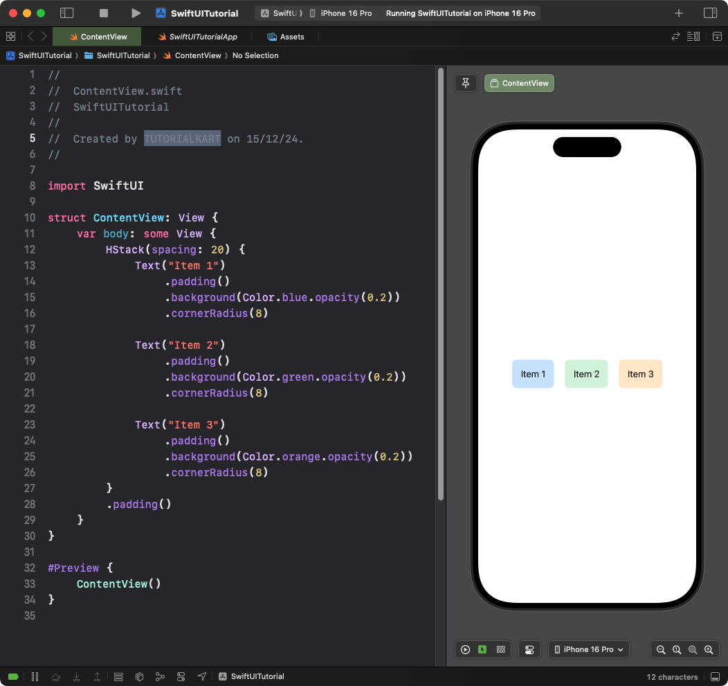
The HStack arranges its child views horizontally:
Code Example:
import SwiftUI

struct ContentView: View {
    var body: some View {
        HStack(spacing: 20) {
            Text("Item 1")
                .padding()
                .background(Color.blue.opacity(0.2))
                .cornerRadius(8)

            Text("Item 2")
                .padding()
                .background(Color.green.opacity(0.2))
                .cornerRadius(8)

            Text("Item 3")
                .padding()
                .background(Color.orange.opacity(0.2))
                .cornerRadius(8)
        }
        .padding()
    }
}
Explanation:
- The
HStackarranges the text views horizontally. - The
spacingparameter defines the space between the items. - Each item has a background color and rounded corners for styling.
Result: Three items are displayed in a horizontal row with equal spacing between them.
Example 2: Using a VStack
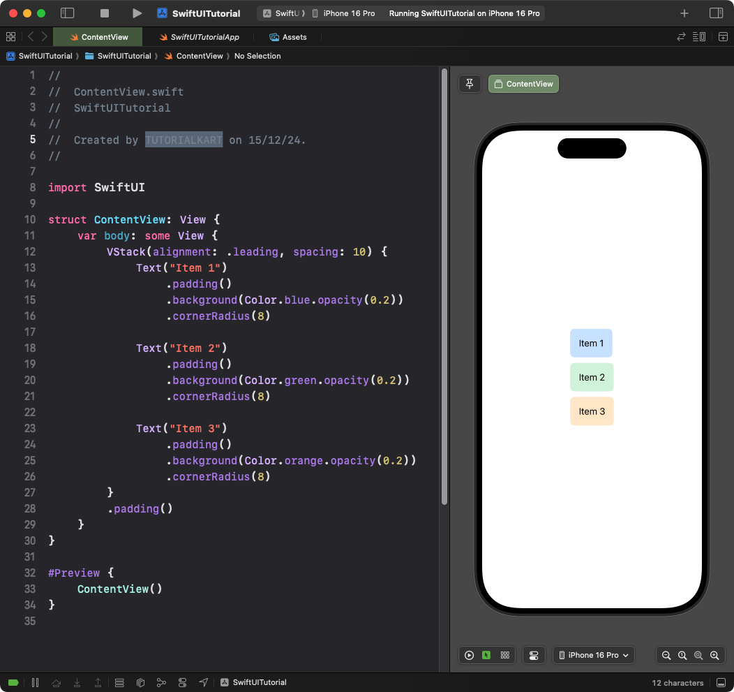
The VStack arranges its child views vertically:
Code Example:
import SwiftUI

struct ContentView: View {
    var body: some View {
        VStack(alignment: .leading, spacing: 10) {
            Text("Item 1")
                .padding()
                .background(Color.blue.opacity(0.2))
                .cornerRadius(8)

            Text("Item 2")
                .padding()
                .background(Color.green.opacity(0.2))
                .cornerRadius(8)

            Text("Item 3")
                .padding()
                .background(Color.orange.opacity(0.2))
                .cornerRadius(8)
        }
        .padding()
    }
}
Explanation:
- The
VStackarranges the text views vertically. - The
alignmentparameter aligns the items to the left (.leading). - The
spacingparameter defines the vertical space between the items.
Result: Three items are displayed in a vertical column, aligned to the left.
Example 3: Using a ZStack
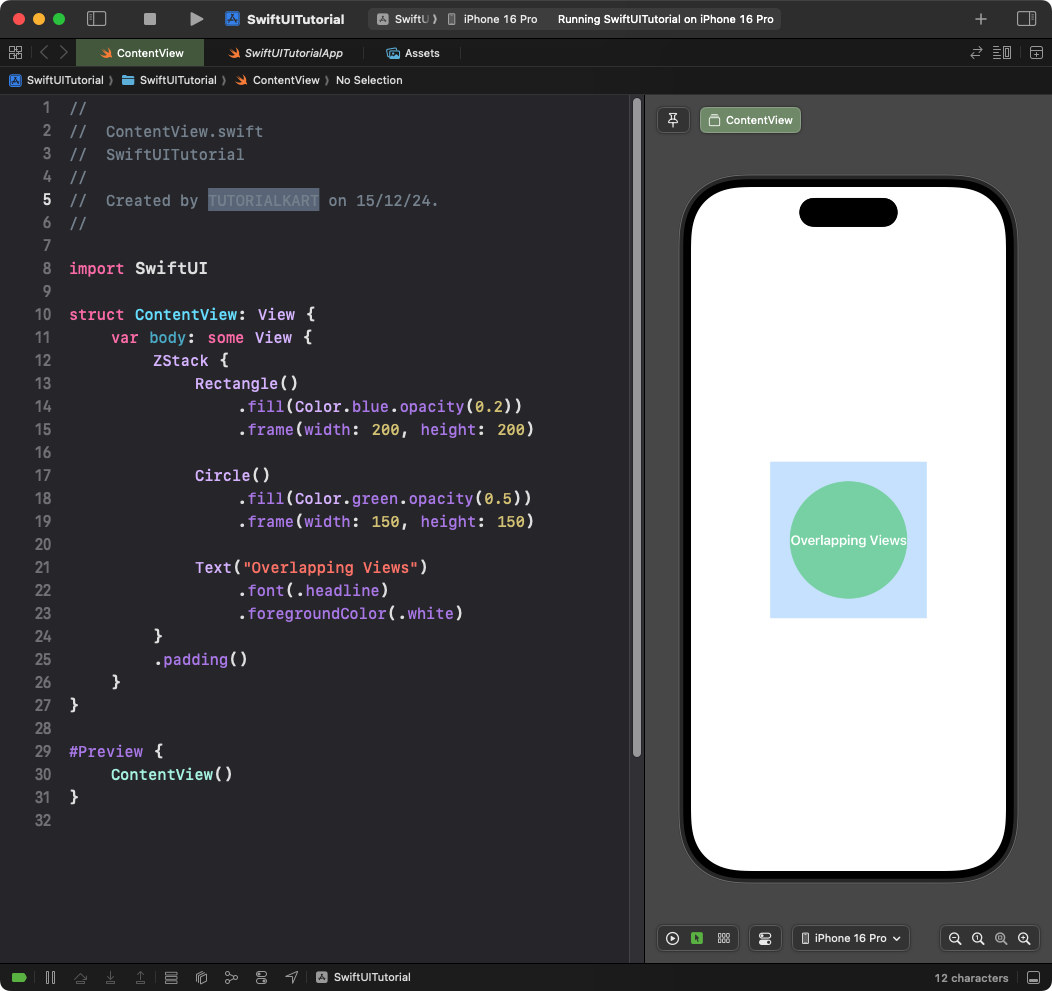
The ZStack overlays its child views on top of each other:
Code Example:
import SwiftUI

struct ContentView: View {
    var body: some View {
        ZStack {
            Rectangle()
                .fill(Color.blue.opacity(0.2))
                .frame(width: 200, height: 200)

            Circle()
                .fill(Color.green.opacity(0.5))
                .frame(width: 150, height: 150)

            Text("Overlapping Views")
                .font(.headline)
                .foregroundColor(.white)
        }
        .padding()
    }
}
Explanation:
- The
ZStackoverlays a rectangle, a circle, and text. - Each view is layered on top of the previous one.
Result: The rectangle forms the background, the circle overlays it, and the text appears on top.
Conclusion
Stacks in SwiftUI—HStack, VStack, and ZStack—provide flexible tools for arranging views in different layouts. By using stacks strategically, you can create complex and dynamic user interfaces while keeping your code clean and organized.
