SwiftUI – Stepper
In SwiftUI, a Stepper is a control that lets users increment or decrement a value by tapping “+” and “-” buttons. It is often used to adjust numeric values, such as quantities, dates, or settings, in a user-friendly and intuitive way.
This tutorial covers the usage of the SwiftUI Stepper with examples for customising its behaviour, range, and appearance.
Basic Syntax for Stepper
The basic syntax of a SwiftUI Stepper looks like this:
Stepper("Label", value: $value, in: range)Here:
"Label": The label describing the Stepper’s purpose.$value: A binding to a numeric state variable (e.g.,@State).range: (Optional) A closed range to define the minimum and maximum allowable values.
The Stepper also allows you to perform actions when the value changes using closures.
Examples
Let’s look at several examples to demonstrate how to use a Stepper in SwiftUI.
Example 1: Basic Stepper
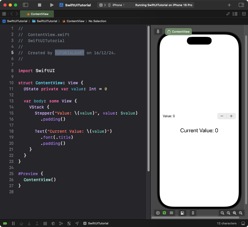
This example shows a simple Stepper that increments and decrements a numeric value.
Code Example:
import SwiftUI

struct ContentView: View {
    @State private var value: Int = 0

    var body: some View {
        VStack {
            Stepper("Value: \(value)", value: $value)
                .padding()

            Text("Current Value: \(value)")
                .font(.title)
                .padding()
        }
    }
}
Xcode Screenshot:

Explanation:
- The
@Statepropertyvalueholds the current numeric value. - The
Stepperautomatically increments or decrements the value when the “+” or “-” buttons are tapped. - The label dynamically updates to reflect the current value.
Result: A Stepper control that displays and adjusts a numeric value.
Example 2: SwiftUI Stepper with Range
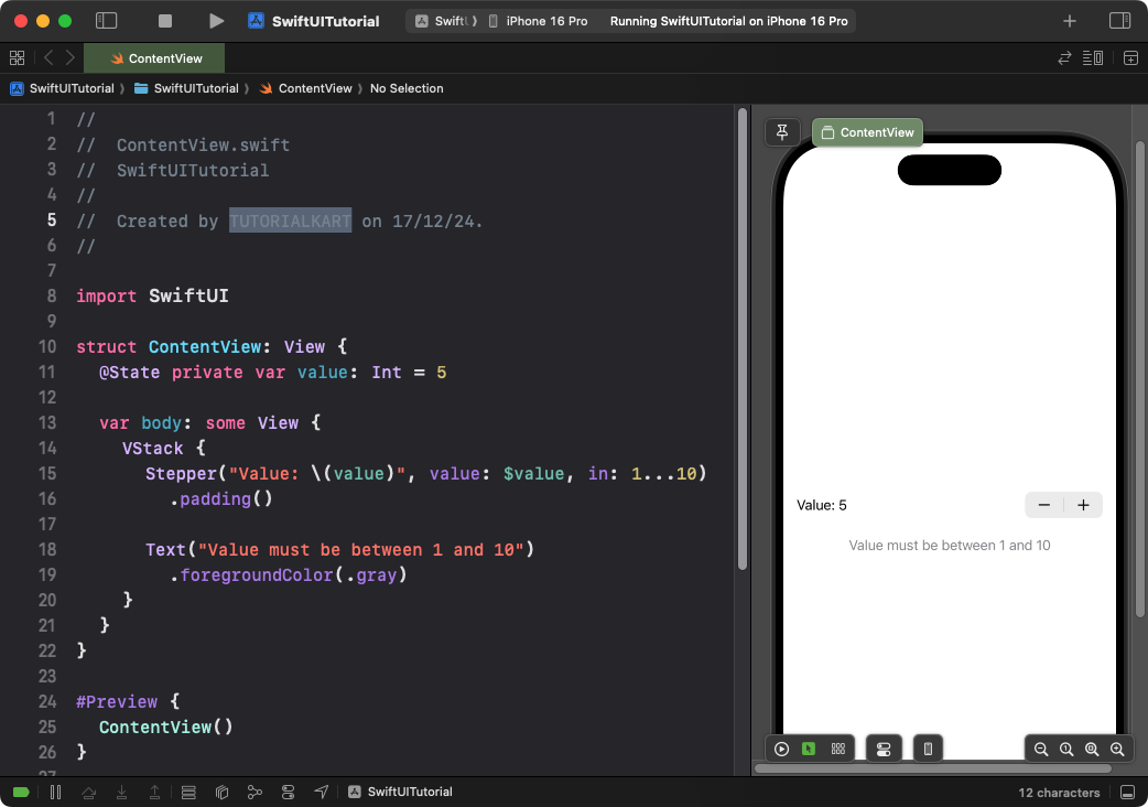
This example restricts the Stepper’s range to a minimum and maximum value:
Code Example:
import SwiftUI

struct ContentView: View {
    @State private var value: Int = 5

    var body: some View {
        VStack {
            Stepper("Value: \(value)", value: $value, in: 1...10)
                .padding()

            Text("Value must be between 1 and 10")
                .foregroundColor(.gray)
        }
    }
}
Xcode Screenshot:

Explanation:
- The
in: 1...10parameter restricts the Stepper’s range to values between 1 and 10. - The value cannot go below 1 or above 10 when the Stepper buttons are tapped.
Result: A Stepper that adjusts a numeric value within the specified range.
Example 3: Stepper with Step Increment
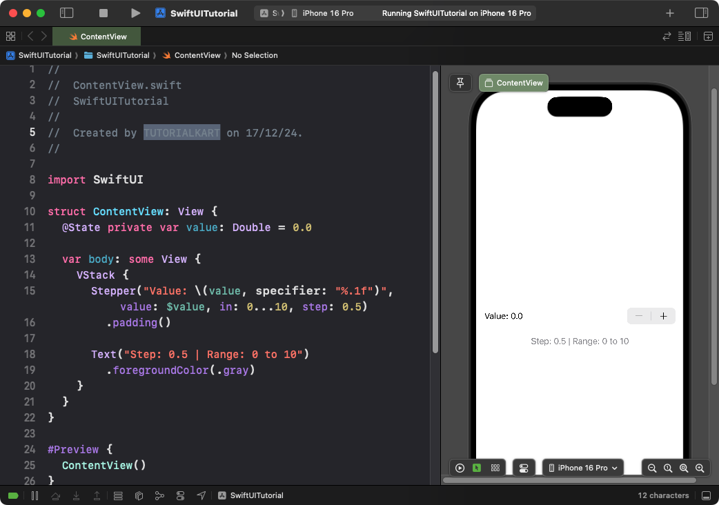
This example shows how to increment or decrement the Stepper’s value by a custom step size:
Code Example:
import SwiftUI

struct ContentView: View {
    @State private var value: Double = 0.0

    var body: some View {
        VStack {
            Stepper("Value: \(value, specifier: "%.1f")", value: $value, in: 0...10, step: 0.5)
                .padding()

            Text("Step: 0.5 | Range: 0 to 10")
                .foregroundColor(.gray)
        }
    }
}
Xcode Screenshot:

Explanation:
- The
step: 0.5parameter makes the Stepper increase or decrease by 0.5. - The range is set from 0 to 10, and the value dynamically updates with a precision of 1 decimal point.
Result: A Stepper that adjusts values in increments of 0.5 within the specified range.
Example 4: Stepper with Custom Actions
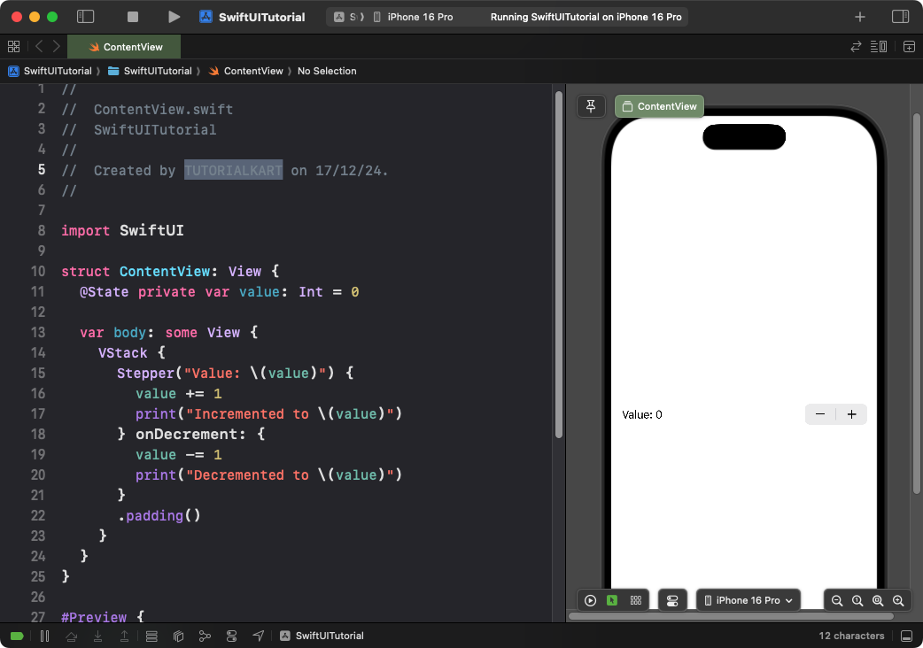
This example demonstrates how to perform actions when the Stepper value changes:
Code Example:
import SwiftUI

struct ContentView: View {
    @State private var value: Int = 0

    var body: some View {
        VStack {
            Stepper("Value: \(value)") {
                value += 1
                print("Incremented to \(value)")
            } onDecrement: {
                value -= 1
                print("Decremented to \(value)")
            }
            .padding()
        }
    }
}
Xcode Screenshot:

Explanation:
- The
onIncrementclosure executes when the Stepper’s “+” button is tapped. - The
onDecrementclosure executes when the “-” button is tapped. - You can perform custom actions, such as printing or updating additional states.
Result: A Stepper that logs changes and performs custom actions when incremented or decremented.
Conclusion
SwiftUI’s Stepper provides an easy way to increment or decrement values with customizable behavior. You can set ranges, define step increments, and even execute custom actions when the value changes. It’s a versatile control for forms, settings, and numeric inputs in SwiftUI applications.
References:
