SwiftUI – Text Background
In SwiftUI, you can customize the background of a Text view using the .background modifier. This allows you to enhance the appearance of your text by adding colors, gradients, images, or even other views as a background.
In this SwiftUI tutorial, we will explore how to use the .background modifier with different types of content and create visually appealing text layouts.
Syntax for Text Background
The basic syntax for adding a background to a Text view is:
Text("Your text here")
    .background(backgroundView)
Here:
"Your text here": The content of theTextview..background: A modifier that defines the background for the text.backgroundView: The background content, which can be a color, gradient, image, or any SwiftUI view.
Examples
Let’s explore some examples to understand how to use the .background modifier effectively.
Example 1: Adding a Solid Color Background
The simplest way to add a background to text is by using a solid color. Here’s how:
Code Example:
import SwiftUI

struct ContentView: View {
    var body: some View {
        Text("This is text with a solid color background.")
            .padding()
            .background(Color.blue)
            .foregroundColor(.white)
            .cornerRadius(10)
    }
}
Explanation:
- The
.background(Color.blue)adds a blue background to the text. - The
.padding()creates space around the text to make the background more prominent. - The
.foregroundColor(.white)ensures the text is readable against the blue background. - The
.cornerRadius(10)rounds the edges of the background.
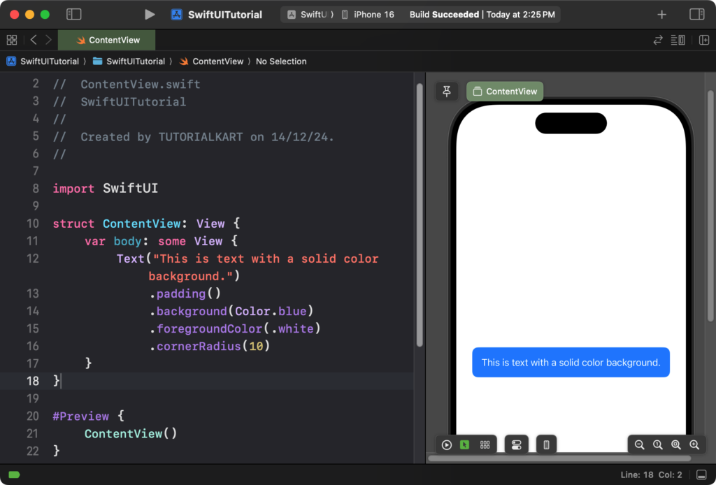
Result: The text appears with a blue background, white text color, and rounded corners.
Example 2: Adding a Gradient Background
You can use gradients as a background for your text to create a more dynamic effect:
Code Example:
import SwiftUI

struct ContentView: View {
    var body: some View {
        Text("Gradient Background Example")
            .padding()
            .background(
                LinearGradient(
                    gradient: Gradient(colors: [.purple, .blue]),
                    startPoint: .topLeading,
                    endPoint: .bottomTrailing
                )
            )
            .foregroundColor(.white)
            .cornerRadius(10)
    }
}
Explanation:
- The
LinearGradientcreates a smooth transition between purple and blue colors. - The gradient is applied as the background using the
.background()modifier. - The text color is set to white to ensure readability.
- The
.cornerRadius(10)rounds the edges of the gradient background.
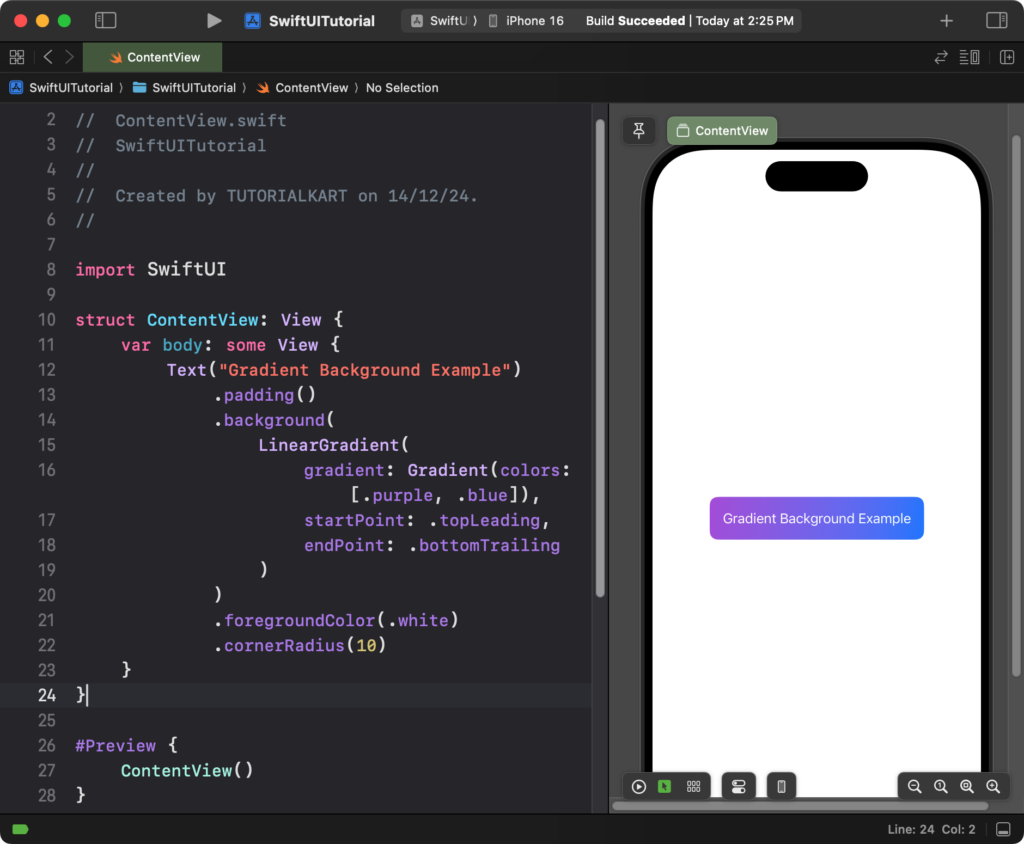
Result: The text appears with a beautiful gradient background that transitions from purple to blue.
Example 3: Adding an Image Background
Here’s how you can use an image as the background for your text:
Code Example:
import SwiftUI

struct ContentView: View {
    var body: some View {
        Text("Image Background Example")
            .padding()
            .background(
                Image("backgroundImage")
                    .resizable()
                    .scaledToFill()
            )
            .foregroundColor(.white)
            .cornerRadius(10)
            .frame(width: 300, height: 100)
    }
}
Explanation:
- The
Image("backgroundImage")refers to an image added to your asset catalog.
- The
.resizable()and.scaledToFill()modifiers ensure the image covers the background area properly. - The
.frame(width: 300, height: 100)defines the size of the text and its background. - The
.cornerRadius(10)gives the image rounded edges.
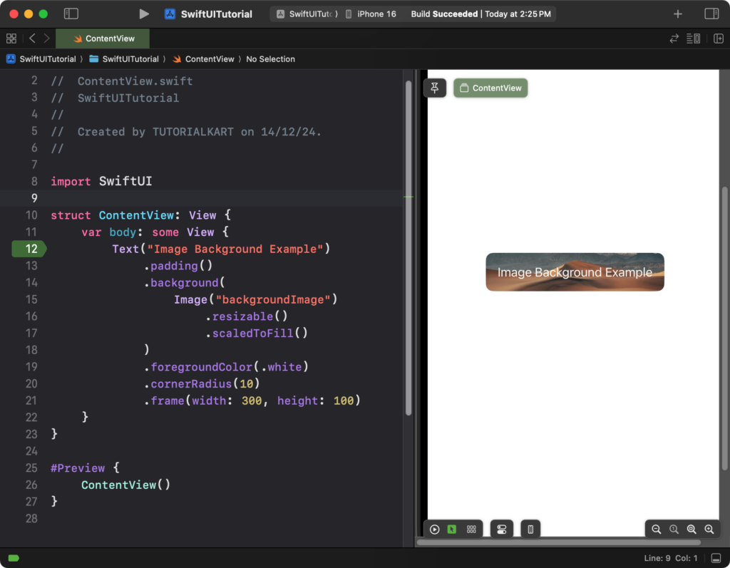
Result: The text is displayed with an image background that scales to fit the frame dimensions.
Conclusion
The .background modifier in SwiftUI is a powerful tool for customizing text backgrounds. Whether you use solid colors, gradients, or images, it allows you to create engaging and visually appealing designs for your app’s interface.
