SwiftUI – Text Line Height
In SwiftUI, you can adjust the spacing between lines of text using the .lineSpacing() modifier or by customizing the line height through the .lineHeight() property of a custom font. Line height customization is useful for enhancing readability, aligning text with your app’s design, or creating visually appealing typography.
In this SwiftUI tutorial, we will learn how to control text line height using .lineSpacing() and custom font styles in SwiftUI.
Adjusting Line Height in SwiftUI
SwiftUI provides two primary methods for adjusting line height:
- Using
.lineSpacing(): This modifier adds space between lines of text in a multi-lineTextview. - Using custom fonts: You can define custom line height by applying a font with specific line height attributes.
Examples
Let’s explore how to adjust line height in SwiftUI with practical examples.
Example 1: Using .lineSpacing()
The .lineSpacing() modifier adjusts the spacing between lines of text in a multi-line Text view:
Code Example:
import SwiftUI

struct ContentView: View {
    var body: some View {
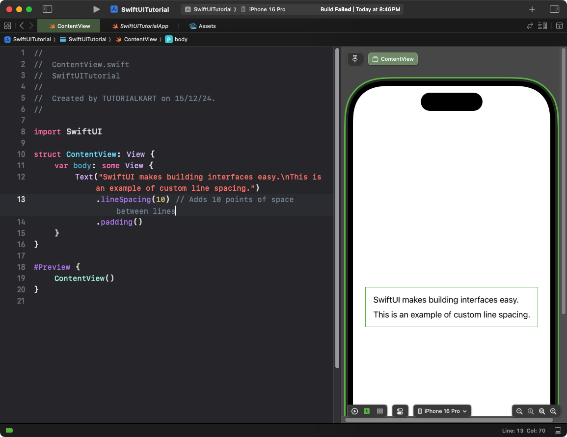
        Text("SwiftUI makes building interfaces easy.\nThis is an example of custom line spacing.")
            .lineSpacing(10) // Adds 10 points of space between lines
            .padding()
    }
}
Explanation:
- The
.lineSpacing(10)modifier adds 10 points of space between each line of text. - This works for any multi-line
Textview.
Result: The text appears with increased spacing between lines for better readability.
Example 2: Using Custom Fonts with Line Height
You can use custom fonts to control line height more precisely. Here’s how to apply a custom font with a specific line height:
Code Example:
import SwiftUI

struct ContentView: View {
    var body: some View {
        Text("SwiftUI allows precise control over text attributes.\nYou can customize line height with custom fonts.")
            .font(.system(size: 16, weight: .regular, design: .default)
                .leading(.loose)) // Adjusts line height to a looser spacing
            .padding()
    }
}
Explanation:
- The
.font(.system(...).leading(.loose))applies a system font with loose line height. - Other options for
.leading()include.tight(smaller line height) and.standard(default line height).
Result: The text appears with a looser line height for a spacious, elegant look.
Example 3: Combining Line Spacing and Fonts
You can combine .lineSpacing() and custom fonts for even more control over line height:
Code Example:
import SwiftUI

struct ContentView: View {
    var body: some View {
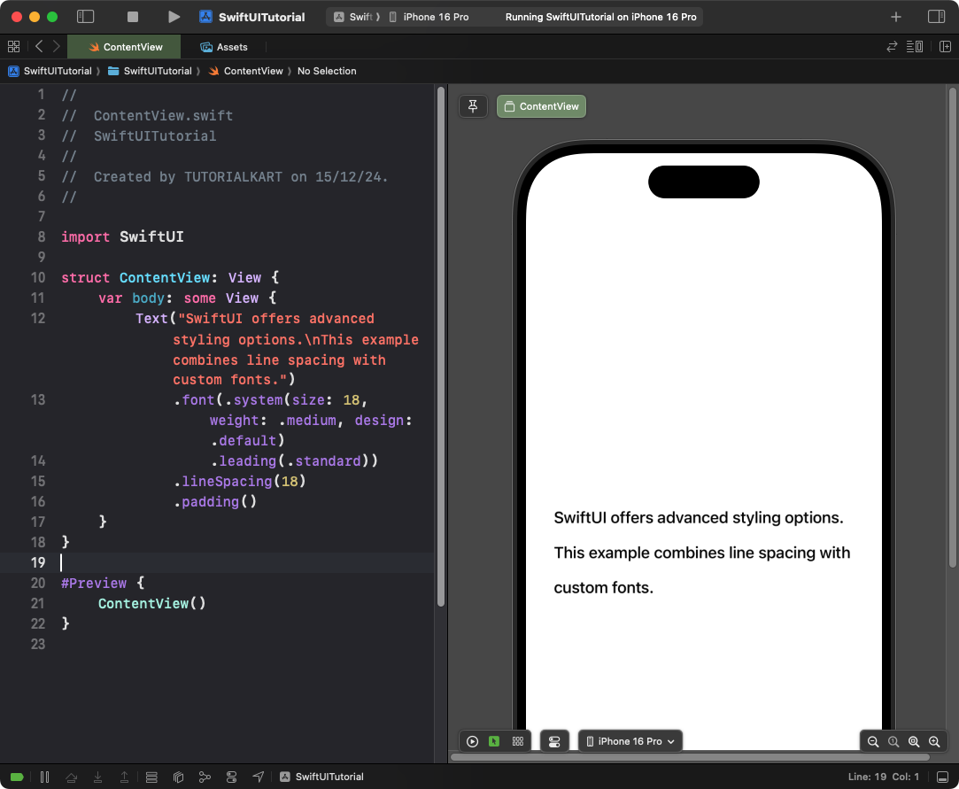
        Text("SwiftUI offers advanced styling options.\nThis example combines line spacing with custom fonts.")
            .font(.system(size: 18, weight: .medium, design: .default)
                .leading(.standard)) // Standard line height
            .lineSpacing(18) // Adds 8 points between lines
            .padding()
    }
}
Explanation:
- The custom font defines the base line height using
.leading(.standard). - The
.lineSpacing(18)modifier adds 18 points of extra space between lines.
Result: The text is displayed with a balanced line height, combining both standard leading and additional spacing.
Conclusion
Adjusting text line height in SwiftUI is straightforward with the .lineSpacing() modifier and custom font attributes like .leading(). By combining these tools, you can create text layouts that improve readability and align with your app’s design requirements.
