SwiftUI – Text Styling
In SwiftUI, you can customize and style text using a variety of modifiers. These modifiers allow you to change the font, color, weight, and other properties of the Text view. By combining these modifiers, you can create visually appealing and highly customized text layouts.
In this SwiftUI tutorial, we will explore different ways to style text in SwiftUI with examples for beginners.
Basic Text Styling Syntax
In SwiftUI, text styling is applied using modifiers. Here’s a simple example:
Text("Your styled text here")
    .font(.title)
    .foregroundColor(.blue)
    .bold()
Here:
.font(): Changes the font size and style..foregroundColor(): Sets the text color..bold(): Makes the text bold.
You can combine multiple modifiers to achieve the desired text appearance.
Examples
Let’s explore some common text styling techniques in SwiftUI with examples.
Example 1: Applying Multiple Styles
Combine multiple modifiers to style text:
Code Example:
import SwiftUI

struct ContentView: View {
    var body: some View {
        Text("SwiftUI Text Styling")
            .font(.largeTitle)
            .foregroundColor(.purple)
            .italic()
            .bold()
            .padding()
    }
}
Explanation:
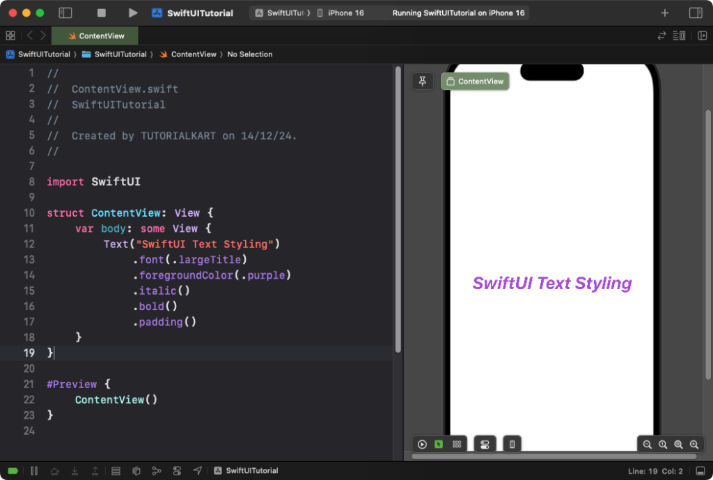
.font(.largeTitle): Makes the text large..foregroundColor(.purple): Sets the text color to purple..italic(): Applies an italic style to the text..bold(): Makes the text bold..padding(): Adds space around the text for better spacing.
Result: The text appears large, bold, italic, and purple, with spacing around it.
Example 2: Adding a Background and Corner Radius
Text styling can also include adding a background and rounded corners for a polished look:
Code Example:
import SwiftUI

struct ContentView: View {
    var body: some View {
        Text("Stylish Text")
            .font(.title)
            .foregroundColor(.white)
            .padding()
            .background(Color.blue)
            .cornerRadius(10)
    }
}
Explanation:
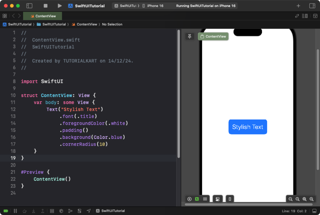
.background(Color.blue): Adds a blue background behind the text..cornerRadius(10): Rounds the edges of the background..foregroundColor(.white): Sets the text color to white for contrast..padding(): Adds space between the text and its background.
Result: The text is displayed with a blue background, white text color, and rounded corners.
Example 3: Customizing Text Spacing
You can adjust character and line spacing to improve readability:
Code Example:
import SwiftUI

struct ContentView: View {
    var body: some View {
        Text("SwiftUI\nText\nStyling")
            .font(.headline)
            .foregroundColor(.black)
            .multilineTextAlignment(.center)
            .lineSpacing(10) // Space between lines
            .kerning(2) // Space between characters
            .padding()
    }
}
Explanation:
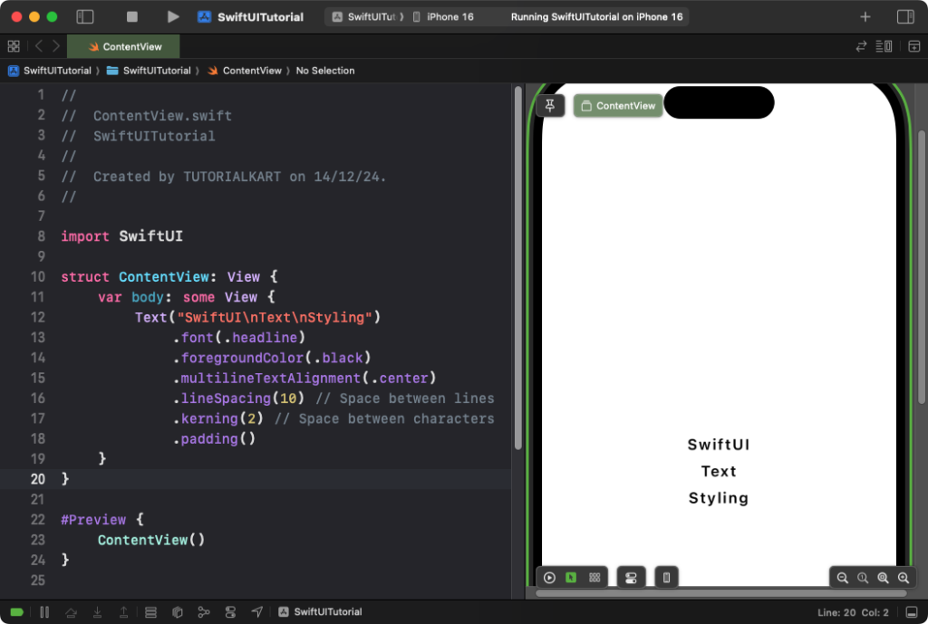
.lineSpacing(10): Adds 10 points of space between lines of text..kerning(2): Adds 2 points of space between characters..multilineTextAlignment(.center): Centers the text lines horizontally.
Result: The text is evenly spaced between lines and characters, with alignment centered.
Conclusion
SwiftUI provides powerful and intuitive tools for styling text, allowing you to create beautifully customized designs. By combining modifiers like .font(), .foregroundColor(), .padding(), and more, you can easily achieve the desired look for your app’s typography.
