SwiftUI – TextField Background Color
In SwiftUI, you can style a TextField to enhance its visual appearance, including customizing its background color.


By default, the TextField does not have a visible background, but you can easily add and customise it using the .background() modifier or by embedding it within a styled container.
This tutorial explores how to customise the background color of a TextField in SwiftUI with practical examples.
Customizing Background Color
To add a background color to a TextField, you can:
- Use the
.background()Modifier: Apply a solid or gradient background directly to theTextField. - Wrap the
TextFieldin aZStackorRoundedRectangle: Use these elements for more advanced background designs.
Examples
Let’s look at examples of how to apply background colors to a TextField.
Example 1: Solid Background Color
This example demonstrates how to add a solid background color to a TextField:
Code Example:
import SwiftUI

struct ContentView: View {
    @State private var text: String = ""

    var body: some View {
        TextField("Enter text", text: $text)
            .padding()
            .background(Color.yellow) // Adds yellow background color
            .cornerRadius(8) // Rounds the corners of the background
            .padding()
    }
}
Explanation:
- The
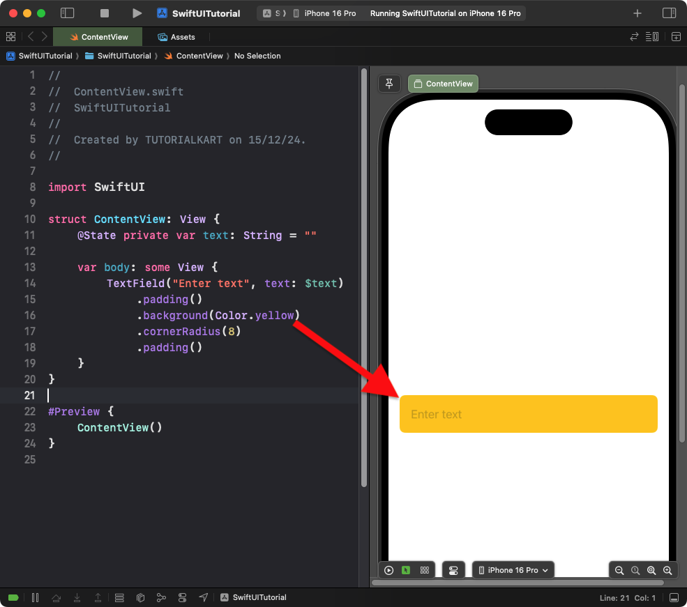
.background(Color.yellow)modifier applies a yellow background to theTextField. - The
.cornerRadius(8)modifier rounds the corners of the background for a polished look.
Result: A TextField with a yellow background and rounded corners is displayed.
Example 2: Gradient Background Color
This example uses a gradient background for the TextField:
Code Example:
import SwiftUI

struct ContentView: View {
    @State private var text: String = ""

    var body: some View {
        TextField("Enter text", text: $text)
            .padding()
            .background(
                LinearGradient(
                    gradient: Gradient(colors: [Color.blue, Color.purple]),
                    startPoint: .leading,
                    endPoint: .trailing
                )
            )
            .cornerRadius(10) // Rounds the corners of the gradient background
            .padding()
    }
}
Explanation:
- The
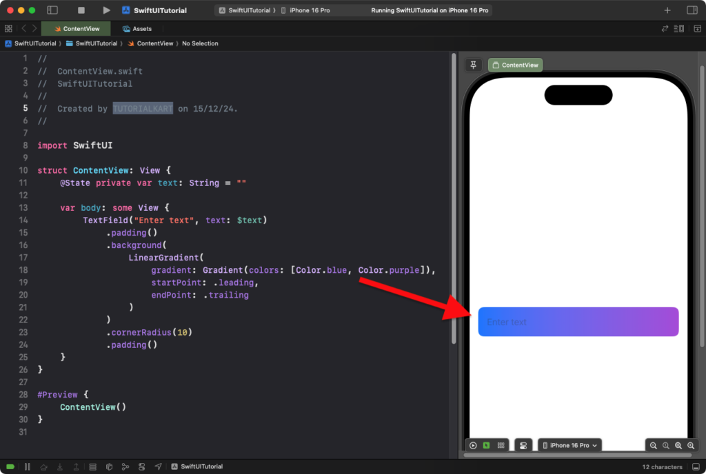
LinearGradientcreates a gradient background transitioning from blue to purple. - The
.cornerRadius(10)modifier rounds the corners of the gradient background.
Result: A TextField with a gradient background and rounded corners is displayed.
Example 3: Custom Background with Border
This example demonstrates a TextField with a custom background color and a border:
Code Example:
import SwiftUI

struct ContentView: View {
    @State private var text: String = ""

    var body: some View {
        TextField("Enter text", text: $text)
            .padding()
            .background(Color(UIColor.secondarySystemBackground)) // Light gray background
            .cornerRadius(8)
            .overlay(
                RoundedRectangle(cornerRadius: 8)
                    .stroke(Color.blue, lineWidth: 2) // Blue border
            )
            .padding()
    }
}
Explanation:
- The
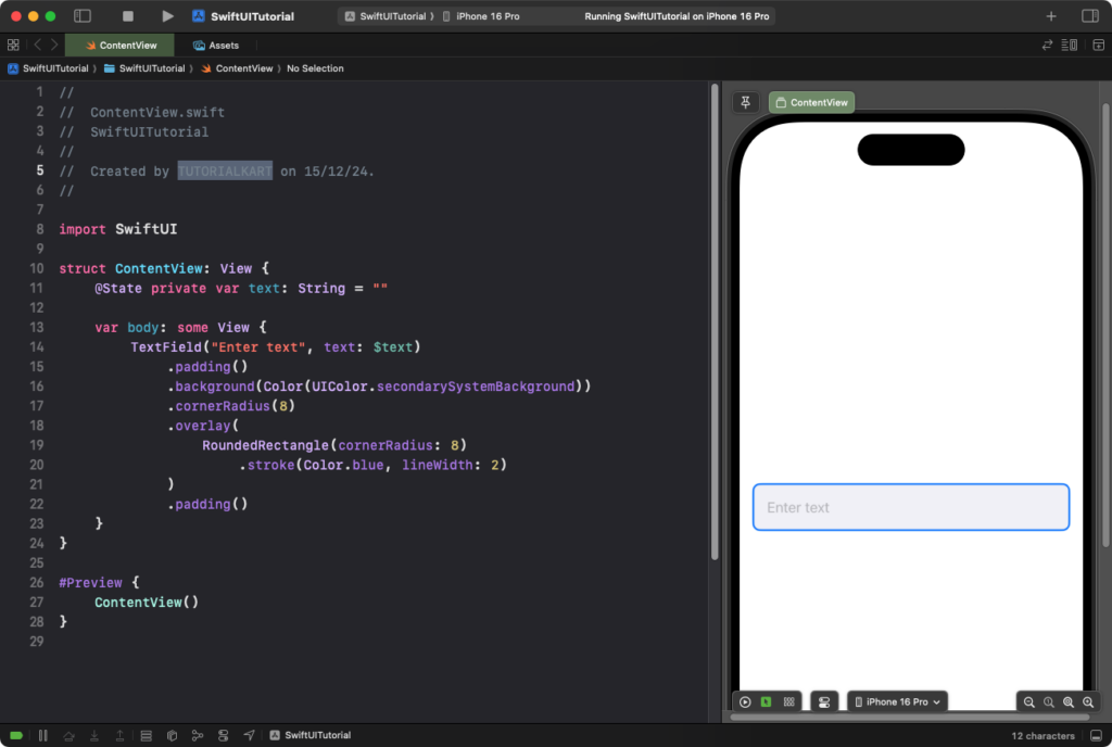
.background(Color(UIColor.secondarySystemBackground))applies a light gray background. - The
.overlay()modifier adds a blue border around theTextField. - The
.cornerRadius(8)ensures the background and border have rounded corners.
Result: A TextField with a custom background and border appears.
Conclusion
Adding a background color to a SwiftUI TextField enhances its appearance and usability. Using the .background() modifier or a container view, you can customize the background to match your app’s design. These examples demonstrate how to apply solid colors, gradients, and advanced styling with borders.
