SwiftUI – TextField Character Limit
In SwiftUI, a TextField allows users to input text. However, there may be situations where you want to restrict the input to a specific character limit, such as limiting usernames or IDs. SwiftUI does not provide a built-in modifier for character limits, but you can achieve this functionality by monitoring and modifying the input text dynamically.

This tutorial explains how to implement a character limit for a TextField in SwiftUI using practical examples.
Restricting Character Limit
To limit the number of characters in a TextField, you can use the onChange modifier to observe changes in the input and truncate the text to the desired length.
Basic Syntax
The general approach is:
TextField("Placeholder", text: $text)
    .onChange(of: text) { newValue in
        if newValue.count > characterLimit {
            text = String(newValue.prefix(characterLimit))
        }
    }
Here:
text: A state variable bound to theTextField.characterLimit: The maximum number of characters allowed.newValue.prefix(characterLimit): Truncates the text to the specified length if it exceeds the limit.
Examples
Let’s look at examples of limiting the character count in a TextField.
Example 1: Simple Character Limit
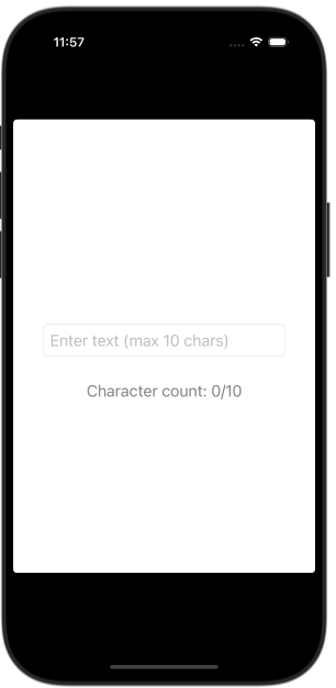
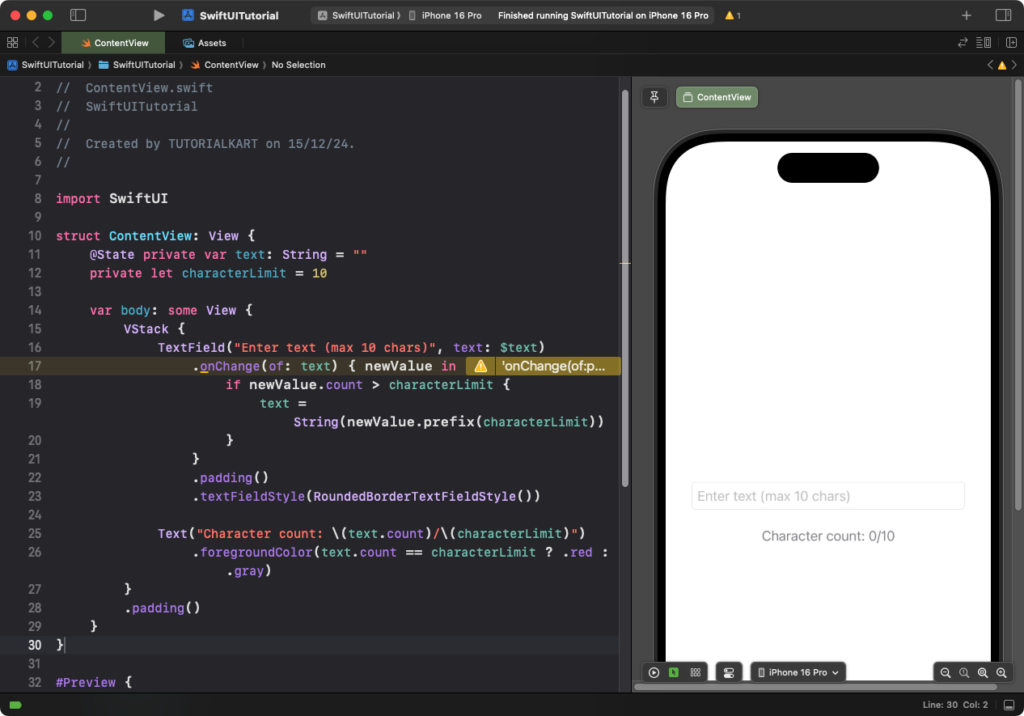
This example demonstrates a basic TextField with a 10-character limit:
Code Example:
import SwiftUI

struct ContentView: View {
    @State private var text: String = ""
    private let characterLimit = 10

    var body: some View {
        VStack {
            TextField("Enter text (max 10 chars)", text: $text)
                .onChange(of: text) { newValue in
                    if newValue.count > characterLimit {
                        text = String(newValue.prefix(characterLimit))
                    }
                }
                .padding()
                .textFieldStyle(RoundedBorderTextFieldStyle())

            Text("Character count: \(text.count)/\(characterLimit)")
                .foregroundColor(text.count == characterLimit ? .red : .gray)
        }
        .padding()
    }
}
Explanation:
- The
onChangemodifier checks the input length and truncates it if it exceeds 10 characters. - A text label displays the current character count and changes color when the limit is reached.
- The
.textFieldStyle(RoundedBorderTextFieldStyle())modifier applies a rounded border to theTextField.
Result: The TextField enforces a 10-character limit and displays feedback to the user.
Example 2: Dynamic Character Limit
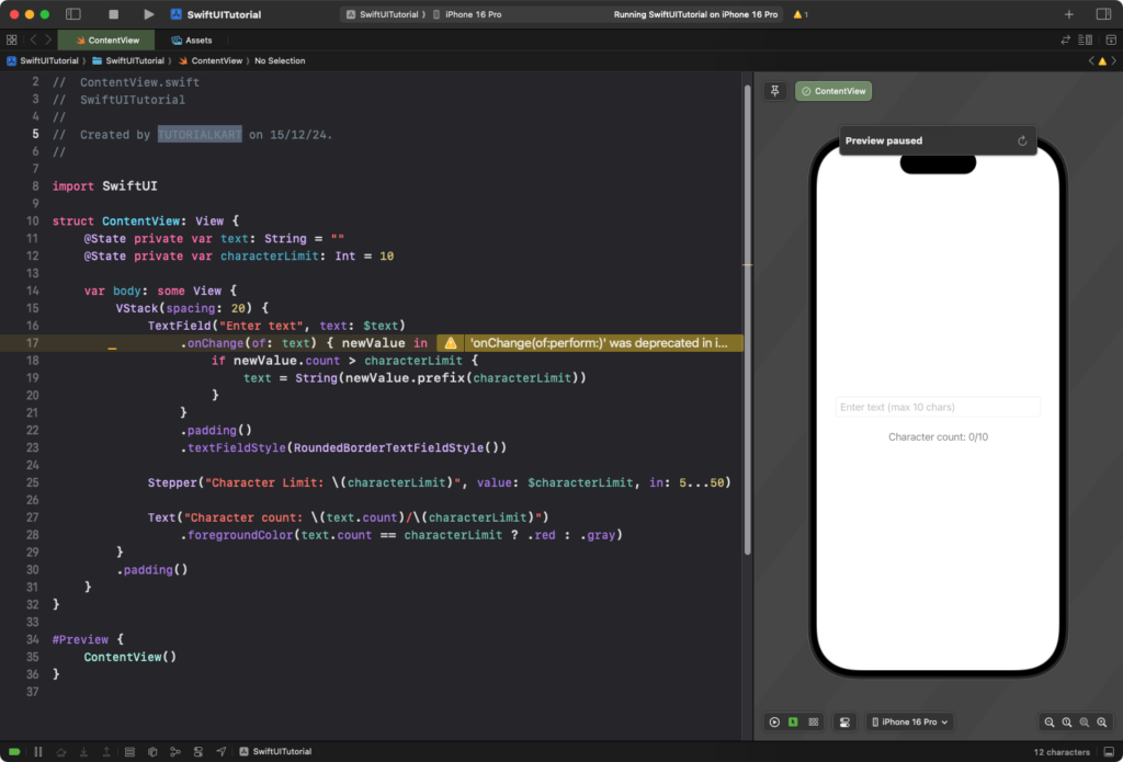
You can make the character limit dynamic by allowing the user to set the limit:
Code Example:
import SwiftUI

struct ContentView: View {
    @State private var text: String = ""
    @State private var characterLimit: Int = 10

    var body: some View {
        VStack(spacing: 20) {
            TextField("Enter text", text: $text)
                .onChange(of: text) { newValue in
                    if newValue.count > characterLimit {
                        text = String(newValue.prefix(characterLimit))
                    }
                }
                .padding()
                .textFieldStyle(RoundedBorderTextFieldStyle())

            Stepper("Character Limit: \(characterLimit)", value: $characterLimit, in: 5...50)

            Text("Character count: \(text.count)/\(characterLimit)")
                .foregroundColor(text.count == characterLimit ? .red : .gray)
        }
        .padding()
    }
}
Explanation:
- The
Stepperallows the user to dynamically adjust the character limit between 5 and 50. - The
onChangemodifier ensures the input is truncated based on the current limit. - A label displays the current character count and limit, with visual feedback when the limit is reached.
Result: The user can dynamically set the character limit, and the TextField enforces it.
Conclusion
Implementing a character limit in SwiftUI TextField is straightforward using the onChange modifier. By dynamically validating and truncating input, you can ensure user input meets specific requirements. Adding feedback, like a character counter or dynamic limit adjustment, improves the user experience and aligns with your app’s design goals.
